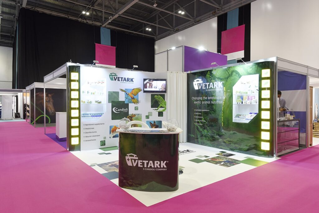
29 Dec What are the Best Colour Choices for Event Graphics Printing?
What are the Best Colour Choices for Event Graphics Printing?
Event graphics have increasingly become a popular choice of business owners who want their business to stand out in any event, such as trade shows, industrial affairs, or other corporate affairs.
It’s because well-designed and strategically placed graphics make the event visitors more receptive to your brand message.
Therefore, if you’ve utilised the right set of colours in all these graphics and signage, your brand might as well make its way to peoples’ subconscious minds, enabling them to remember your company whenever they need a product or service you offer.
Though you can reap various benefits by simply placing professionally designed graphics in all types of events, the primary advantage relates to drawing significant attention and visits to your company by the right set of audience.
Almost all businesses now use event graphics to attract prospective customers to their trade shows. It has become more critical than ever to get your graphics designed that are distinct, eye-catchy, and work as a lead magnet.
However, to make all this happen, you must choose the right graphic type and pay extra attention to its quality because these two factors hugely influence the effectiveness of event signage.
If you’re finding ways to boost the efficiency and effectiveness of the graphics and signage used at all your upcoming events, then read till the end.
What Are Event Graphics?

Event graphics are a type of exterior signage used to direct and inform your guest in any industrial affair about your brand, business goals, and other crucial details.
These graphics are various types, including tabletop displays, banner stands, outdoor and indoor hanging banners, back-lit graphics, foldable display panels, wall backdrop, pole-pocket or boulevard banners, etc.
You can choose any of these graphics to express your brand message and connect to the target audience in a more profound and meaningful manner.
Each event graphic serves a particular purpose, so you need to be wise with the selection. These are available in various designs, sizes, colours and can also be customised to fulfil a brand’s precise requirements.
If you want to create a pleasant lasting impression on the visitors, make sure you get graphics that look professional, and their design aligns perfectly with your brand.
Why Colour Choices Play an Important Role in Event Graphics Printing?
It would be an understatement to say colours play a significant role in our day-to-day life. From the everyday clothes we buy to the cars we choose, these products’ colours influence the buying decision.
The same applies to the event signage as well. When a person enters a trade exhibit or any offline event, he gets surrounded by endless brand banners and other graphics vying for his attention.
But it is the most aesthetic graphics that make the person visit a particular brand booth. If you want your business startup to stand out and grab the most attention in the upcoming events, be sure to get the graphics designed using the right set of colours.
However, it’s essential not to pick any random colours because it won’t yield any positive benefits. If you’re still wondering how colour choices play a significant role in creating stellar event graphics that make people hooked to your brand, let’s continue reading,
1 – Colours Evoke Emotions
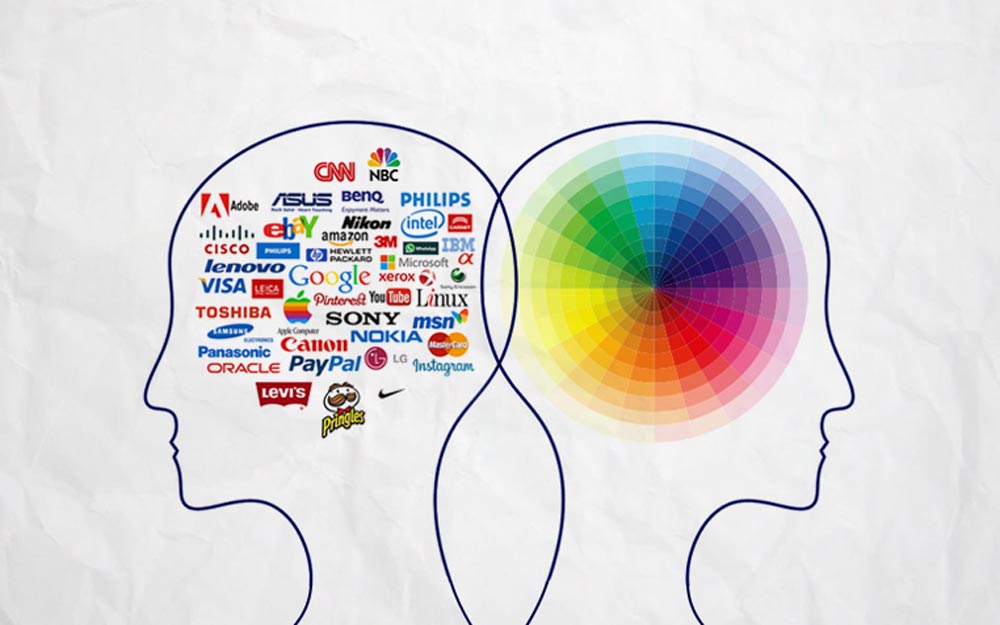
The primary reason colours get so much attention in event graphic designing is their ability to evoke certain emotions.
For example, suppose you check out the brand logos of KFC, McDonald’s, Wendy’s, Coca-Cola, Dominos, Burger King, Taco Bell, and Pizza Hut. In that case, all these commercial establishments use red in their brand logo and graphics.
They don’t use red because they like it, but because this colour is known to stimulate the viewers’ metabolism, making them want to eat something.
Like the colour red, each colour has associations with various emotions. It is why brands are very strategic with the colours they include in their brand, and you should too.
2 – Enhances the Graphics Legibility
Anyone who wants to put across a message through the signage used at the events must be cautious with colours.
It is needed to maintain the proper contrast between the lightness and darkness of each colour used on the graphics.
If the colours you plan to use don’t go along well, it may result in visual clutter, preventing people from seeing clearly what’s written on the graphic.
Hence, always pick colours that complement each other instead of overshadowing the other.
To make the graphics bright, visually pleasing, and clutter-free, take the help of a professional event graphics printer in NYC who knows what works best.
They will be able to suggest to you the best colour combination that will enhance the aesthetics of your graphics and will also do an excellent job at clearly conveying your brand message.
3 – Makes People Familiar With Your Brand
If you have ever gone to a trade fair month ago but still remember one brand of the many, it is because of the visuals that stuck with you.
Businesses should always try their best to create graphics that instantly catches attention and stay in their memory for a long time.
It may sound like a pretty impossible task, but you can quickly achieve it by designing this signage with the right set of colours.
You can either incorporate brand colours in these graphics if they have some influential colours or pick some shades based on colour psychology.
For example, if you’re a business selling luxury items, you should consider including the colour gold in the graphics for the much-needed visual appeal and quick resonance with opulence.
So, always pick colours based on the nature of your business and the notion you want people to have when they see your brand logo or graphics.
4 – Helps Fulfil the Set Event Goals
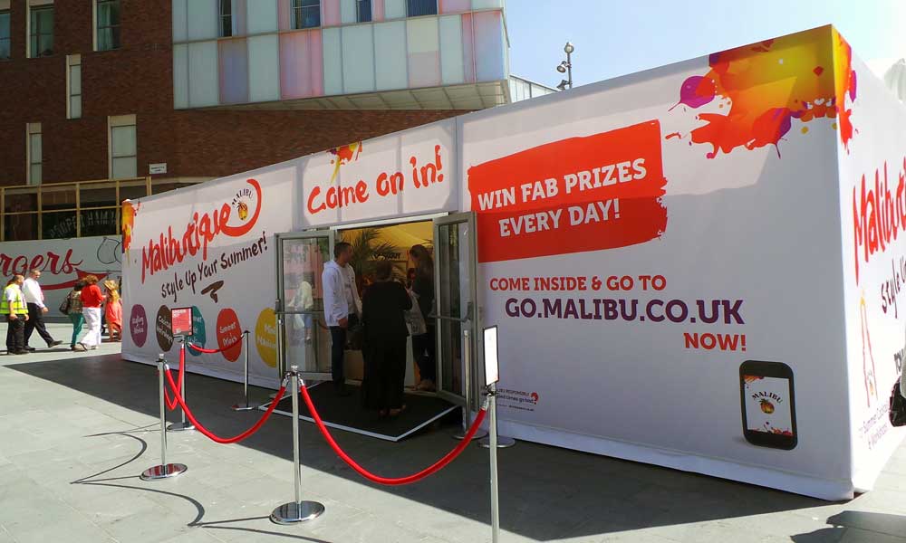
The primary goal of organising an event is to promote your products or increase brand awareness, and it can only be done if your business manages to grab peoples’ attention.
An event usually has hundreds, if not thousands, of businesses as participants, encouraging attendees to visit their business booth.
With stiff competition around, colours can get your brand noticed. If you’ve placed banners or tabletop displays featuring dull colours, the chances are bleak that it will grab peoples’ attention.
On the other hand, if you replace the dull-looking banner with a vibrant banner featuring eye-grabbing colours, you’ll naturally start attracting people’s attention.
But always remember, putting the correct text is as important as using the right set of colours for maximum benefit.
So if your primary event goal is to generate product inquiries and boost brand awareness, stunning event graphics with colours can help achieve all these goals.
Now that you’re aware of how your colour choices can bring a significant difference, let’s head straight to some colour choices you should consider including in the graphics for best results.
What are the Best Colour Choices Available?
Colours are greatly valued today because they speak a language that even words don’t. They are used by brands to communicate with people emotionally, thereby being more effective in persuading people to take a specific action.
While there is no denying that the right choice of colours can benefit a brand significantly, the main challenge lies in picking the perfect colour for your brand.
If you’re in the planning phase of your event graphic designs, we’ve listed down some best colour choices that you should consider in the graphics to elevate the aesthetic appeal and grab peoples’ attention.
1 – Blue
Symbolising trust, responsibility, loyalty, and security, Blue is a favourite colour of hospitals, airlines, and large companies.
Blue is known to possess a calming and soothing effect on the human psyche, making its viewers feel secure and confident.
As this colour positively impacts peoples’ minds, companies like to incorporate it in their branding and marketing collateral.
There are various enticing shades of blue to choose from, so you’ll have enough variations to play with.
2 – Red
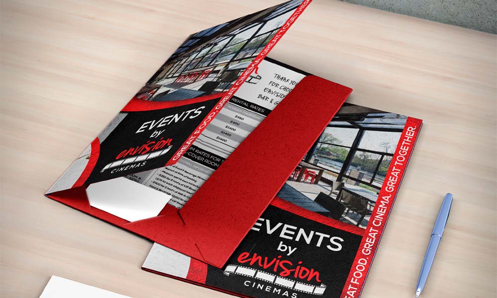
Red is a powerful colour that evokes strong emotions used mainly by food giants and dating apps. This vibrant colour looks gorgeous and falls in perfect alignment with most other colours.
You will mostly find this colour being used as a symbol of power and courage in top businesses; it is why the most prominent award show hosts make top celebrities walk on a red carpet to make them feel powerful and valued.
If you want your graphics to grab eyeballs and make people associate with your brand, consider red in your event graphics.
3 – Yellow
This vibrant colour signifies energy, playfulness, warmth, youth, and happiness. Therefore, brands must use yellow in their graphics to attract more people in an unaggressive way.
The best part of this colour is its vibrancy. Just a splash of this colour can make any dull, boring event graphic transform into an eye-catchy and high-converting one.
4 – Pink
We’ve all grown up hearing pink is for girls, and the way this colour blends in for branding material of feminine products makes us think how accurate the saying was.
Pink is often associated with fun, delicate, upbeat, romance, sweetness, and everything girly. Incorporating pink in the graphics will work well if your business sells women’s hygiene products or any feminine product.
Bakery businesses also use this colour as it signifies sweetness.
5 – Green
Known for its calming effect on the human psyche, brands often use this colour to project themselves as mature, professional, and well-balanced.
As green is associated with calmness, soothing, renewal, health, growth, etc., spa centres, green food suppliers, eco-friendly product sellers, and more should include green in their event signage for maximum attention and brand resonance.
Though these are some top, trending colours that can be an excellent fit for your event graphics, you can also consider other inviting options like purple, orange, grey, black, white, and brown.
If you’re wondering how to play with colours while designing these graphics for your event show, let’s take a look at some of the best tips to get started,
4 Tips to Choose the Best Colour for Your Event Graphics
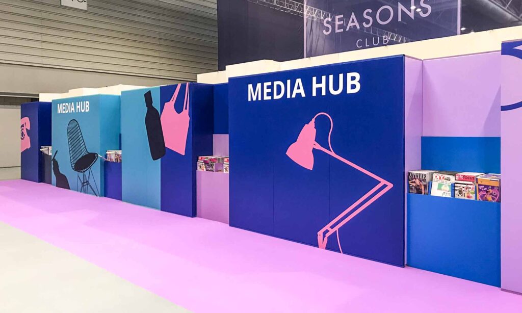
If you want to showcase your business as a distinct brand that people can trust, you must create your own unique colour palette and use the same to design your event graphics.
To help you with the process, we’ve listed down the four most effective ways to assist you in choosing the most effective, best colours for your event signage.
1 – Take the Help of Colour Psychology
You cannot fill the graphics at your event with multiple colours, so choosing the right two to three colours is extremely important if you want to make an impact. You can easily find these colours using colour psychology.
The study of colour psychology explains how specific colours influence human emotions, persuading them to make subconscious purchase decisions, so one can never go wrong while finalising colours using this technique.
If you don’t know how to leverage this technique, take the help of professional event graphic designers who have been doing this for years.
2 – Focus On The Primary Colour of Your Brand
While grabbing people’s attention using eye-catchy colours is undoubtedly the end goal of your event graphics, the colours should ultimately match your brand, and the design shouldn’t look like a forced one.
If the colours of your graphic designs are not consistent with your brand logo and its colour palette, it can harm the event attendees.
To show your brand as reliable, professional, and sincere, you must ensure your brand message and colour palette are consistent throughout all the exterior signage used at your event.
To save time, you can hand over the responsibility of designing your graphics and signage to a reputed signage manufacturer in advance and ask them to include the colours that sync well with your company.
3 – Pick 2-3 Primary Colours Using the Colour Wheel
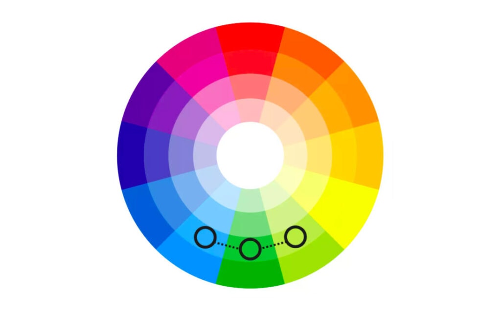
You may get tempted to add many colours to your graphics, but it can backfire really soon. An excellent way to make it look stunning is by picking two to three primary colours using the colour wheel.
A colour wheel helps people understand the relation between warm, cool, and tertiary colours with the help of a wheel surrounded by different core colours.
Once you get an idea of the primary colours, you can use the same wheel to pick a few accent colours for the graphics.
4 – Don’t Forget to Keep Colour Blindness in Mind
Many businesses overlook an important factor while designing their event graphics: picking the colours and keeping those with colour blindness in mind.
A significant population has some degree of colour blindness, preventing them from seeing the proper form of colours.
So if you want everyone to see the graphics and signage at your event from the same lenses, ask the manufacturer to avoid using hues that might confuse a person.
Are You Ready to Design a Stunning Graphic for Your Next Event Now?
You will rarely face any difficulty if you keep these details in mind while finalising the colours for your event graphics.
Also, instead of getting it done alone, it will be wise to take consultation or help from a professional, designing stunning event graphics for years.
Experts can design a perfect graphic and provide the best advice for all the marketing collaterals to make your brand stand out in upcoming events.
The post What are the Best Colour Choices for Event Graphics Printing? is by Stuart and appeared first on Inkbot Design.


