
01 Apr 11 Best Landing Pages that Have Our Full Attention
11 Best Landing Pages that Have Our Full Attention
Landing pages are meant to pull users in and turn them into leads. The goal of each page can be different, or you can use various pages to keep track of your marketing efforts and which ones are the best return on investment (ROI).
One of the best ways to learn how to create captivating landing pages is by studying truly stellar examples. No matter how you bring the elements needed together, you’ll find the best landing pages all share a few things in common.
How Can I Make My Landing Page Better?
You can almost always improve a landing page. Knowing what makes a page better is a great place to start. Check your headings, images, calls to action (CTAs) and how well the offer serves your target audience by solving a common pain point.
What makes a great landing page? We’ve scoured the Internet for examples of the best landing pages to showcase the best elements to include on your page. Here are our favourites.
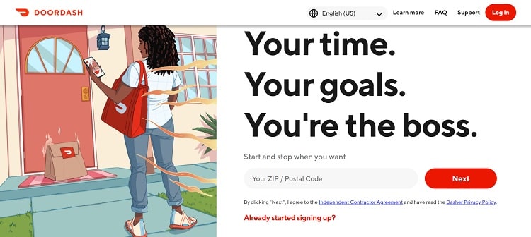
1 – DoorDash
DoorDash serves both consumers and contractors. They couldn’t deliver food without their Dashers, so their landing page needs to encourage people to sign up immediately. However, if someone lands on the wrong page and doesn’t fully understand what a “Dasher” is, it might create confusion.
DoorDash taps into the headline’s power by using short sentences and clear directions about precisely what the page offers.
The headline reads, “Your time. Your goals. You’re the boss.” Everything else on the page backs up the headline and encourages site visitors to sign up.
Tweak your headline until it explains precisely what the page offers the consumer. What is the unique value proposition you’re offering them? Why should they care? Note how DoorDash points out the benefits of being your own boss.
2 – NoRedInk
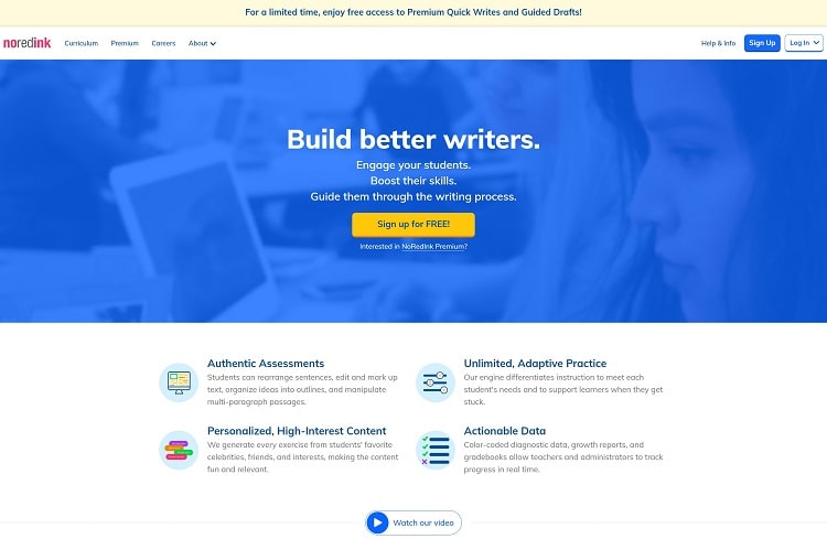
NoRedInk starts a ticking clock on their offer to grab free access to their Premium services. A headline reading is at the top of the landing page, “For a limited time, enjoy free access to Premium Quick Writers and Guided Drafts!”
Users see they can get something desirable for no initial investment on their part. They are much more likely to sign up and give it a try.
Everything else on the page backs up the benefits of the service, including the list of features most teachers would find desirable, such as boosting student skills and generating customised exercises meant to engage students. The lessons are based on what the student prefers, such as a celebrity or interest.
Limiting how long a freebie is available can make people sign up now. However, keep in mind that you don’t want to tell users you have a limited time offer and keep it available for years. You’ll need to find something new occasionally to entice new and repeat visitors to sign up.
3 – ExpressVPN
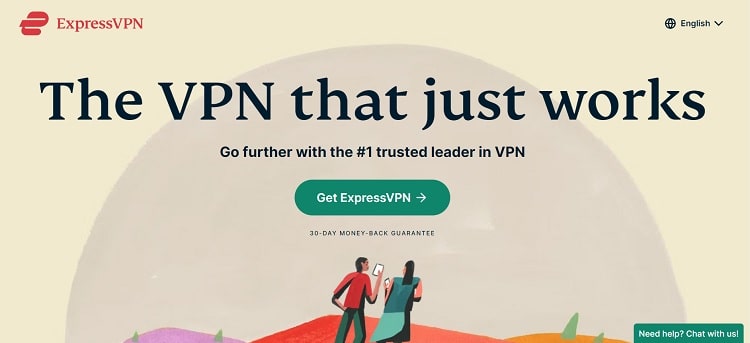
ExpressVPN adds a chat button feature so you can get in touch with them at any point in the signup process. Keep in mind that when someone lands on your page for the first time, they may not have heard of your company. They have no reason to trust you or that you’ll fulfil your promises.
Adding clear contact information builds another level of reliability. They’ll see it is easy to get in touch and ask questions, so they’ll assume you’ll be there if they have a problem with the product or service.
Different companies utilise different points of contact. A live chat might work best for your brand, or you might find a toll-free phone number or email address is best. If possible, offer multiple ways to reach out. Experiment and see what your target audience prefers.
4 – Goby
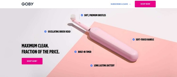
Goby uses a well-placed, relevant product photo to highlight the benefits of choosing their toothbrush over other brands. Note the checkmarks surrounding the product that list out the user benefits.
They point to a long-lasting battery, built-in timer and oscillating brush head. Some brands choose to showcase features via video or customer testimonials. Your goal is to show the user why they should take a chance on your product or service.
The features you list on your landing page should help build on the user’s information about your product. What’s unique about yours over every other option out there? Focus on things the user cares most about. If you aren’t sure, it’s time to do some market research and figure out how to meet your clients’ needs.
5 – Row House
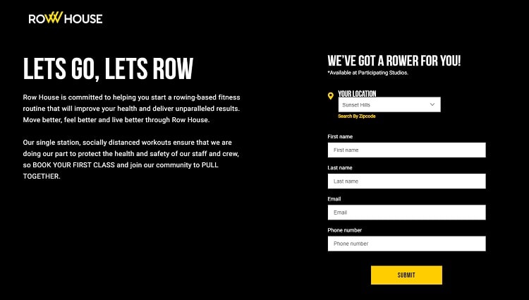
Row House shares some insight into its philosophy and commitment to those working out in its facilities. Playing a video in the background gives the user an idea of some of the routines and equipment they can expect.
They then explain how it works and invite the site visitor to book their first class. One thing of note is the pace of the video. As it plays in the background, the people move quicker, creating a sense of urgency and encouraging the consumer to sign up.
At the end of the clip, a woman holds up her hand and stops motion for a millisecond, drawing attention to the signup form on the right.
Think about how every element on your landing page points the user toward the signup form or CTA. How can you push their attention where you want it to go? Have you shared enough information for them to move from awareness to the decision stage? Try different scenarios and do split testing until you find the perfect combination.
6 – Shef
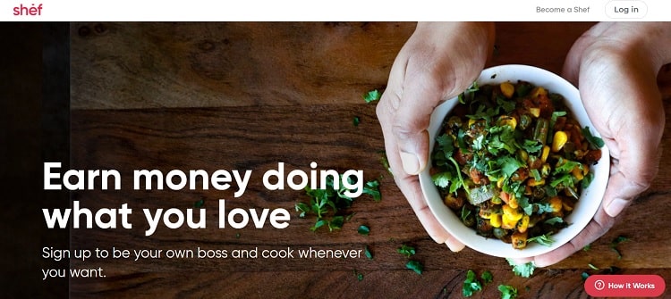
Shef uses a giant and beautiful hero image to showcase what the company is about. When the user reads the headline “Earn money doing what you love,” there is no doubt it has something to do with food and cooking.
When you look at the image above, the first thing you notice is probably the hands holding food. Think about how your hero image grabs attention and whether it sends the message you want it to send to the user. You can then tweak placement, colours and other elements, so you direct the path your buyer travels.
If you want to build insight along the way, you offer cues about where you’d like the user to go first, second and last. For example, if you first want to establish a food brand, you’d highlight food in your hero image. Your headline might further define what type of food. Your call to action button would explain how to learn more about the topic or offer an invitation.
7 – Nightwatch
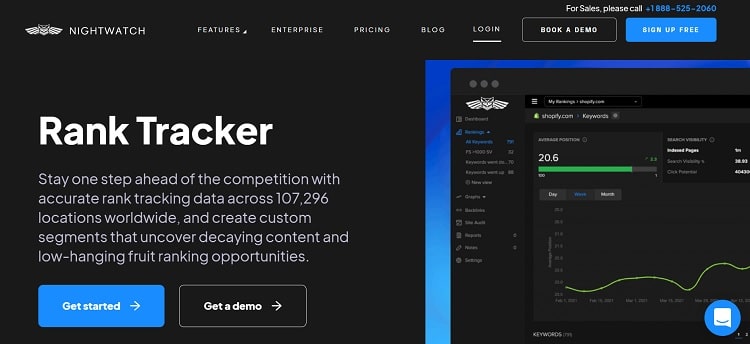
Nightwatch tracks browser ranking across different platforms so you can ensure you reach as many people as possible and rank high in search engine results. To showcase just how their product works, they offer a demo of it.
If you sell software as a service (SaaS), offering a free demo can help establish just how easy your product is to use. SaaS doesn’t always require a significant upfront investment for small business owners, but they may be reluctant to try another service and pay the monthly fees.
The try before you buy model lets them see if your software will help them grow their company. You’ll also save time and effort in taking users off your account, as they’ll have a better idea if they want your service before they sign up.
You probably should at least collect an email and first name in exchange for the free demo. You’ll then have a lead you can reach out to later and see if you can help them in some way.
8 – Curology
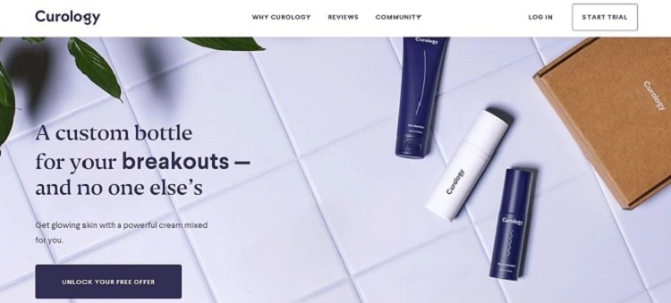
Curology taps into animation to grab user attention and keep it long enough to convert them into leads. When you land on the page, you see a headline about a custom bottle. The words then start to change from “breakouts” to “dark spots” to “uneven skin tone.”
The idea is that the product is customised to suit your particular needs, and they show that by listing a variety of issues their buyer personas might have. They then invite you to unlock your free offer via a CTA button.
Tap into the power of animation on your landing page and better engage site visitors. You can do something similar to Curology’s and change just a few words. You could also use moving arrows to point the way, add video or drop in an animated logo. Try different ideas until you find one that works best for your brand image.
9 – Gusto
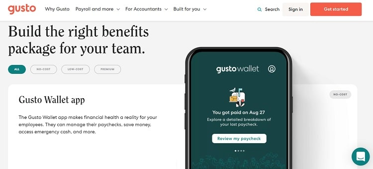
Gusto manages to keep its landing page interactive by offering some options based on what type of benefits the customer is looking for. Note the buttons the user can click on, such as “All,” “No-Cost,” “Low-Cost”, and “Premium.” By clicking on each one, new information appears.
Gusto’s landing page layout works best when users are in the awareness stage and ready to enter into research about the company and products. When the user clicks on one of the options, they invest time and effort and are more likely to stay rather than bounce away.
Finally, as the information builds, there are numerous CTA opportunities. The entire site pushes the user through the buyer’s journey, encouraging them to “Get Started.”
10 – Wise
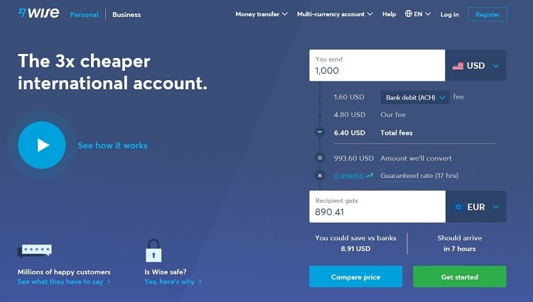
Wise does a couple of exciting things that make their landing page unique. First, they have a play button so the user can initiate a video should they choose. They also keep things simple and don’t add a bunch of clutter. There are only a few places to go on the page, and all point toward the objective of getting the user to sign up.
We love this landing page because the calculator shows how much money you could save and how faster it arrives than a traditional bank. The user plugs in “You Send” with an amount and chooses the type of currency, such as USD or the British Pound. The numbers then recalculate to show how much the recipient gets, how much you potentially save and how long it will take to get there.
Calculators are an excellent way to show site visitors that you understand their needs. Offering such a tool also engages the person and keeps them on your site longer, leading to higher conversions because they spend more time with your business and get to know you.
11 – Simply Business
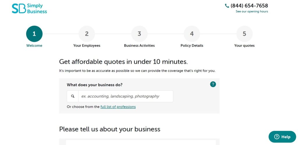
Simply Business lays out the user’s steps from start to finish. They use numbers one through five and a subheading for each number icon, so the user knows they’ll complete five steps to get a quote.
The potential lead sees precisely what they need to do to move forward by laying out the process. There is no question about how long it will take, how many form fields they’ll need to fill out or anything else. The process is simple and to the point.
Your landing pages should be clear cut. Don’t send users on a chase that never ends. If they click on a CTA, they should either be taken to the prize for doing so or given a layout of exactly how long it might take them to arrive at their end goal.
Don’t try to pack too many things into one landing page. Keep everything short and to the point. The last thing you want to do is frustrate your prospects.
What Do the Best Landing Pages Need?
After studying the samples of the best landing pages above, you might better understand what you can add to your landing page to draw users in and convert them into customers.
Think about the industry you’re in. Study the competition to see what works best for them. Come up with a unique niche and value proposition and share it on your landing pages.
Finally, always test any changes against the old version. Use A/B split testing to ensure your adjustments improve your landing page and bring more leads your way. With a bit of tweaking, almost any landing page can improve.
What are the best landing pages examples you’ve seen online? Be sure to let us know in the comments below.
Author Bio: Eleanor Hecks is editor-in-chief at Designerly Magazine. Before becoming a full-time freelance designer, she was the creative director at a digital marketing agency. Eleanor lives in Philly with her husband and pup, Bear.
The post 11 Best Landing Pages that Have Our Full Attention is by Stuart and appeared first on Inkbot Design.