
09 Feb Top 5 Web Design Myths to Ignore
Top 5 Web Design Myths to Ignore
As designers, we know that creating high-quality user experiences can take time and require careful planning, but not all of us are up to speed when designing good online content.
Sometimes our knowledge gets in the way of making informed decisions about how best to present information to our audience.
And sometimes, those bad ideas spread like wildfire through social media channels and across the internet before anyone stops to question whether or not they’re actually true.
However, it doesn’t have to stop you from developing beautiful, functional sites!
Here are five common web design myths we often see worldwide that aren’t supported by current research. Avoid these web design myths at all costs if you care about providing excellent service for your clients and users.
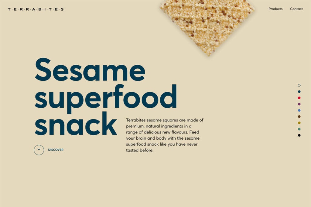
Myth #1 – Websites must be flashy
Once, there was this idea out there that “if I’m going to pay money, then my site needs to look incredible in every way possible.”
These web design myths have been perpetuated far too long now, and there’s no evidence supporting their validity.
The only reason you need to spend much money on your web design is to make your business more visible to potential customers.
As a rule of thumb, the further away from the entrance people are sitting at the website, the less likely they will find what they’re looking for.
Suppose you’ve ever worked with a client whose vision for their website included bright colours, animated GIFs, mind-bending drop shadows and other special effects.
In that case, chances are they were also hoping for better conversions among visitors.
But many studies show that the opposite is true.
Having fewer fancy graphics and animations makes your pages load faster, which means happier customers. Why?
When a page loads slowly, it can ruin your user experience and even make users leave your site.
Users will abandon a slow-loading website. This could be because they think something went wrong or want to get back to somewhere else on their computer quickly.
Nowadays, most people access the internet using mobile devices, so your website may become inaccessible if you rely solely on Flash elements.
Luckily, HTML5 has made it possible to use dynamic content without worrying about compatibility issues. You can use these new techniques to create interactive features for your site by adding custom JavaScript.
Using CSS and HTML5, you can add a “pop up” window to offer users some unique information or even give them the option of subscribing to your newsletter.
Also, keep in mind that some browsers still lack support for HTML 5, meaning older versions of Internet Explorer could render your website incorrectly.
Myth #2 – All websites should have an About Us page
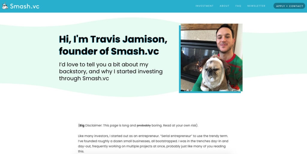
For years, one of the biggest web design myths professional marketers made was focusing too much on selling their products/services rather than expressing themselves via blog posts and articles.
Now, it seems, adding a few paragraphs explaining why your company exists isn’t such a crazy thing anymore either.
Yes, including a brief overview of yourself and your business on every web page sounds overwhelming, but doing so allows potential customers to know exactly who you are and what type of experience they can expect when interacting with you.
It gives them context for everything else they’ll come into contact with after visiting your site and helps them understand where you fit within the broader market landscape.
Don’t worry about breaking the bank to create something truly unique here. Google Docs templates are free and easy to customise to suit your brand perfectly, while platforms like Squarespace offer affordable monthly plans to build beautiful websites designed specifically for businesses.
Even companies like Shopify allow non-technical individuals to set up eCommerce stores without hiring expensive developers.
Myth #3 – Users don’t want to read any text on screen longer than necessary
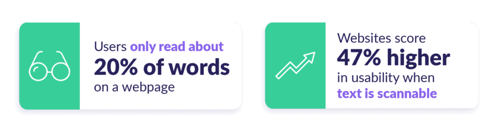
One of the worst things you can do for your readers’ eyesight (and general attention span), especially if they’re reading on smaller screens, is forcing them to scroll endlessly down lengthy blocks of text.
The best way to combat this problem is to break up those blocks with short paragraphs rather than long ones. And that’s easy enough to do when you have a blog that’s all about words!
An alternative solution? Use columns — just like in magazines.
If you insist upon cramming tons of copy onto each page, consider only displaying essential information on larger monitors.
Otherwise, try splitting your big blocks into digestible chunks instead.
And don’t forget to give your readers breaks between sections. Take advantage of white space to emphasise certain words or phrases, highlight essential links, or even include small illustrations or infographics.
Doing so will help break up large amounts of text and avoid eye strain over time. And, the more often you visit a site with this method in place, the less likely it is that your eyes will suffer from glaucoma or other vision-related diseases.
Myth #4 – You need to use lots of images, videos and other media to make users happy

While it’s certainly possible to include multimedia features like video clips and audio files on your homepage, presenting users with endless options can confuse them.
You have limited space to work with to present an exciting page full of content. The best solution is to use the most straightforward layout that accomplishes what you’re trying to say.
Not only does this tactic encourage scrolling, but it forces viewers to click through multiple menus just to view the content.
Forcing your users to navigate back and forth repeatedly wastes their precious attention spans.
Instead, stick to keeping your imagery simple. Use thumbnails whenever possible, limit the number of buttons you display per page, and ensure straightforward navigation.
Don’t worry about losing the ability to provide richer interactions later down the line; focusing on clean layouts right off the bat will save you countless headaches further down the road.
Myth #5 – A cluttered layout will confuse visitors more than help them find what they’re looking for
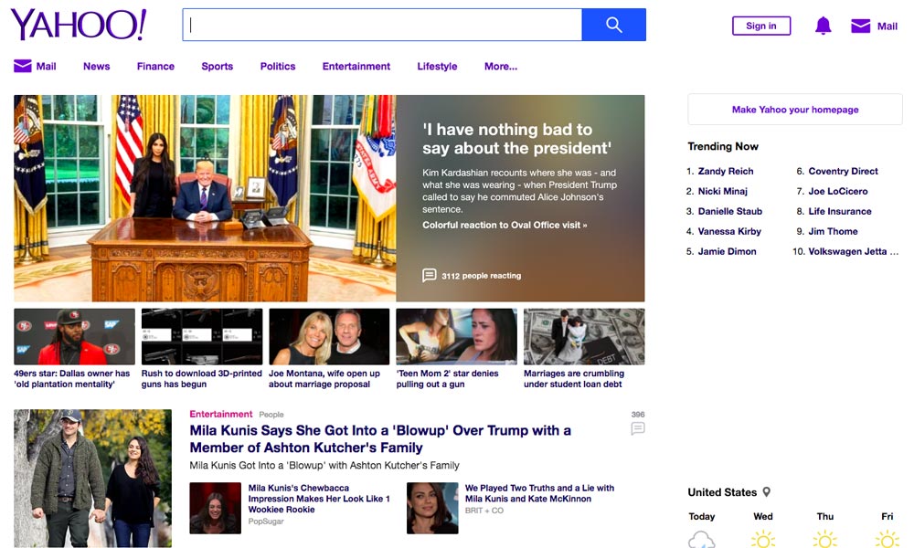
It often feels like clutter is everywhere nowadays: emails, news feeds, job boards, etc.
When deciding which apps and services to integrate into your daily routine, it can be challenging to figure out where to start.
The same goes for building your digital footprint. Is Twitter worth signing up for? What’s the difference between Pinterest and Instagram anyway? How would you describe Snapchat to your mom?
Cluttered interfaces can lead to frustration and lost interest because it’s tough to navigate efficiently. So, don’t make that mistake. Keep your interface clean and minimal, but not too blank.
If you have more than one step in a process or task flow, you should consider breaking them into separate screen flows with clear next steps for the user.
Instead of being overloaded with information, let your users pick and choose what interests them most.
Provide clear calls to action throughout your site so they can easily reach out to different departments if needed. Focus on organising valuable resources together in ways that make sense to your target audience.
In short…
Just remember that you shouldn’t blindly follow outdated web design myths and advice provided by others simply because everyone else says it works.
“The best way to predict the future is to create it.”
Alan Kay
Make sure you always put your users first and use data analysis tools to inform your work instead of relying entirely on gut feelings.
The only answer is to understand how people search, where they are going, and the value of their time to find a way to meet their needs while also making money from their business.
Good luck out there!
The post Top 5 Web Design Myths to Ignore is by Stuart and appeared first on Inkbot Design.