
24 Sep Top 10 Tips for Creating Promotional Flyer Designs
Top 10 Tips for Creating Promotional Flyer Designs
Digital marketing has now taken over traditional marketing to cater to a broader audience and make customised offers for the target market.
Various digital marketing platforms and techniques are now popular among startups and enterprises.
Social media is one of the most engaging tools in digital marketing.
There are different tools and elements that businesses can use on social media to engage their audiences, such as flyers, gifs, videos, blogs, and other content material.
All these tools have different uses and impact on user engagement.
Promotional flyer designs are among some of the most effective tools that businesses use to engage their audiences.
This article explores some tips and tricks of creating promotional flyers that are widely used in digital marketing in today’s innovative times.
What are Promotional Flyer Designs?
Promotional flyer designs are widely used as affordable marketing materials for large-scale and small-scale businesses.
A single flyer contains much information that is presented in a way that appeals to the customer.
The one-page handout can be used to convey an important message, promote new products and services, or brand endorsement.
Promotional flyers focus on visual appeal and include interactive graphics that instantly catch the audience’s attention.
The digital world has quickly picked up on the tradition and turned it into a digital material for promotional activities.
Flyers help online businesses drum up business and attract new customers to buy their products and services.

The 10 Tips for Creating Promotional Flyer Designs
There are various ways to design a promotional flyer that looks professional and attracts users’ attention.
Some of these tips are indeed the secret recipe for building aesthetically pleasing and engaging promotional flyer designs.
These ten tips will help you create a masterpiece that will not only look great but generate results as well.
Have a look at the tips crafted by our expert designers and creative artists:
Need help with Promotional Flyer Design?
Your Business is your Brand. Your Brand is our Business.™
1 – Keep it Short and Simple
The first thing to keep in mind is making a promotional flyer that is short and sweet and includes necessary elements only.
It means your flyer shouldn’t have too much information that is hard for users to absorb and creates a content cluster.
Make sure your content is to the point and easy to understand.
Concisely present your content and refrain from squeezing in too much.
Combine a sophisticated font with aesthetic flyer design.
2 – Always Proofread the Text
Any mistakes in your content will be a turn off for your customers.
So, before you send out the flyer, make sure you check for grammatical errors, punctuation marks, spelling errors, and the information itself.
Apart from content mistakes, make sure the information you’re offering is authentic and factual.
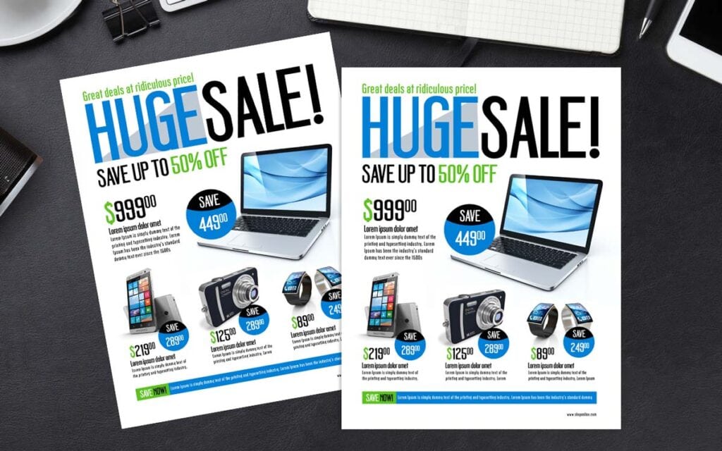
For example, if the website is offering up to 50% discount, then cross-checked that information on the flyer, sometimes designers might miss the ‘up to,’ which can pose as a problem.
3 – Make the Most of a Layout

You’ve chosen a layout, and it’s time to customise it according to what your business needs.
Flyers have restricted space, but that doesn’t mean you can’t use all the space.
The key is to use design elements, textured backgrounds, and graphics that are placed correctly.
Start by adding a background, placing the font, and then putting elements to use the extra spaces.
Create a grid system and place the elements one by one. Make sure the details look clean and clutter-free.
4 – Pick Catchy Titles
What is the first thing that entices a user to read further? A catchy headline.
That’s the first line of your promotional flyer that the audience will read; it’s also basically the line that helps the reader decide if they want to read ahead or not.
Try to make it catchy by using words like ‘big sale,’ ‘amazing discounts,’ ‘great offers’ or ‘mind-blowing deals.’
It is crucial to choose titles that will attract the audience.
But you must not over-commit or miscommit in your flyers.
Only talk about things that you are offering for real.
The only catch is to present the information in an eyecatching manner, so your audience stops and reads your flyer.
5 – Use High-Resolution Graphics
The most obvious choice is picking graphics that are attractive and appealing.
The best way to present your information is by using infographics that get the information across.
Images are a great tool to engage your customers so that they’re interested in reading your next flyer too.
However, choosing high-quality graphics and images is integral for creating good promotional flyer designs.
Low-resolution images are difficult to grab and require extra effort from the audience.
Also, it gives an unprofessional impression to the audience.
6 – Emphasis on Keywords

In the emerging digital world, content is becoming the most used marketing tool.
When you’re creating a flyer, you need to emphasise on specific keywords that grasp the audience’s attention.
Use phrases that help sell your products and services.
Increase the font size of such keywords so that they’re the first thing your customers see.
You may use keywords like ‘free,’ ‘guarantee,’ ‘offer,’ ‘limited time,’ ‘slashed prices,’ etc.
Plan your content strategy around those keywords to attract new buyers.
Not only will these keywords inform the audience that they are at the right place, but they also help your content rank higher on search engines.
7 – Add a CTA (Call to Action)
The promotional flyer is useless if it doesn’t have a CTA, i.e., Call to Action.
A CTA is a button or statement that tells your buyer what to do next after they’ve read the information.
The standard text is ‘Call Us,’ ‘Order Now,’ or ‘Buy Now.’
However, you can play around with those words to direct customers to your website.
Choose bright colours for your CTAs to grab attention.
Additionally, it’s essential to know the right placement for the CTA button or text.
Brands usually place it at the end of the flyer or ad so that the customer immediately knows what’s up next.
You can use more that one CTA in your flyer, but only if it does not disrupt the flow of the flyer.
Do not make the audience feel as if you are forcing them to take any action.
Instead, give them reasons to take action through your content and offerings presented in the flyer.
Then add a CTA as if you are helping the audience avail the services.
8 – Use the Right Colour Palette
So, what is the right colour palette when you’re creating a flyer?
The right colours are the ones that fit the mood and the essence of the message on your brochure.
The colours should set the mood of your readers; for example, a tech-based flyer should have appealing colours like teal or grey, while a sale flyer should have bright colours like red or yellow.
However, along with the colour palette, you need to ensure that the colours sit correctly with your brand.
If you still don’t know which colours work best, then pick monochrome and bright colours to amp up the flyer designs.
9 – Use Brand Elements that Customers Identify

When you send out a flyer, you want to ensure that customers identify your brand immediately.
To make it identifiable, add brand elements like logo design, tagline, USP, website link, etc.
For example, the’M’ of Mcdonald’s immediately identifiable.
If the’M’ is added at the start of any flyer, customers will recognise it in a heartbeat.
However, don’t add all the elements to your flyer; make sure to use the right features that fit the theme of the brochure.
Most of the time, a logo is all you need to add to the flyer for brand recognition.
10 – Manage Your Space
Don’t underestimate the existence of whitespace.
Every flyer needs whitespace so that it doesn’t look cluttered or messy.
Ask your designer to make a grid according to the content you have ready and place it accordingly.
The use of whitespace will give your readers some room and help them focus on the information.
Instead of adding too many elements and information in the flyer, leave some breathable space that helps create content hierarchy in the brochure.
Secret Tip
Make sure that you are creating a flyer for one offering or purpose only.
For example, create separate promotional flyer designs for your Buy One Get One Free offer instead of merging it with your 20% Flat Discount.
Do not cluster the flyer with unnecessary information and keep it focused.
Confusing the audience between two or more offers will make it difficult for them to make a choice.
The Secret to Creating Great Flyers!
If you are still wondering how to create a result-driven flyer, get professional help from Inkbot Design to help you create a breathtaking flyer for your business.
A designer only needs content and guidelines to design a masterpiece while taking care of the technicalities himself.
A design company will focus on your requirements and entertain revisions until they can deliver promotional flyer designs that you (and potential customers) will love.
Author Bio: Tabish Khalid works as the Digital Marketing Manager for Designster. He develops and implements digital strategies for Designster, along with aligning business goals with digital marketing activities. He actively contributes articles related to digital and content marketing.
