
20 Feb Landing Pages in 2020 – Everything You Need to Know
Landing Pages in 2020 – Everything You Need to Know
If you spend much time online, you must have ended up on a few landing pages recently—even if you didn’t realise immediately that you were actually on a landing page.
A landing page is something like a stepping stone between a message and an action.
This kind of page is essential in any sort of inbound marketing strategy.
Landing pages are designed to move a user through the sales funnel and transform them into leads.
Visitors are led on a journey where they see valuable content that keeps them going further to a point where they either download a free eBook, request a consultation, or take another form of action.
If you believe that you don’t need landing pages at all, just bear in mind that they can increase conversion rates up to 300% if used correctly (targeting and content).
So, with all that in mind, why don’t you take a look below and learn everything you need to know about landing pages in 2020?
It doesn’t matter whether you are a marketer or a business owner; what follows will help your business grow.
Why do you need a landing page?

You might be wondering why you would invest time and money into creating a page only to have people download a free eBook or fill out a form.
Why wouldn’t you just use your default Homepage or About page?
Well, in short, a landing page eliminates distractions by removing navigation, competing links, and alternate options, so you capture your visitors’ attention in the best manner possible.
When you manage to grab someone’s complete attention, you get to guide them wherever you want to.
This is how conversions happen.
And that’s why converting landing pages play an essential role in the world of marketing.
So, now that you are aware of the power of landing pages keep reading to learn what you should do to reap the maximum results.
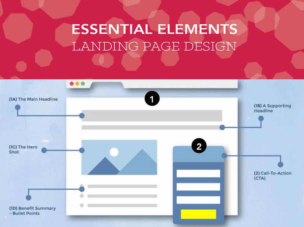
Headline and images

Did you know that, on average, for every ten people that visit a landing page, at least seven will bounce off the page?
Still, even though this number is scary, you can keep it at a minimum by crafting a benefit-focused headline.
People want to know what’s in it for them within seconds of arriving on the page.
The headline is the first thing they will look at.
And as such, it needs to be clear and concise.
It should communicate the value of your landing page offer.
Additionally, you must include an image that depicts the offer you are trying to push and appeal to your target audience.
The image has to convey a feeling; it needs to illustrate how your visitors will feel once they receive your offer.
Bear in mind that some images will work better than others, so you should always split test your options to see what the best fit is.
The all-too-important design

The landing page design needs to encourage visitors to convert from leads into subscribers or customers.
Effective design that is on-brand should include your product or service and company information.
It should also incorporate relevant offers and calls-to-action (CTAs).
However, to master the design for your landing pages, you should be familiar with the main differences between landing pages and homepages.
Another important aspect of this issue is responsiveness.
A page with responsive design appears and functions well on all devices (desktop, laptop, mobile).
People browse the internet from different devices and locations, and responsive design is there to ensure a smooth journey for everyone.
Your entire website needs to be responsive, but it’s critical that you have a responsive landing page design.
This is the first page every visitor interacts with when they come to your website from the campaign you created.
And that is precisely why excellent user experience is of the utmost importance.
Websites and pages that are unresponsive can lead to frustration among visitors.
Images and text that don’t fit the screen, videos that don’t play, or buttons that lead nowhere, are a real burden and annoyance.
So, make sure to prioritise responsiveness so that your visitors don’t abandon your landing page.
Compelling copy is essential

Now that you have read about the ins-and-outs of design, it’s time to move on to the actual content of the page.
The words need to be sold. They are the ones that make visitors click on your CTAs.
Therefore, your landing page copy needs to be clear, concise, and it should guide your visitors to the action you want them to complete.
This kind of copy also speaks directly to your visitors by using ‘you’ and ‘your’ to make them feel engaged.
Moreover, including clear and standout CTAs is essential.
The CTA is arguably the most crucial element on your landing page. This button needs to stand out since it directly encourages conversion.
When writing a CTA, be clear about what you want visitors to do.
Also, use a colour that contrasts with other elements on the page, if possible. You will want to grab their attention with CTAs.
Present a relevant offer

People have come to your landing page for something, never forget that. That something is ultimately your product or service.
Therefore, your offer should be compelling enough for the visitors to give out their info, but it should also be relevant to your business.
For instance, if you are in the fit-out business, offering an eBook revolving around interior design tips and tricks might be a good idea.
Or, if you are selling basketball shoes and equipment, you might want to have someone film a shoe review or unboxing.
This way, your potential buyers will be able to see how great their experiences can be should they buy a particular pair of shoes from you.
Additionally, this content can serve educational purposes.
Many athletes are incredibly picky when it comes to their footwear and clothing garments.
They want to know all the ins-and-outs of what they are buying.
This is not only useful to your visitors, but you are also offering it to them for free. It’s a win-win situation.
Don’t go over the top with requests

It’s essential to acquire as much information as possible. However, don’t go over the top with it.
Do not ask for too much, but aim at what you need.
Remember that how much you ask for depends on several factors.
These include how well-acquainted visitors are with you, where they are in their buyer’s journey, and how much they trust you.
So, asking for as little info as you need in your lead form might be wise just so that you create a low barrier to entry.
Frequently, a name and an email are more than enough to capture a new lead.
Include testimonials

If you want high click-through rates for your landing pages, if you’re going to drive further conversions, you have to include testimonials.
Customer testimonials build trust and credibility with your audience for your products or services.
Mostly, testimonials encourage visitors to take the next step in your sales funnel, and that results in a higher conversion rate.
It may be tricky for you to incorporate this on your landing page without coming across as too pushy. But don’t worry, there are ways.
- For a start, you should use your target audience. Feature them since that reiterates to prospective customers that your product is the right product for them.
- Also, try using authoritative sources in your landing page testimonials to show your worth better and increase credibility. Visitors are more likely to buy into a product or service if they see that a well-known and respected company or person is also a fan.
- Finally, you could also look into testimonials software. For example, you can find and then compare software solutions to see which one will suit you best.
Compare different tools like Signpost vs Vocal References. They are prominent names, but you could look for other options too. Then evaluate and make a decision.
Obligatory Thank You page

Once you get your leads to fill out your form or buy a product, you should direct them to a Thank You page.
It’s fair to say that you could just include such a message right there on the form.
However, it is better to have a page dedicated to thanking your visitors.
A thank you page serves three essential purposes:
- It delivers the offer that you promised (usually in the form of an instant download).
- It allows you to interest your new lead in additional relevant content.
- It serves as a chance to thank them for their interest, which goes a long way in promoting them to returning customers down the line.
If you stick to having a message only, you are leaving visitors stranded on your landing page.
The goal is to convert, so you have to make sure that visitors don’t get distracted.
Hence, include a Thank You page instead of a message.
The page should have navigation back to your website in case your visitors feel like looking for more products/services.

The post Landing Pages in 2020 – Everything You Need to Know is by Stuart and appeared first on Inkbot Design.