
02 Mar 7 Stunning Colour Palettes of Modern Tech Companies
7 Stunning Colour Palettes of Modern Tech Companies
Colours are all around us – in the clothes we wear, the homes we live in and the screens we look at every day.
Since colours are so ingrained in our lives, it’s hard to see how they influence our perceptions and decisions.
In design, colours are not just shades meant to please the eye but rather a tool to bring your project to the next level.
Colours have the unique ability to influence the mood we’re in, change the feel of a space, and affect the presentation of information.
We all use colour, but it’s how you use it that makes the impact.
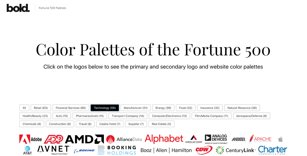
That’s why Bold Web Design created a new Colour Palette tool for Fortune 500 companies.
It shows the colour palettes used for logos and websites of these successful companies, to give inspiration to fellow designers.
These colour palettes were made to bring awareness to colour choices, to help see which colours complement each other, which colours are associated in specific industries, and much more.
First, let’s take a look at the types of colour palettes that work well together and why that is.
What Colours Work Well Together & Why
We’ve all been with a friend shopping, and they try on an outfit that doesn’t match.
Either the patterns are clashing, or the colours are not working together.
Some people may say they’re just not good with fashion, but the truth is, there’s a bit of science to the madness.
Specific colours work well together because there’s a strategy that explains why.
It’s all based on the colour wheel, starting with the primary colours.

Learning these colour schemes is an easy way to match and understand why colours work together if you’re not feeling confident.
Just remember, there are always exceptions to the rules!
Complementary
If colours are complementary, they are opposite on the colour wheel.
This is an excellent option if you’re looking for your colours to pop and stand out, as they make a harsh contrast.
Split Complementary
Not confident in your ability to choose colours?
Start with this one!
Split complementary involves three colours in which you choose one colour and then match it with two adjacent tones.
Analogous
Like an array of similar colours? This colour scheme is for you – this involves three colours that are next to each other on the colour wheel.
Pro tip: use a tint to get the best results!
Triadic
Similar to the split complementary, but with an added colour, these colours create a high contrast as well.
These three colours are equally apart on the colour wheel – creating the difference between them.
Tetradic
Imagine a rectangle on the colour wheel, and you have triadic!
This is also the same as a double complementary.
Keep in mind that this is the most laborious collection of colours to balance.
Let’s dig a little further

Brands don’t just pick brand colours because they think they’re “pretty” or because they precisely follow the logic of the colour wheel.
There’s much more thought that goes into the process and a lot more creativity.
Each brand has a stance within its industry and is trying to differentiate itself in the market.
What better way to do that than with the colour palettes?
While they may fall into an industry category, each company has a unique spin on the colours they use to show how their products or services are different from all the other companies in that industry.
Tech companies, for example, tend to air on the side of neutrality.
Sometimes they have a pop of colour that has high contrast against the neutrals to stand out, which you’ll find below.
On the other side, companies in marketing or those in a more creative field may be more open to exploring a more “colourful” palette to represent their brand.
Ever feel happy and decide to wear a bright shirt instead of your go-to black one?
Colours can impact our feelings, and because of this we subconsciously know how they make us feel.
Think about a yoga studio, for example.
You will most likely see greens, warm browns, and orange.
Why? These colours provide warmth, peacefulness, and clarity; all qualities that the practice of yoga promotes.
Have you ever heard it’s a good idea to wear a colour like red to an interview?
That’s because red shows confidence and boldness – 2 qualities you want to present while trying to land the job.
Keeping this in mind, there are also shades to each colour that add another dynamic!
Just within a red, there could be a plum red, bright red, deep red, or orangey-red (and many more).
In this case, an orangey-red most likely wouldn’t be the best choice.
If you’re going for a bold statement, sticking with the primary colour is probably the best call.
7 Stunning Colour Palettes
Cisco

It’s no secret that blue is the most popular colour in the world.
In most cases, blue complements every situation and person.
These cool blue tones are perfect for a technology company, as blue evokes feelings of security!
Complemented with green tones, these colours take on an analogous colour scheme with a complementary system of red.
This palette could even be considered an earthy collection of colours – an essential topic as Cisco has an initiative for environmental sustainability.
The Apache Company

Can you tell from their colour palette that The Apache Company is a non-profit?
Maybe not, but these colours support their mission.
As an all-volunteer community, their colours consist of warm oranges and reds – this shows attention and movement.
Since these shades of reds, yellows, and purples are all next to each other on the colour wheel, this would be considered an analogous colour scheme.
Apple

Apple is famously known for its lack of colour.
Let’s dive further into that.
Why would it be beneficial for a company to pick mainly white, greys, and black?
Since these colours are lacking colour, Apple can write its own story.
Black and white means something different to everyone.
This could be an extension of their products; showcasing their credibility and stress on the factual data-driven company they are.
Their pop of colours used in product launches and other advertising are complementary colours, making them stand out, which seems to be a consistent theme in this colour palette.
Insight

It may be hard to believe that an IT company’s spotlight colour palettes are different shades of pink, purple and red.
Yet, this might be precisely what they were going for.
Just as Apple took a taboo colour palette, so is Insight.
I’m sure you can’t think of many pink tech companies.
Done tastefully, Insight strives to impact culture and make a global reach.
Pink is commonly associated with emotions, making this a perfect decision.
If you look at how closely the shades are together, you’ll realise this is an analogous scheme!
Omnicom Group

Did someone say pastels?
This colour palette could be the colouring for a popsicle package, which we commonly associate with feelings of fun and happiness during the warmer weather.
Being a global marketing communications company, they must cater to many different people and situations.
Moreover, with the creative flair of marketing.
This colour palette does just that.
This is close to a triadic, but the shades of the colours, tone down the harshness that a triadic has typically.
Hewlett Packard Enterprise

Did it just get cool in here?
As you can see, Hewlett took to using all cool-toned colours – a prevalent tactic for most IT companies.
When you think of information technology, you probably think of technical, machine, and screens (which have a blue light).
Furthermore, cool blue can translate to a feeling of security and trust – a paramount quality in an IT company.
As seen with Apple, the neutral colours still made it in their colour palettes.
With a pop of colour with peach and yellow, this complements the darker blue and green shades.
Adobe

Similar to Apple, Adobe’s colour palette makes a statement.
Sticking with neutrals and high contrast and bold colour like red, you could spot these colours from miles away.
It’s no surprise that these two companies are both in the tech industry – an ever-evolving and highly competitive place right now.
The supporting colours aren’t shy shades either, showcasing yellows and a yellowy green.
Unlike many other colour palettes, this one doesn’t fit into the standard colour scheme categories.
Conclusion
As you can see, each company approaches their colour palettes differently.
There isn’t a right or wrong way to choose colours, but there are guidelines in place to help you along the way.
The colour wheel is a great resource to review if you’re finding yourself stuck.
Follow the different colour schemes: complementary, analogous, triadic, split complementary, and tetradic.
While these guidelines do have a theory behind why they work, these guidelines don’t have to be strictly followed.
As shown through Adobe’s bold colour moves, going against the grain may be more beneficial than trying to fit a scheme.
When in doubt, test it out. Colours are a form of expression, meaning many combinations can provide the same result or solution to the goal.
The post 7 Stunning Colour Palettes of Modern Tech Companies is by Stuart and appeared first on Inkbot Design.