20 Mar 10 Logo Design Principles to Follow
10 Logo Design Principles to Follow
Running a business in a competitive segment is always going to be a challenge.
Even if you come up with a new product or service, the competition is always going to introduce something similar and catch up.
However, this is when differentiating yourself becomes more important than ever.
Visual communication is often not an integral part of businesses, but it should be.
It influences perception and first impressions.
The right logo design, business card and even website can instantly shift opinion in your favour.
Let’s shift our focus to the logo design principles – the core brand identity of your company.
Logos are used to identify, and as such should – ideally – be different from the competition.
A famous designer once said that a logo does not sell (directly), it identifies.
A good logo is simple enough to be instantly identifiable, distinctive and it should be able to convey the business’s message.
For any aspiring designer, there should be a base set of logo design principles that they should abide by.
1 – Industry Research

A logo is a part of a company’s visual communication.
It is not its own entity; instead, it’s a part of the business and will often be the inspiration for the rest of the visual branding.
As such, it is essential to have a full sit-down with your client and talk to them about their industry niche.
Whether it’s a small one-person e-commerce business or a large organisation, you will need to know who you’re dealing with before going to the drawing board.
If you’re lucky, the client will know everything the logo needs to achieve to represent the business accurately.
However, most of the time, you will have to find this out for yourself by doing thorough research on the client’s industry and competition.
Remember, it’s not the client’s responsibility to give you the requirements for the logo – you’re the designer.
Also, it will definitely help you to ask the right questions.
2 – Simplicity
Simple logos tend to age well, as is evident with the logos of famous brands.
Just think of Honda, Nike, McDonalds and Coke, and you’ll find your proof.
Most popular brands have simple logos that make them easier to remember and identify.
Some famous companies did start with fairly busy-looking logos, but over time these were simplified quite a bit to increase recognition.

Also worth considering while designing a logo is that it’s going to be viewed across multiple mediums – from phone screens to giant billboards.
A logo should be simple enough that it can be observed without losing detail in various formats and sizes.
- Peachpit Press
- Airey, David (Author)
- English (Publication Language)
- 240 Pages – 08/20/2014 (Publication Date) – Peachpit Press (Publisher)
3 – Memorable
Just think of the Honda logo, and you’ll be able to instantly recall how it looks to a high degree of accuracy.
The thing is, no one spends more than a second looking at a logo.
Thus, it should have the property of being easy to remember.
A logo with simple shapes will be easier to remember.
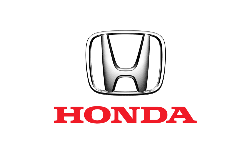
Think of it this way, if a person can describe the essential elements of a logo without overthinking, that logo has been designed well.
Colour will also play a significant role in memorable logo design principles.
According to Brazilian designer Paula Rupolo:
“Colours are the first thing you notice in a logo, what gets fastest to our brains, then you read a logo’s shape, icons, or typography”.
She proved this point by conducting an experiment in which she swapped the colours of rival brands.

4 – Distinctive
Take a look at your competition, and then go for a logo that doesn’t look like any other logo in your niche.
The thing is, most companies have a ‘that’ll do’ mentality when it comes to the logo.
They’re willing to settle for the most generic and bland designs just because visual communication isn’t on their priority list.
The thing is, to stand out you have to make a distinction, and a logo is an excellent way to do that.
We’ve explained how simple logo design principles to aid in recognition and familiarity.
Simply use those principles but come up with something distinctive and characterful.
5 – Modern Yet Timeless
A logo should be created with modern design characteristics in mind.
However, it should be noted that the logo shouldn’t be made just with this year’s design trends or it will look severely dated after a few years.
The Bata logo is an excellent example of a timeless design.
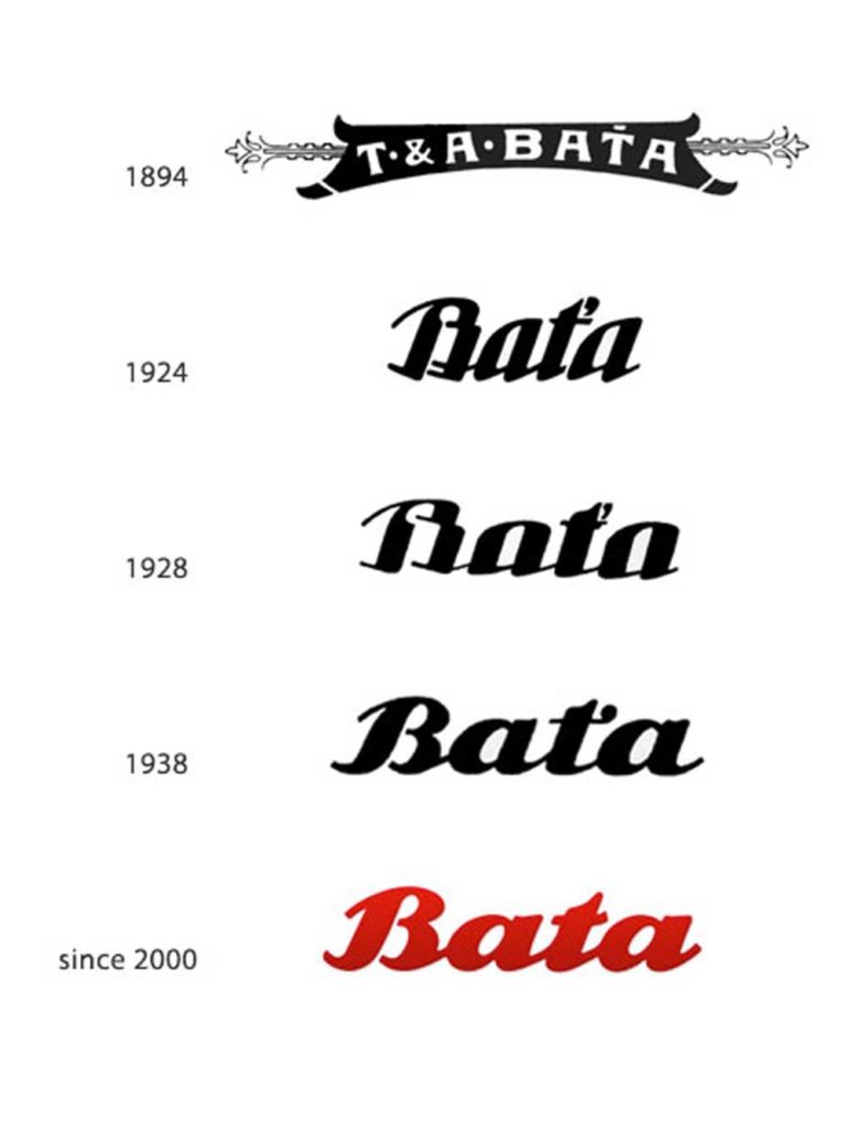
The shape of the logo has fundamentally remained unchanged since 1938.
To modernise following these logo design principles, all Bata had to do was to add a little colour into the mix.
Because the basic shape has stayed the same, the company hasn’t lost any brand familiarity and recognition.
- TASCHEN
- Hardcover Book
- Müller, Jens (Author)
- English (Publication Language)
- 432 Pages – 11/01/2015 (Publication Date) – TASCHEN (Publisher)
6 – Appropriate
The logo should be appropriate for the type of company it represents.
For example, a black and professional typeface for a mainstream children’s clothing brand will seem out of place.
A colourful and bold typeface will be much more appropriate here, but on the other hand, the same style would not be suitable for a mental hospital.
Graphic designer Hanna Giles experimented by swapping the styling elements of famous brands to see how much fonts and colours impact the perception of the brand.
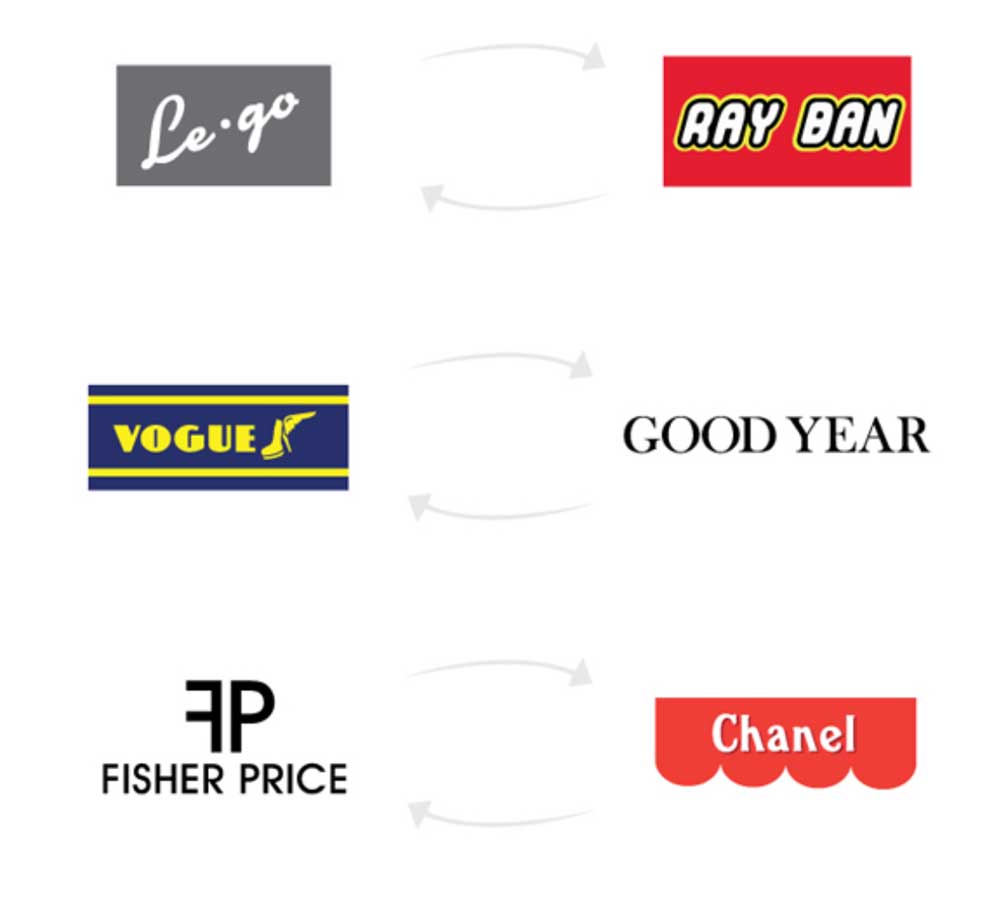
According to Giles,
“All the small details and choices you make when creating a new logo matter, so be thorough and make sure you’re selling to the right audience.”
7 – Adaptable
A logo will appear on everything from a business card to a billboard.
Electronic displays cannot be ignored any longer as well.
Modern smartphones have exceptionally high-resolution displays, and as such require logos to be made with a very high pixel density.
If you’re working on a logo but create it on a 1000px by 1000px canvas, you’ll quickly realise the limitations of this.
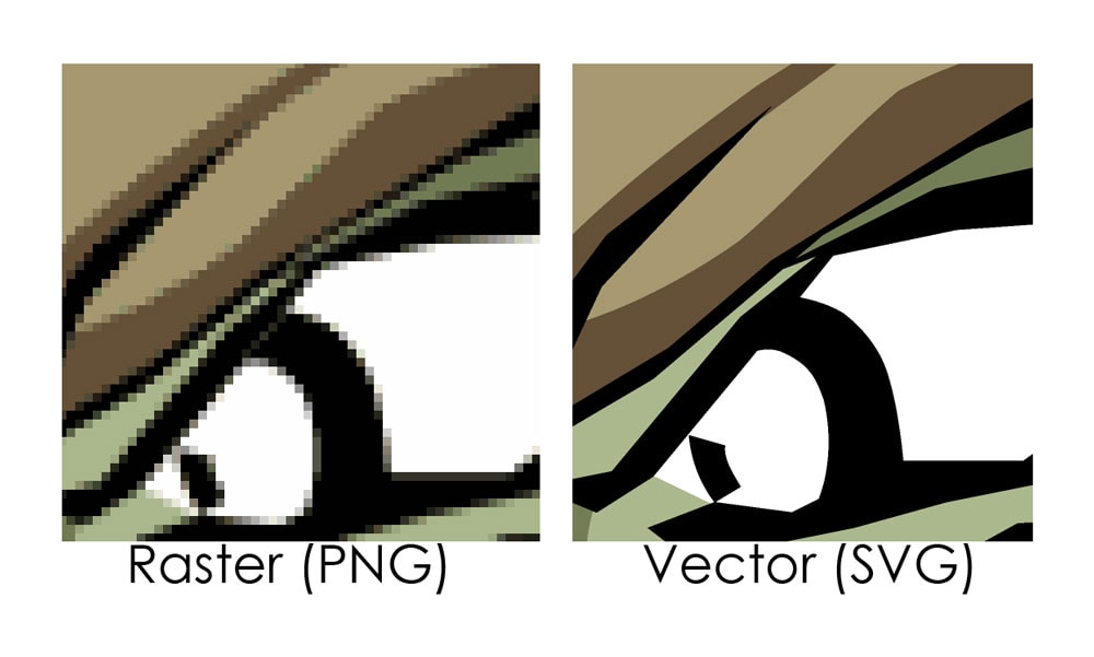
To remove the limitations of raster graphics, it’s imperative to design a logo in a vector format.
Vector graphics are scalable and can be stretched to any size without any loss in detail.
8 – Typography
To make a truly memorable logo, it is critical to use original typography.
Avoid using fonts that are common or used as paragraph fonts on the internet.
This type of recognition will simply make the logo appear drab and uninteresting.
How many times have you seen a logo designed with the Arial font and thought, “that’s interesting!”?

Hence, try to look for custom-made fonts, there are plenty of boutique designers that sell these.
A beautiful and distinctive typeface will help your logo stand out and become memorable, just be sure not to sacrifice readability in the pursuit of a ‘unique look’ with your font.
9 – Monotone
Logos are used in a variety of mediums and formats, some of which are going to be very small, such as a business card.
On such a small scale, it can be challenging to distinguish between lots of colours.
Thus, it is essential that a logo should look just as impactful in limited or black and white colours.

An excellent approach to these logo design principles is to sketch out the initial form of the logo in black and white to judge how good the logo will look in its purest form.
Adding colour in the starting stages of the design process can detract from the overall design.
For example, if you saw your logo in all-blue, you might have a different impression than if you saw it in all-red.
Black and white take this element away and allows you to focus on the elemental composition of the design.
- Hardcover Book
- Bokhua, George (Author)
- English (Publication Language)
- 224 Pages – 08/02/2022 (Publication Date) – Rockport Publishers (Publisher)
10 – Brand Heritage
Always be mindful to respect the brand heritage when designing a new logo for an existing brand.
Many brands will look to create a new logo to convey to customers that they’re evolving with the time, or just to make the logo more straightforward and easy to understand.
However, many designers go overboard with the ‘make simpler’ strategy and forget about the history and subtle nuances of the brand.
A good example of this (in our opinion) would be the redesign of the famous Black & Decker brand.
This is the old Black & Decker logo.
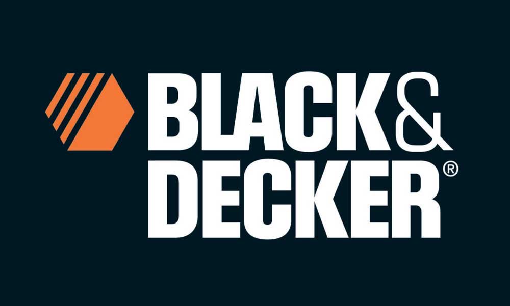
As a company that manufactures power tools and heavy-duty, long-lasting appliances, this logo looks the part.
It is bold and conveys a message of robustness.
The new logo, however, is a step in the wrong direction.
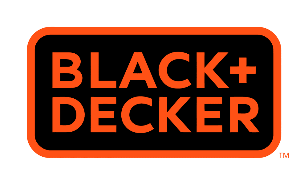
The bold and imposing typeface has been replaced by a cleaner yet delicate-looking sans-serif font.
The ampersand has been replaced with a simpler ‘+’ sign.
However, the rugged quality of the old logo is lost completely.
The new logo would suit the company if it were a manufacturer of beauty and health products.
The worst decision, however, is the exclusion of the iconic nut icon.
There is nothing similar between the old logo and its ‘redesign‘, which is a misstep in our opinion.
What logo design principles have we missed? Be sure to leave a comment below!
The post 10 Logo Design Principles to Follow is by Stuart and appeared first on Inkbot Design.


