
25 Feb Why Do We Need Logos? Branding Psychology
Why Do We Need Logos? Branding Psychology
So you’ve got yourself a business idea. It may be small to start with, but your vision is clear, it has potential, and most importantly—you can see how this could change lives in some way. So what next?
How do you make that dream a reality? The answer lies within an adage often repeated by entrepreneurs everywhere. “Do What You Love And Money Will Follow.”
It’s true. If I were to ask any entrepreneur about their greatest secret weapon, they would probably all tell me the same thing. That secret weapon is marketing.
They know that there is no product, service, brand, company, etc., without marketing.
But here’s where many falls. They don’t have any cohesive plan on how to market themselves properly. Without a solid foundation to build from, it will take years before success comes knocking on your door.
That brings us back to our original question: Why Do We Need Logos Anyway?
Well, let’s think about it like this. If you had a friend who came up with a brilliant new advertising campaign for your favourite beer brand, which could result in record sales and increased profits, wouldn’t you want them working for you? Of course, even though this scenario sounds ideal, the chances are slim that you’ll get hired by the beer brand.
When someone creates something unique that everyone wants (think Apple), the first reaction is usually “Oh wow!” followed by comparisons to other similar products already available.
Then after realising that these things aren’t exactly affordable, people tend to move onto alternatives that offer more bang for their buck. In short, people prefer the familiar over the unknown.
But here’s the excellent news: When you create something truly different and memorable, whether it’s a website, advertisement, logo, slogan, packaging, etc., then you become known as being different.
People begin to recognise your uniqueness and appreciate the time and effort to bring this product/service to life.
A good logo design is essentially nothing more than a piece of art used to communicate a message while establishing credibility and trustworthiness. After all, doesn’t every type of communication require both clarity and confidence?
When creating a logo, designers must keep two main points in mind: 1) Clarity 2) Contagiousness.
Meaning your audience should instantly understand the meaning behind the image. Also, the logo needs to appeal to emotions so that it becomes associated with feelings of comfortability and familiarity.
What is a Logo Design anyway?
A logo is simply a graphic representation of a brand identity. These designs are typically created using Adobe Illustrator software and contain multiple layers consisting of various shapes, colours, fonts, gradients, images, icons, etc.
As such, they’re designed to convey specific messages about your organisation, products, services, culture, philosophy, values, mission statement, corporate goals, personality, etc.
However, there isn’t much difference between a successful logo and a bad one aside from aesthetics.
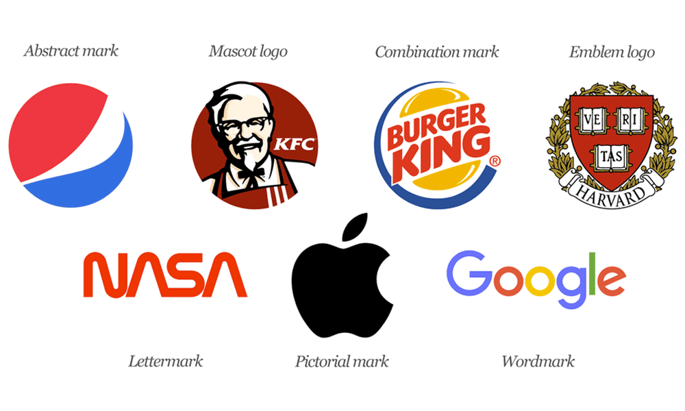
There are four common types of logos:
1.) Abstract
2.) Geometric
3.) Emblematic
4.) Iconic
Abstract represent vague concepts that lack specifics and depth, whereas geometric use straight lines and angles to depict formality and stability.
Emblems symbolise ideals and ideas through imagery, objects, metaphors, allegories, proverbs, etc.
Lastly, iconic logos contain recognisable symbols that immediately identify the Brand. For example, Nike uses the Swoosh icon to draw attention and make a statement.
Logos are for Communication, not Self-expression.

Companies choose to invest money into designing a custom logo to promote self-expression. However, the truth is that consumers are unlikely to remember brands based solely upon visual cues alone.
Instead, it takes careful thoughtfulness and strategic planning to ensure that the right messaging is conveyed via the chosen symbolism.
For instance, Coca Cola chose red and white as their primary colour scheme due to associating these hues with strength and vitality. They decided to promote energy and life rather than just drinking soda.
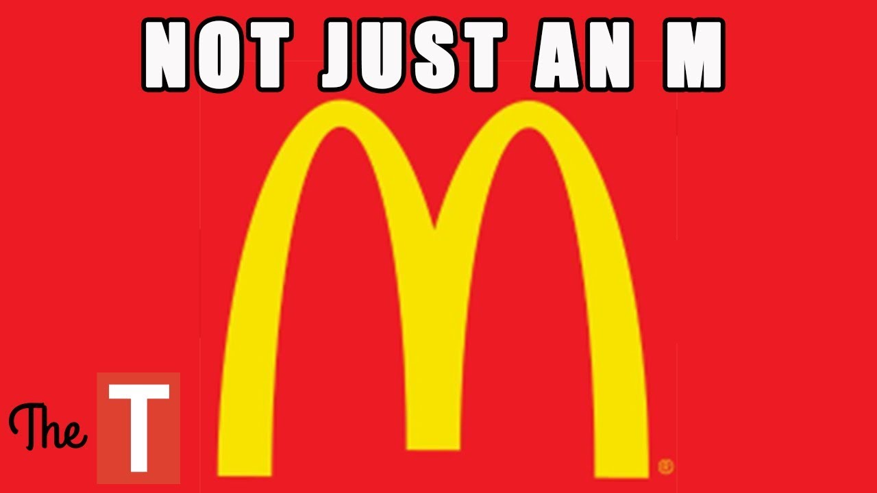
On the other hand, McDonald’s went with yellow and red since these hues relate to fun and enjoyment. Thus, their goal was to make fast food appear less intimidating and healthier.
These examples show how important it is to consider your target audience when deciding on a theme. While you may believe that a particular hue makes you stand out amongst competitors, research shows otherwise.
According to a study conducted by the University of California Berkeley Graduate School of Public Health, studies indicate that specific colours cause people to feel unhealthy.
The takeaway: Colors hold significance only insofar as they complement or conflict with others around them. Therefore, try to avoid clashing colours whenever possible. Remember that colour theory states that the contrasting colours determine the most potent emotion evoked by a single hue.
Why do we need Logos? The Psychology
A logo is essentially designed to communicate something about who we are and what we stand for. There are several psychological reasons behind this.
First off, we need logos to immediately impact our customers’ minds to associate us with whatever product or service we provide them.
A logo should instantly convey what it stands for – whether that’s being a ‘leader’, ‘reliable’, etc., depending upon its use.
Secondly, a logo must help create a brand identity for ourselves.
And thirdly, a successful logo will have lasting implications for years to come. If used properly, a well-designed logo could become part of the cultural psyche itself.
So, here’s why all these factors play such crucial roles in creating a winning logo design. First up is colour psychology which deals with the ways colours affect human behaviour.
The Psychology of Colour in Logos
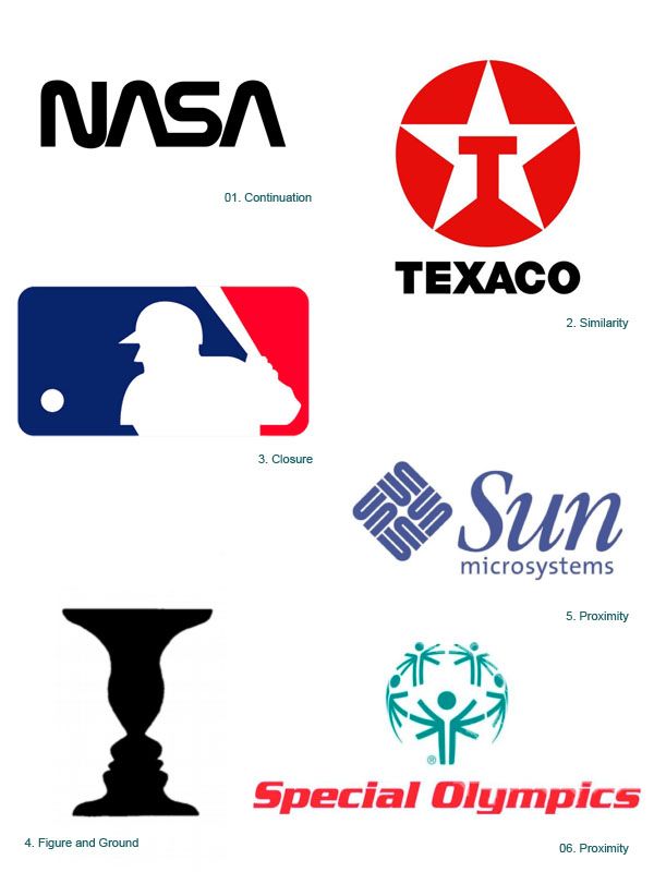
Colour psychology is based mainly on science but sometimes draws inspiration from art history. We refer to this field as Gestalt theory because it was developed by Max Wertheimer (one of the founders of modern psychology) and his associates at Harvard University around 1912.
He said four basic principles govern visual perception – proximity, similarity, continuation, and closure.
These principles apply equally when talking about any form of communication, including text, speech, images, music and even logos.
Colours are known to influence people more than anything else. Research shows that colours evoke certain emotions like happiness, love, anger, sadness and fear, which ultimately affects people’s behaviours towards objects.
For example, red attracts attention while green helps balance out feelings of anxiety. Hence, choosing colours carefully is highly critical during the logo design process.
We associate different hues according to their meanings since different colours invoke distinct thoughts. For instance, blue evokes calmness, while purple suggests royalty and luxury.
Red is associated with excitement, whereas orange signifies warmth and friendliness. Green represents freshness and youthfulness, while yellow denotes joy and energy. Black indicates sophistication, whereas white conveys innocence and purity.
Another interesting finding regarding colours is related to age preferences. Research shows that adults prefer dark blues, greens, blacks and browns while children would rather see bright yellows, pinks and oranges.
So now, let’s move on to explaining some of the critical concepts of logo design psychology.
Logos as Social Signals
People relate more directly with words than with pictures. That’s precisely why compelling logos usually consist of letterforms instead of complex illustrations.
As mentioned earlier, letters are easier to read than symbols (like arrows). Logos, therefore, work best when communicating through typography.
Moreover, studies show that readers perceive written words faster than shapes. Therefore, using specific fonts makes sure that your target audiences don’t get distracted away from reading your message.
Similarly, incorporating only black typefaces ensures that anyone viewing your logo won’t have trouble making out individual details due to overbearing background noises.
In addition to working effectively across various mediums, logos should also appeal to multiple senses. Studies reveal that vision accounts for 55% of emotional response towards brands while sound plays second fiddle at just 10%.
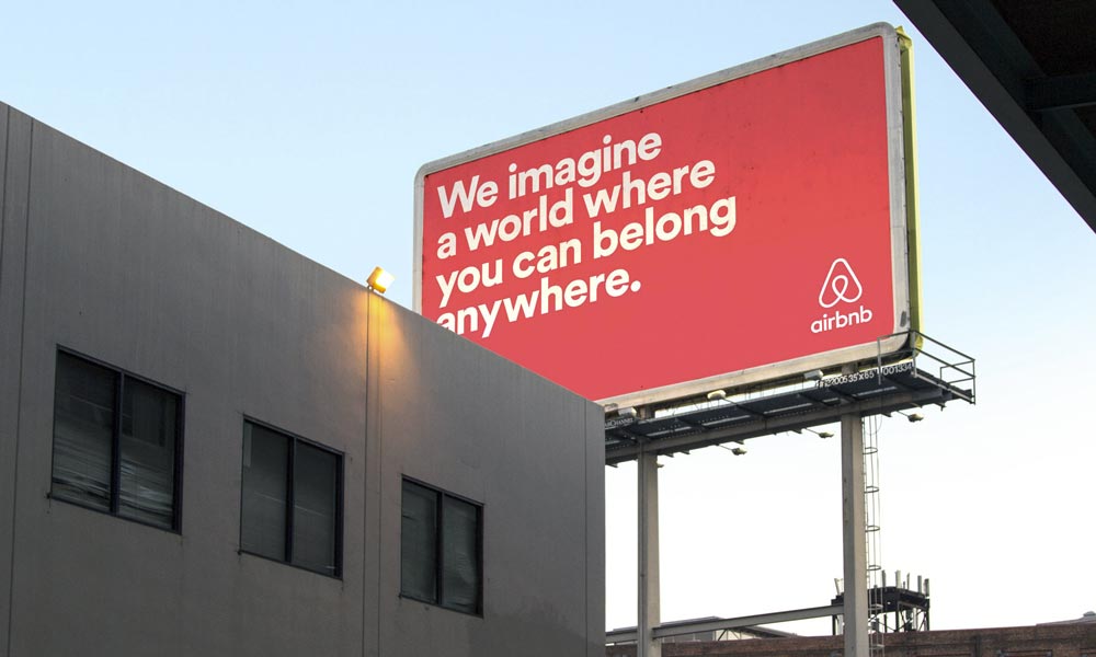
Although sight outweighs hearing in terms of importance, both still contribute significantly toward forming overall perceptions. Just imagine looking at massive billboard advertising hoardings along a busy street corner and then trying to figure out what those big letters say!
Hence, having a solid sense of direction is imperative when designing a logo. Also, logos shouldn’t look cluttered. They should be clean enough not to distract your viewers’ eyes away from the main focus area.
Finally, remember that logos aren’t meant to be static. After all, they’re supposed to be dynamic entities that constantly evolve to suit changing times.
Nowadays, companies adopt complex designs with information crammed inside tiny little spaces. However, people pay less attention to the small print and more to large ones. Thus, try keeping your logo uncomplicated yet clearly legible.
Psychological Reasons Behind Logo Use
As discussed above, logos function primarily as social signals. They serve as cues for consumers to identify products/services offered by specific organisations.
When you think about it logically, humans rely heavily on signs before committing to decisions. Hence, logos follow the same pattern and act as guiding pointers for potential clients.
Moreover, we need logos for memory triggers. Your brain records each time it comes across a particular symbol or word.
Eventually, these memories take shape and help form associations between those visuals and the services provided by the company. In short, logos subconsciously tell us stories and build long term relationships with our customers.
Here’s another fascinating study was done by psychologist James J Gagliardi in 1992 titled “Do You Know What Makes You Buy?”
He discovered three primary characteristics of buyers – the ability to compare prices, the desire to maximise savings and the tendency to seek new suppliers.
Based on his findings, he came up with the Buying Decisions Model. Using this approach, marketers could decipher consumer buying patterns and predict future trends.
Applying similar techniques to understand the psychology of logo design could prove beneficial for businesses. Of course, there’s always room for innovation. But that’s where creativity comes in.
Logos should incorporate meaningful imagery directly related to your business goals, for starters. On top of that, they need to reflect your core values. Last but not least, they should contain powerful calls to action.
Since we need logos to represent the face of an organisation, they should offer a direct link to your website and give visitors quick access to contact forms.
If you’re planning to hire someone to handle the entire logo design project for you, check out our Portfolio.
We have extensive experience in developing logos for hundreds of major corporations.
Your Brand is not your Identity, and you aren’t a Business!
By now, you’ve realised that logos benefit businesses as well as customers. But there are still those who argue that logos waste resources and distract attention away from core functions.
After all, if your entire focus is on building a brand, who cares how the final result looks? Furthermore, some say that branding efforts detract from the quality of customer care and hamper innovation.
To address these concerns, let’s talk about branding vs identity development.
First, let’s differentiate between the two terms. Whereas branding refers to the overall impression a brand leaves,
Identity describes specific qualities that define your organisation. Think of it as taking a snapshot of a person and describing him later. Now, imagine doing the opposite.
Branding focuses heavily on visuals while ignoring other aspects of human interaction. By extension, it’s responsible for developing a consistent tone, style, and voice across various media channels.
Meanwhile, Identity encompasses external and internal characteristics such as ethics, beliefs, and practices. It ensures that employees share a sense of unity despite the diversity among teams.
While branding helps establish consistency and ownership, Identity establishes authority and trustworthiness. Moreover, it enables organisations to retain control over their reputation and protect intellectual property rights.
Overall, the process involves defining the purpose and direction of an organisation while ensuring compliance with regulations and standards.
Lastly, branding tends to be superficial since it relies mainly on visuals. Most often, this means focusing too heavily on appearances.
Yet, Identity requires thoughtful consideration since you don’t want to look like every other business in your area.
We have much experience with branding and identity design for companies of all sizes. We also have great relationships with top identity experts who provide their services at no cost to our clients.
If you need logos or identity design, we can get it done for you at a reasonable price. Fill in the contact form here, and we will be happy to share some helpful design tips with you.
The post Why Do We Need Logos? Branding Psychology is by Stuart and appeared first on Inkbot Design.