

17 Dec Top 5 New Branding Trends in 2020 for Design Inspiration
Top 5 New Branding Trends in 2020 for Design Inspiration
We are visual beings, and so naturally with the advancement of technology, comes the progress of graphic design.
We don’t even realise the impact that graphic design has on our day to day lives, how it has allowed us to progress our visual communication.
From the signs we see in the streets to the branding of products, graphic design is vital to how we view anything visual.
With all that being said, as with everything else, graphic design has its hits and misses.
Thankfully we’ll be looking into popular hits of graphic design for this year to help you recognise what you should be seeking inspiration from.
Your brand design should be authentic to your brand’s vision, but also be on trend so that your audience connects to it.
You want it to capture the attention of friends, family, and strangers alike.
Watch this video to see a summary of all 9 branding trends:
We’ve put together the top 5 graphic design trends of 2020 below:
Unique Animations
GIFs have been popular for a long time, but they recently picked up their vigour due to the rise of social media.
You can find any emotion in the form of a GIF; it’s ridiculously outrageous in the best way possible.
What’s becoming more popular in the world of graphic design is a more sophisticated type of animation.
Drawing upon the old and repurposing it into a more professional capacity.
Our attention spans are decreasing with the increased use of technology.
Short animations are the perfect way of engaging with your audience.
It requires no more than 5 seconds of their time, mixed with soothing colours and eye-catching animations.
You could take the easy way out and use popular GIFs in your marketing, but that wouldn’t have the same impact on your audience.
There’s a bigger chance that you may hit the marketing jackpot by creating your own animation content.
It may skyrocket your brand awareness and catapult you into fame and glory.
The GIF below is an example of a branded animation video. It has the personality and uniqueness that every business should produce for their own brand.
Give your viewers a sense of your company culture and personality.
Videos also perform better than photos do on social media.
So your audience is more likely to take action after viewing an animation over a photo.
The point of graphic design is to capture your audience’s visual attention and engage them with it.
Heavy yet simple fonts
Apparel, branding, logos, and headlines – in all these cases, heavy yet straightforward works.
Less is more with these branding trends.
“Heavy yet simple” is a way to describe a sharp contrast in your font choices.
Don’t underestimate the importance of using the right logo design fonts.
The purpose of this stylistic choice is to create an impact on your audience engagement in your branding.
The words of your graphic design can only go so far if they’re not visually grabbing the attention of your customers.
Choosing the wrong font can create a struggle to attract the right crowd.
It’s easier to go for what we know works already rather than experimenting on fonts that can put your branding at risk.
That’s why choosing weighty yet simple fonts is the modern and contemporary way to go.
Adobe gives a great example of how fonts add much value to your branding, but colours with contrast can also support it to create a fully packaged graphic:
The key to utilising a heavy font is to ensure that there’s only a short bit of text or used as just a header.
You want your font to be easy on the eyes of your readers.
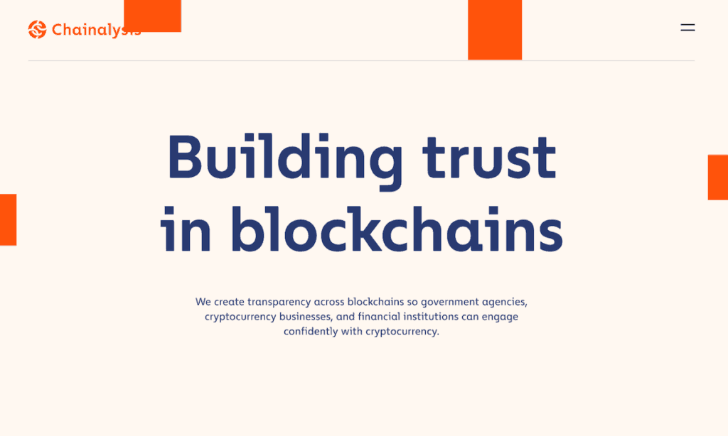
Chainalysis only uses a bold font in their header, the rest of their copy is in regular text:
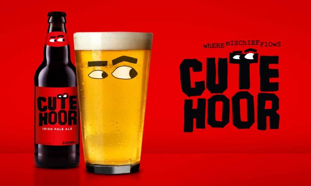
Cute Hoor is another example of a brewery logo using not only bold fonts but illustrations on their stock photos:
Abstract and dreamy illustrations
Illustrations keep things funky and fresh for your brand.
They create a cohesive mood, usually with some sort of reference to human experience (humour, hope, etc).
Too many companies use generic photos for their branding, without much consideration.
The point of many illustrations for branding is to keep your audience engaged with the message you are trying to send.
You want to make a memorable expression for potential customers so that you stand out on the internet.
You want to distinguish yourself from the competition.
Many brands have recently adopted a brand illustration system.
This means that it’s not just one-off illustrations, it’s a collection of themed drawings that represent the brand image.
My favourite company illustration is with Casper.
They use the concept and meaning for illustrations to force you to determine which words are being represented in their ads.
The colours are light, and the illustrations are simple:
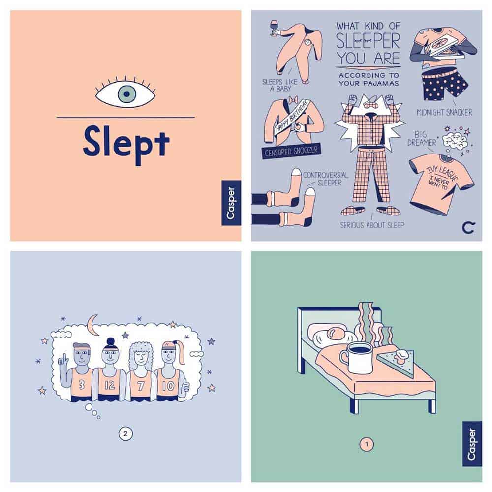
Nowadays, companies have characters associated with their illustrations, which is what I enjoy most.
It feels like a story is being told in their branding, almost like a fun storybook you enjoy reading.
It is cohesive, and it brings a genuine feel to your brand. It also leaves makes your branding memorable.
Remember that your customers are mainly drawn to illustrations that represent your voice as a brand. Let that voice shine!
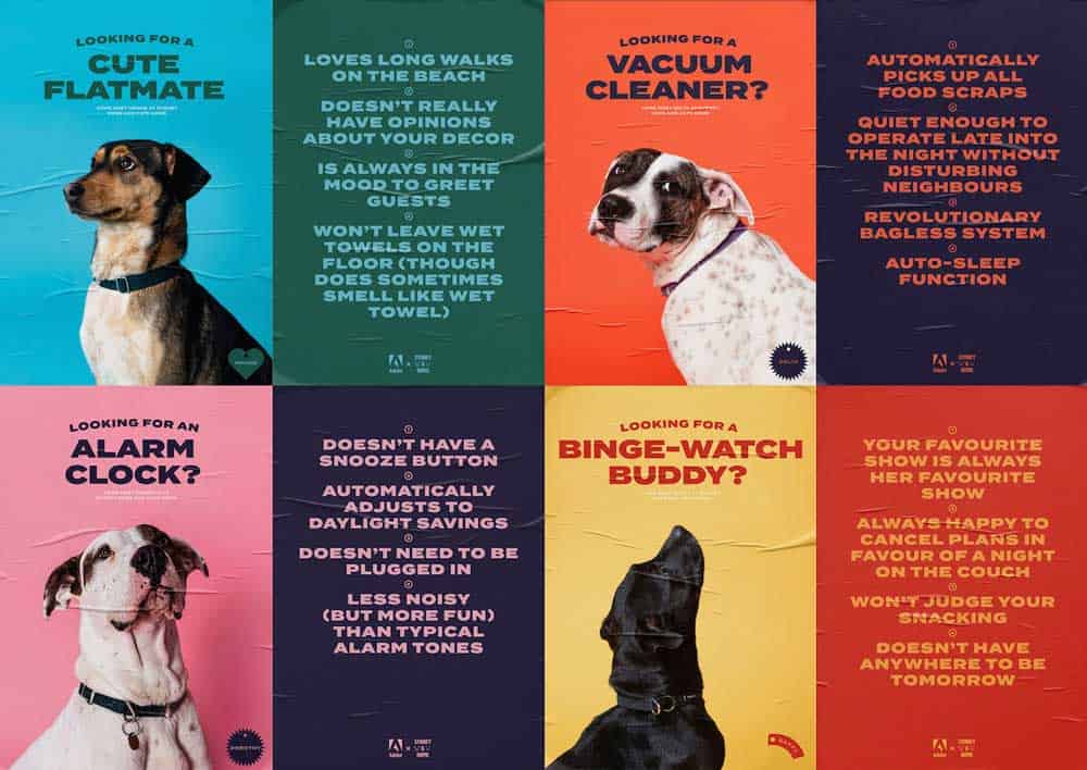
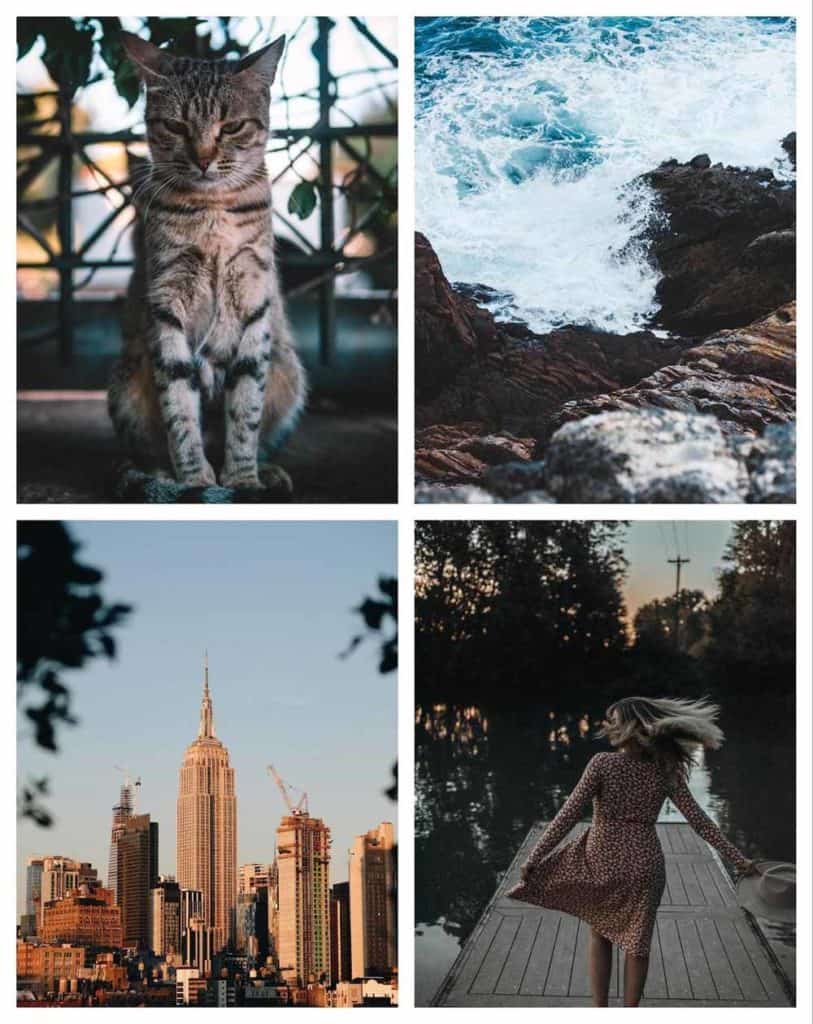
Genuine and Neutral Stock photos
We can take a moment to appreciate the fact that stock photos have shifted in their style.
It used to be that stock photos were these bright, colourful images where the saturation was dialled up. Your poor eyes would be strained from the intensity.
With the rise of social media, especially Instagram, the quality of stock photos has risen.
Now the average person can immediately recognise and distinguish between genuine imagery and generic imagery.
The difference in the impact of using any stock photo you find on the internet versus a stock photo that blends and represents your brand’s look is monumental.
You do not want to use a one size fits all photo, nor do you want it to look so dull and vanilla.
To have a more natural and authentic feel to your photos, muting colour palettes are a great idea.
The more natural the photo looks, the more relatable it feels to your audience.
You want them to connect with your stock photos emotionally.
Here is a set of photos to give you a feel of how genuine stock photos look:
You can also play around with stock photos with cropping and resizing.
It’ll give you an entirely new image to work with.
Hire a photographer to start building upon these authentic photos. Or take the images yourself.
The classier your design looks, the more likely it will stand the test of time.
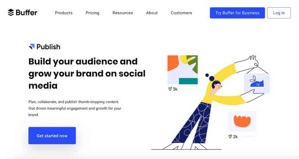
Minimalist Landing Pages
Landing pages are created specifically for marketing.
Its purpose is to convert visitors into leads, meaning it’s vital to the sales of your brand.
A lot of the branding design tips in this blog post have been focused on reactions to popular branding trends.
What’s important to remember is the direct relationship between the graphic design of your brand and how efficient it is digitally.
What that means is, how can you design your pages so that the load time is better and the pages are smaller? The answer is minimalist landing pages.
Google rewards pages that have better load speeds, so you will rank higher if your page loads faster.
If you’re a company that focuses on SEO, this is a massive deal for you.
Buffer is an excellent example of a minimalist landing page that works for both your desktop and mobile device:
The theme that brings all these branding design ideas together is to keep things simple.
This applies to your landing pages as well.
You don’t want pages on your site that distract your customers. You want to create a page that doesn’t use distracting elements.
With fewer distractions, your message and information will be able to stand out immediately.
Slack is another example to look at:
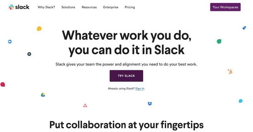
Your eyes are immediately focused on the purple button to click on because of the lack of distractions around it.
That being said, it’s not necessary that you do not include imagery to your landing page.
You can add in an image, video, or graphic. Just pay attention to the rest of your page and the placement of the graphics.
Keep a lookout for the tips that were shared. You will build a better connection between your brand and your customers in no time.
Follow these graphic design tips, and you’ll find that your branding will get much better engagement.
Remember to consider minimalism. Add characters via illustrations. Don’t forget to use basic but bold fonts to have your message stand out. Get personal!
Although these are great guidelines for inspiration, remember to be bold and creative in whatever you do for your branding.
Only when hard work and genuine uniqueness are coupled together, do you connect with your customers.
The post Top 5 New Branding Trends in 2020 for Design Inspiration is by Stuart and appeared first on Inkbot Design.