
05 Nov Top 4 New Graphic Design Trends for 2020
Top 4 New Graphic Design Trends for 2020
Graphic design in 2019 saw pops of vivid colours, geometric shapes, futuristic colours, light and dark colour schemes, hand-drawn illustrations and authentic stock photos.
But as we step into a new decade, what will change in the design world?
Which trends will take the graphic design community by storm in 2020 and beyond?
And which trends will change the way companies approach design?
Lucky for you, I have the answer.
Graphic design trends in 2020 will be all about differentiating yourself from the overly popular and rethinking design to be more natural and realistic compared to the futuristic approach to designs which was all the rage this year.
Without further ado, here are four new graphic design trends you’ll be seeing a lot more of in 2020:
1 – Muted Colour Palettes
The past has been all about flashy, bold colours meant to differentiate you from the herd.
I’m talking hard-hitting yellows, flashy blues and bright greens being the norm over the past few years.
This, however, is deemed to change. In 2020 brands will move away from punchy bold colours to more muted colour palettes.
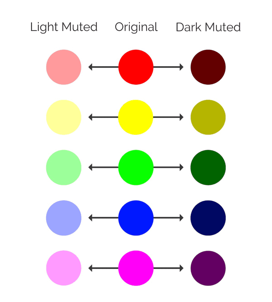
But what are muted colours? Muted colours are slightly less in your face than vivid colours.
This desaturation is achieved by adding black, white or other complementary colours. Think vivid colours, muted tones are the opposite of that.
Let me share a prime example of the brand that’s doing this very well of late. Hint: It’s Apple.
Notorious for using colours that pop in your face (in the not so distant past) they have instead switched it up by opting for more muted tones instead:
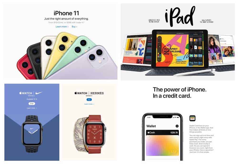
Even the new iPhone colours are more muted, which makes the product look more modern and in tune with the times.
The same applies to their new watch series, the iPads as well as the latest addition: The Apple Card.
And as we all know when Apple does something, the world follows.
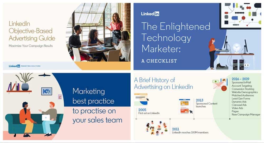
Even LinkedIn’s Marketing team have started rocking muted colours:
This, however, doesn’t mean the world is going to duller now. Think of muted tones as vivid colours that have had their “edge” taken off with an infusion of black or white.
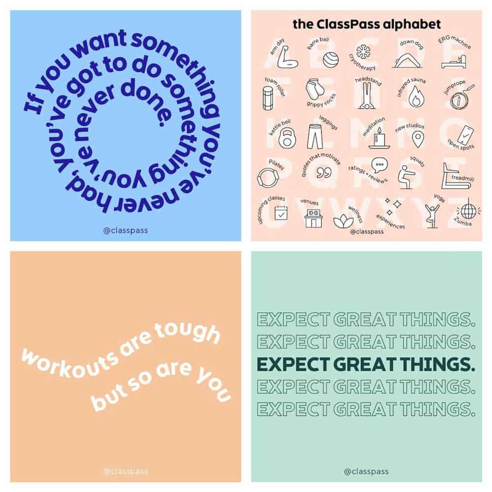
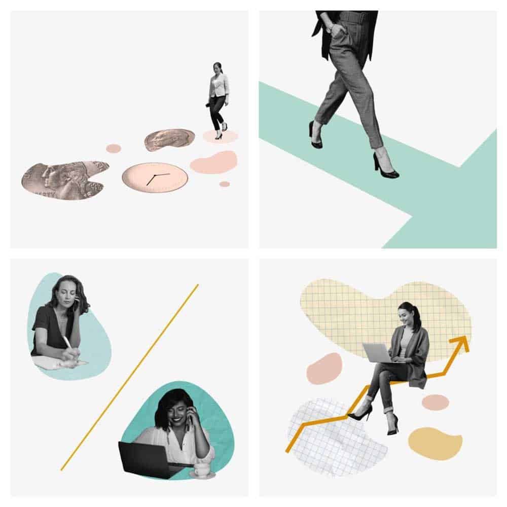
They’re also perfect for making your designs look more natural. And Classpass knows this all too well:
Ellevest does this wonderfully by opting for a lighter background with muted colours:
Pro Tip: When working with a white background, try using lighter muted tones and vice versa for black backgrounds. This makes sure the colours blend well instead of harshly contrasting each other!
If you notice carefully, the above examples are still full of colour. The only difference is that they take a step back to look more natural instead of blowing up in your face.
After years of loud colours, muted colours can be used for a more futuristic appearance as well.
And if you’re looking to make a move to this future yourself, start with a muted colour palette.
Start with your brand colours as a starting spot and add some black and white as secondary colours. And Voila! You now have a great and consistent brand design.
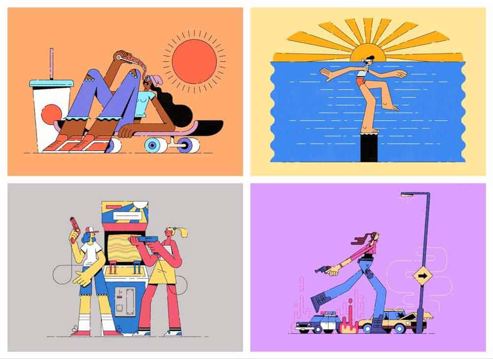
2 – Abstract or Flowing Illustrations
In the crowded world of social media, abstract illustrations are better than generic stock photos or low effort graphics.
The best part? No company can copy them the same way, which means every brand will have its unique take with this trend.
Casper, having started this, has stuck with this trend ever since:
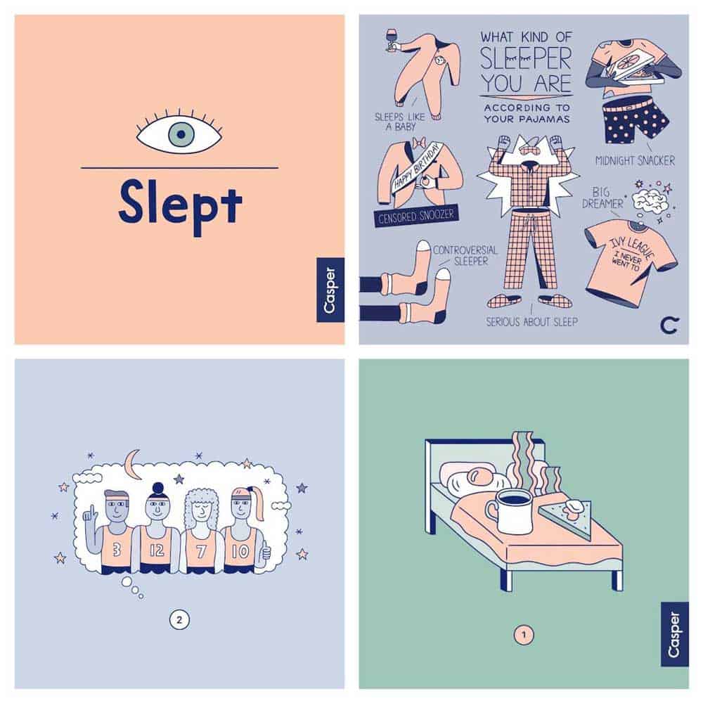
Being first movers, these illustrations are unique and different because you don’t see every brand adopting them or directly mimicking them.
But having said that, this trend has only exploded in popularity as companies like MailChimp start adopting them throughout their online presence:
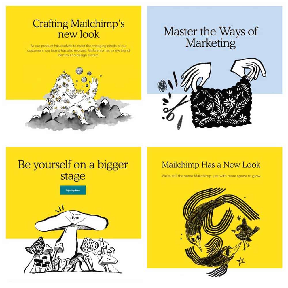
No more boring stock photos on newsletters or generic designs on our social media!
While these graphics may be creative, the end goal of any design is to communicate something visually.
And the key with flowing illustrations is to communicate the critical message quickly.
So when you’re designing your abstract graphics — make sure to remember the message you’re trying to communicate to your audience be it in a business or even a marketing capacity.
For a company that’s always touted minimalism in their designs Apple as always, is one step ahead of the curve and ready to change when they deem it necessary.
Their illustration game as always is on point:
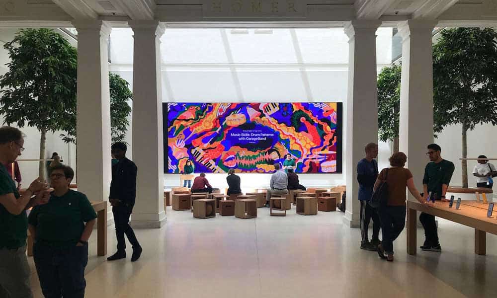
The best part? These colourful illustrations go well with their clean store layouts, elevating their designs in the process.
How do you take these illustrations one step further? By going for the more abstract and exaggerated, like these examples:
Designing dreamy illustrations like the ones before allows certain brands to rise above the ones resorting to more straightforward and more realistic versions.
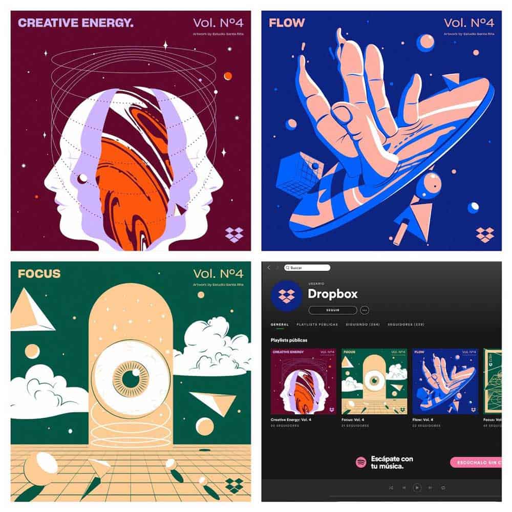
Dropbox has kicked it up a notch on the uniqueness factor with these abstract designs on their monthly playlists:
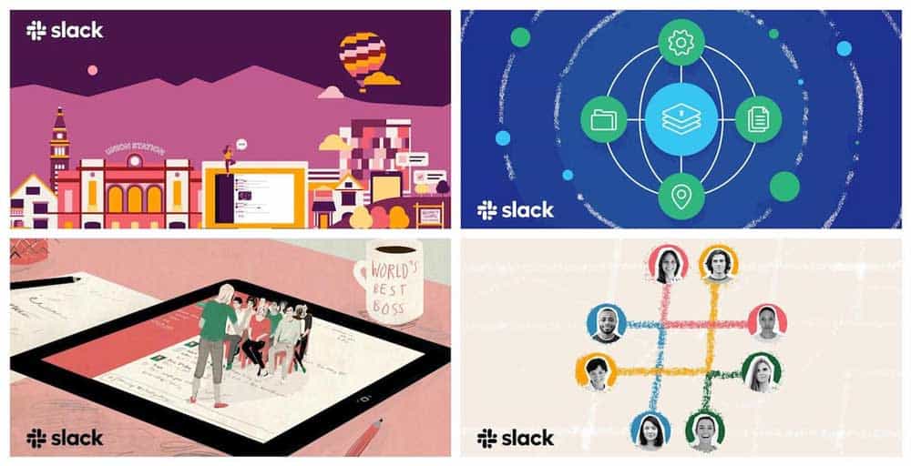
The only real issue I see with the use of flowing illustrations is the lack (or absence) of branding to differentiate one company from the other.
How can you have a visually consistent brand if you incorporate these designs?
Unless you’re a brand like Casper or MailChimp that just went all in, it’s hard to have that consistency across your designs.
Slack has an excellent workaround. They add in their logo to all their designs. So when anyone sees the below examples, they will know it’s Slack:
Pro Tip: The key to standing out would be keeping your illustrations more imaginative and more abstract to make sure they stand out among a herd of too-similar examples.
Start by focusing on one core topic or idea to produce your illustrations around to make it easy. Rinse and repeat.
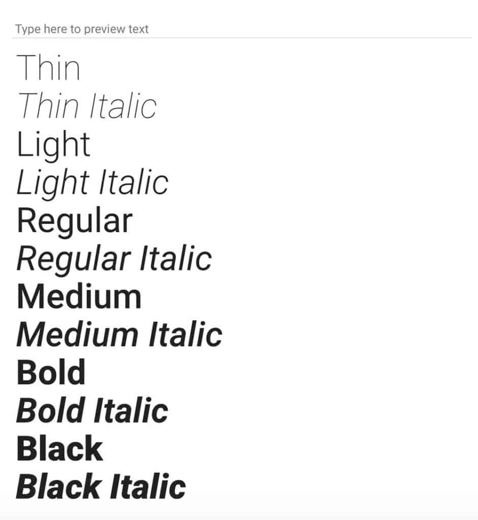
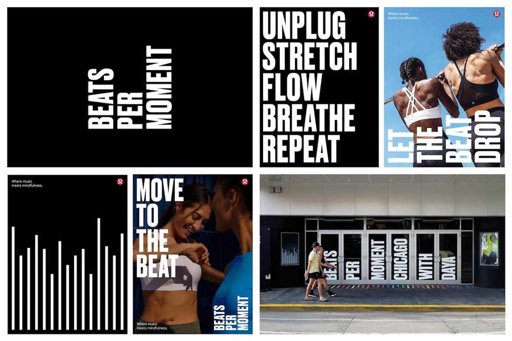
3 – Heavy & Bold Fonts
The past few years have been all about minimalist and handwritten fonts, but as with any trend, there comes an inflexion point.
And that inflexion point and has resulted in brands extensively resorting to bolder or heavier fonts this year.
Fonts come in various weights ranging from thin to heavy with some variations in the middle:
Bolder fonts can give your designs a more modernist feel as well as emphasise your core message.
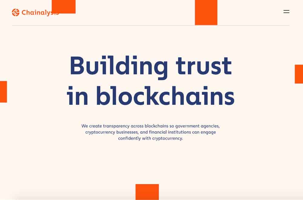
Chainalysis uses this very well with bolder fonts being used only for their header but the subtext featuring regular fonts:
SMLXL only uses bolder fonts to communicate key phrases or shorter messages:
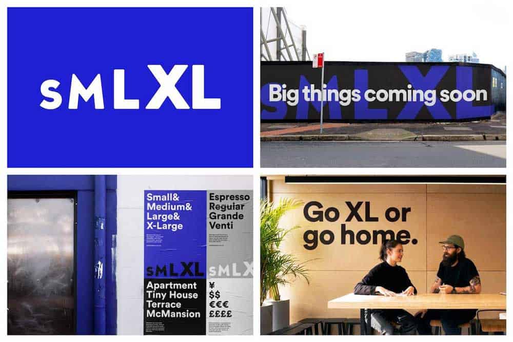
Heavier fonts make the message stronger and more powerful.
SMLXL knows this very well and uses bolder fonts with small bits of texts to magnify their message to significant effect. A lighter font just wouldn’t cut it in this case.
Don’t use bold fonts too much or as a body font, it will just overwhelm the reader.
So try and only communicate shorter or essential messages with bolder fonts.
Also, the right amount of bold fonts can help standout your message on social media quickly.
If designers would have resorted to lighter fonts, chances are a reader would’ve scrolled right past the post and ignored the message entirely.
Want to take this one step further? Match your weighty fonts with an inspiring message or image:
Heavier fonts can be used to create a considerable amount of contrast in your graphics.
Adobe used a heavy font extremely well create contrast on their graphics:
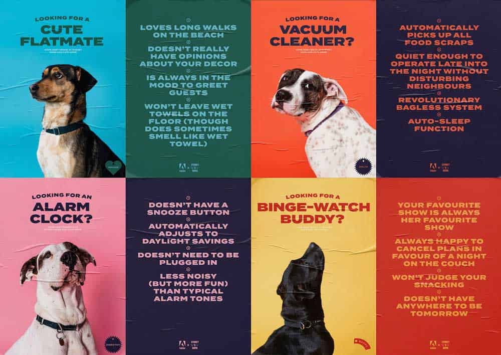
The use of heavier fonts, contrasting them with dog pictures and using reserved colours makes their graphics stand out and keep your focus on the message.
There are tons of exciting designs you can create by combining heavier fonts with non-generic stock photos as well as muted or reserved colour palettes.
And Adobe knows this all too well.
Pro Tip: Don’t overuse weighty fonts. As I mentioned earlier, try to communicate shorter or key messages using bolder fonts and compliment the secondary words with lighter fonts, so the user doesn’t feel overwhelmed.
A heavier font will have more impact when used in conjunction with a lighter font or a more neutral background.
4 – Minimalist Landing Pages
A lot of the trends we talked about earlier have been inversions of previous design trends from the past as companies look to reinvent how they think about design.
For example: bright colours are being replaced by muted shades and realistic illustrations being replaced by the more imaginative and abstract ones.
This trend, however, is more of an SEO trend than a design one.
Why? Minimalist landing pages will essentially allow companies to better optimise their site for reduced page load times as well as smaller page sizes overall.
To stay in Google’s good books, a landing page optimised for search is crucial.
Google rewards fast loading websites and companies opting for minimalist landing pages could see a massive boost in their rankings on Google, especially if they’re focused on SEO!
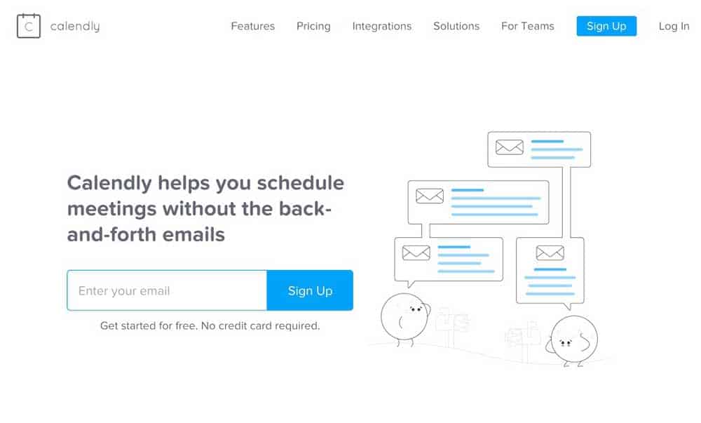
Calendly is one of my favourite tools and a great example of minimalist landing pages done right.
See how they use muted colours, bold fonts and unique illustrations to the significant effect:
Even our friends at Buffer have a minimalist landing page optimised for both desktop and mobile:
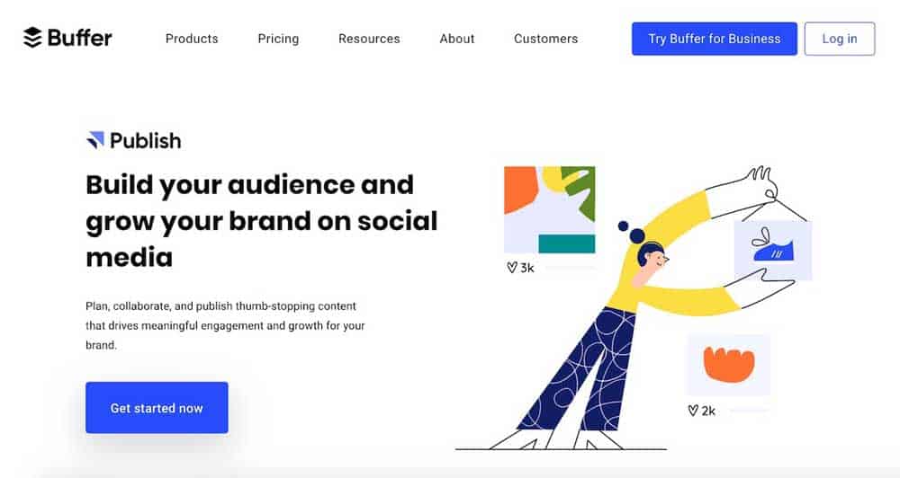
Again, you can see how well they use bolder fonts and imaginative illustrations, all of which come together to give their landing page a clean and minimalist look.
Another benefit of minimalist landing pages? They’re focused, communicate what a user needs to do clearly and often convert better than lengthier pages.
Take Dropbox for example:
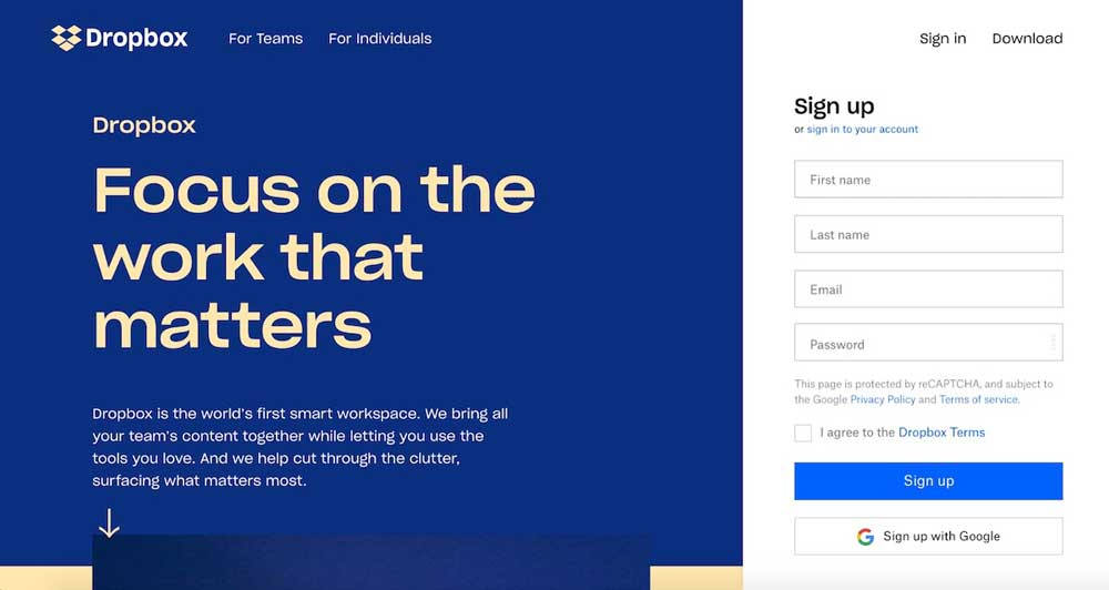
Dropbox makes it as simple and as painless to sign up as possible. It’s the first thing you see when you land on their page.
A concise value proposition, simple signup form and a clear CTA are design best practises every company should aim to follow.
By keeping distracting elements to a minimum, the information takes front seat reducing the cognitive overload on the user and clearly outlining what they need to do you have a landing page that converts and looks good in the process.
Even Slack’s example below does this well:
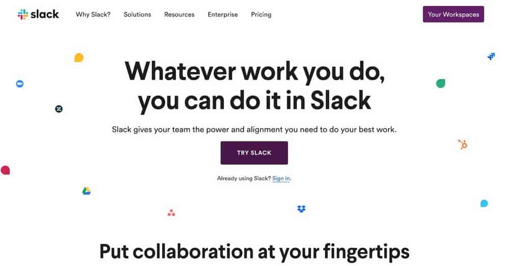
Slack’s CTA is clear as day, they want you to try their tool, and they clearly outline what they offer in just a couple of sentences.
It’s user experience decisions like these that help websites convert new users faster and turn them into long-term customers.
So focus on keeping your landing page elements to a minimal, communicate your value proposition concisely and don’t make the user think!
Because we’re still designing for humans and not computers.
Wrapping Up: Some Final Thoughts
To bring it all together, you’re going to see a lot more Muted Colours, Flowing Illustrations, Heavy & Bold Fonts and a shift to Minimalistic Landing Pages as companies look to redefine how they approach design when it comes to delighting their users and differentiating themselves against other companies adopting similar trends in their design.
I highly recommend mixing and matching the above design trends to come up with something that’s both unique and true to your brand.
Because the only way to indeed stay ahead of the curve is rapid experimentation.
Author Bio: Aditya Sheth is a Content Marketer at Venngage. When he’s not busy writing informative content or executing growth experiments, you can find him reading nonfiction, listening to rap or exploring memes. Find him on Linkedin or tweet him @iamadityashth.
The post Top 4 New Graphic Design Trends for 2020 is by Stuart and appeared first on Inkbot Design.