27 Jan Real Estate Branding Tips – A Logo Design Guide for Realtors
Real Estate Branding Tips – A Logo Design Guide for Realtors
Ever thought about why your competitor’s business gets more attention than yours?
The real estate branding strategy that you use may be the culprit.
Building the brand identity is something that will get you the most money and equity in your real estate business in the end.
If you fail to lay the foundation of your real estate branding, then your ship might not survive the thrusting waves of this ocean.
Do you know what the essential elements of real estate branding are?
A symbol can speak louder than words; it is crucial to have a professional, unique and eye-catching logo.
A logo is something that can carve out a prime piece of your real estate business in your target customer’s mind.
When you believe that your company name speaks who you are and what you do, the next step is to wrap a graphic image around that name that is a logo.
The logo is an integral part of any real estate branding strategy especially in the case of real estate that involves intense competition between brands.
If you are seeking ways to become a successful realtor, consider these incredible logo design tips to make your real estate business fly.
Choose the right colour for your Logo
Colour is one of the critical aspects of a real estate logo design as they create subconscious perceptions in the minds of your prospects.
Think about how building site signs in different colours attract shoppers in a department store.
For instance, red is bold, energetic and passionate while blue exhibits tranquil and trustworthiness.
Pink seems fun, and flirty while white indicates clean, pure and sophisticated nature.
Thus the colour you pick to represent your logo has a significant impact on how your customers will feel about your brand.
So, before choosing a colour for your logo, think about how you want to represent your brand.
You know what the colour of your logo may be one of the potential reasons for most people to choose your service over others.
Consider the shape and symmetry
Colours are not the only element that makes or breaks a brand.
The shapes and symmetry of a logo also play a crucial role in realtor branding while building site signs.
Like colours, forms also affect the emotions conveyed by your logo.
For instance, the square conveys logic, order, security, and containment while the circle represents warmth, comfort, protection, family, movement and connectedness.
Most home buyers will seek security while warmth and comfort also make positive associations related to purchasing a new home.
Symmetry is another crucial component of any logo.
Symmetrical images are more aesthetically pleasing while asymmetrical logos can put off a sense of disorder or disorganisation.
Obviously, you will not want to make such an impression in your customer’s mind.
Finally, graphic elements can be used to illustrate your areas of specialisation.
For instance, the graphic of the region you serve conveys your regional coverage area.
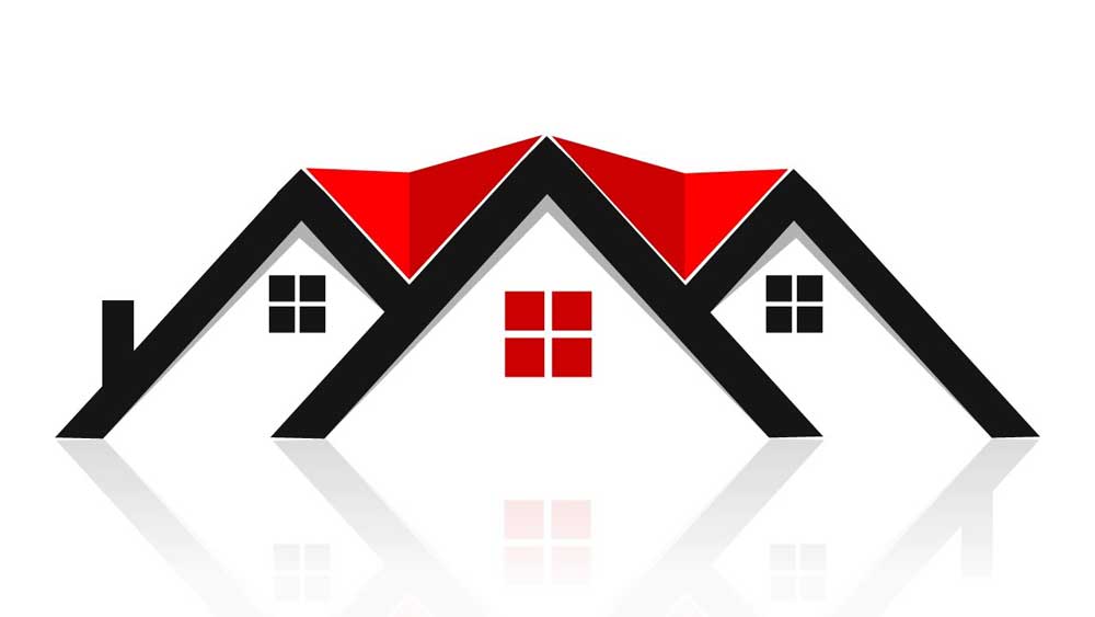
The design of a single-family home speaks about your focus on single-family homes.
Don’t be too generic

Have you ever seen a logo and feel like you have seen it somewhere before?
It is called the generic logo that can be termed as a cliché in the logo game.
When you Google ‘real estate logo design,’ thousands of logos based on conventional symbols will be displayed in front of you.
Yawn, yawn!
It may appear dull and unimaginative to your client.
What the worst thing about it is, the logo is not going to stand out from the mass of your competitors.
There will be nothing memorable about your logo.
You might be a minimalist who loves simplicity.
However, make sure to add enough unique features to your logo while building site signs so that it can represent your brand accurately.
Think outside the box
Although the real estate business deals with houses and buildings, you need not be constrained just to use the building symbols.
Think! What else can you use to give the feel of a home?
It can be picket fences, pillars or locks and keys, there are countless possibilities.
It is all up to your imagination and creative thinking.
A mere glance at your logo should be enough to convey your idea, purpose and why your real estate business is unique.
Keeping the mission statement or distinctive details about your business at the front of your mind will help you think of a logo design centred on the concept of your business.
Sometimes text can be distinctive enough with a striking and unforgettable appeal all on its own.
Instead of spelling out names, you can think of using monograms, abbreviations, or initials while building site signs.
However, don’t overdo it with heavily decorative fonts that have the risk of reflecting an unprofessional vibe.
Try out different font styles, sizes, and colours to choose the one that best represents you.
Design to characterise your area and niche

Your real estate logo design should reflect your niche and speciality.
A logo acts as a concise visual identity of a business that conjures up all the positive images and messages associated with the company when the client sees it.
Visually representing your purpose makes it exciting and increases that chance of grabbing more eyeballs for your business.
The name of the company with a complementary colour is great but try to incorporate something unique for building site signs.
Many firms prefer images reflecting the geographical features like rolling hills and symbols of the ocean while other favourite niche themes use condominiums, baby boomers, and luxury properties.
Your real estate logo should also speak about your personality.
If you cater to a particular region, market, something more traditional like a dormer decoration can work out.
If you are focused on beachfront homes, something like sand and surf may do the trick.
Remember, your logo should reflect your real estate services and your character.
Give it the scroll test

The logo is the first thing that is going to have the first glimpse of your potential customer.
This is why it must be appealing instead of rather than off-putting.
The building site signs should have the potential to inspire people o pause and reflect.
A well-designed logo is much more than an aesthetically pleasing graphic.
You can think of it as the key to winning new business.
As the clients are going to get a lot of different options, it is critical for you to stand out with a creative logo design.
Keep the logo enduring yet straightforward

Something unexpected or unique feature is great to incorporate into your logo design.
However, make sure you are not complicating it.
Excess of everything can have a negative impact on your brand.
A simple logo design with a versatile and memorable feature can be easily recognised and understood by clients.
Although it is easy to get trapped by the temptation of including a beautiful and complex 3d logo, there is no point in making things harder for the clients instead of attracting them.
Think about how the building site signs will reproduce on your for sale boards and office signage.
A unique yet straightforward logo will significantly aid in your market to make your real estate brand stand out and more importantly become memorable.
Modern is a must

Logos are more than just a graphic.
It is the face of an entire business.
An outdated logo signals to potential customers that the way you do business is also obsolete.
Having a modern logo will help you steal the limelight from your competition while showing your clients that you understand the modern consumer.
In today’s crowded marketplace, where the trends and choices keep fluctuating, surviving with an outdated logo is almost impossible.
A compelling logo design is the first chance for realtors to send the right messaging out into the world about their real estate business.
Leave it to the professionals
By now you may have realised that there’s much more to do than just grab the eye while designing a real estate logo.
So, it is well worth taking the help of a professional designer to create a beautiful logo that conveys your business story.
Rather than experimenting on your own, take professional help and advice while designing a real estate logo or building site signs.
Concluding Real Estate Branding
While building a real estate branding, countless things need to get done which may speed things along.
However, if you wish to have a sustainable brand that’s not just a flash in the pan, meticulously pore over your logo.
The most established and sought-after realtors put effort and time to make their logo stand out.
As your logo is one of the most exclusive elements of your company, it is essential to get it right.
Now, it is high time to spend a reasonable amount of time thinking about your real estate branding goals with a killer real estate logo for your business.
With these full-proof logo design tips, your real estate branding will inevitably drive the targeted clients to your door.
Best of luck!
The post Real Estate Branding Tips – A Logo Design Guide for Realtors is by Stuart and appeared first on Inkbot Design.


