
20 Feb Psychology of Colours in Web Design – How Colour Affects Perception
Psychology of Colours in Web Design – How Colour Affects Perception
Colours might be one of the most potent tools at a web designer’s disposal.
They set the tone and the mood, and they underline essential details.
Furthermore, they send subliminal messages to a user’s mind without them knowing.
The goal of this article is to educate you about the smart use of colours and to show you how colours affect the perception of your website.
The psychology of colours in web design plays a significant role in sending the right message to the user, and it is a vital aspect of pleasant user experience. Let’s see how!
The Psychology of colours in web design
When it comes to the psychology of colours in web design, it is crucial to understand a few things:
- what each colour represents
- when to use, and when not to use a colour
- the relationship between colours
- how to combine colours
Knowing these four critical points will help you in any future project.
Best of all, the colours will always remain the same.
There is no new wheel to be discovered, and that is a fact.
However, that doesn’t mean that you cannot improve or elevate the use of colours to another level.
Many people spend their life researching and learning this sophisticated art and finding ways to improve what they already know and provide extra credibility to their designs.
Red

What comes to your mind when you think of red?
It is an intense colour with the power to draw attention and underline essential details.
When our eyes see red, there is a mental image of an exclamation mark in our minds.
Red is good for marketing, entertainment, advertising, sports.
It is also always present in health care and emergency services.
Furthermore, it can be used in context with food, fashion, emotions.
However, due to its powerful features, you must be careful when working with red.
It can easily take too much attention. Avoid it if you are working with nature-related content or professional services.
Yellow

When we think of yellow, we usually imagine the Sun or gold. The yellow colour is bright and shiny.
It speaks about happiness, youth, and pleasant thoughts. Furthermore, it spells out competence and optimism.
That is why it is smart to use yellow for CTA buttons.
Or, if your goal is to inspire people and energise them.
However, just like with red, yellow can also take too much attention.
In plenty of times, it can even be hurtful for our eyes.
One of the biggest mistakes people make when using yellow is picking the wrong hue.
Orange

Combining red and yellow creates orange.
It is essential to understand that orange is a fun colour to look at.
It symbolises happy feelings, success, warmth, and ambition. Furthermore, it is strongly connected to enthusiasm and excitement.
However, since the root of orange is red, it can also be used to underline caution.
On another note, since orange also contains yellow, it is fantastic for CTA buttons, payment forms, etc.
Nevertheless, being a combination of red and yellow, it is easy to overuse it, so be careful!
Green

Green is the colour of nature.
It is associated with energy, balance, calmness, and harmony. It is also the colour of health, money, growth, and generosity.
Furthermore, it can represent both good luck, fortune, and support, but it can also be connected to envy.
With such an array of possibilities, it is easy to understand why green is so important.
It is a fact that our eye likes seeing green.
With that in mind, you should always use it when working with positive themes like health, success, beginning, environment, science, etc.
However, because it is such a versatile colour, people might think that it can go with everything, like Guile’s theme! But it can’t!
Because it is the colour of nature, it is best to avoid it when representing technology-related content, luxury goods, or anything similar.
Blue

Blue is another positive colour, but with a different connotation.
Even though it also represents calmness and energy, it is also the colour of strength, truth, wisdom, loyalty, and productivity.
Different shades of blue can also be refreshing and energising.
Because it is strongly tied to success, it is one of the favourite colours of banks and large corporations.
It can be used in science and health care, but also technology purposes, government, and legal sectors.
However, you should be careful when using blue, since different shades can awake mixed emotions.
Blue can easily create a feeling of coldness and the absence of emotions.
Purple
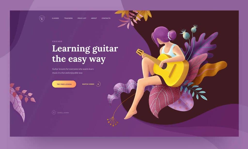
In many cultures, purple represents royalty.
With that in mind, it is associated with authority, power, strength, wealth, respect, and wisdom. Furthermore, it is the colour of imagination and creativity.
Purple has a wide array of usage. It is tied to spirituality, astrology, and romance.
However, purple is a hard colour to use smartly.
It can often create a sense of distance, and it is not the right choice if you want to put something in the spotlight.
Brown
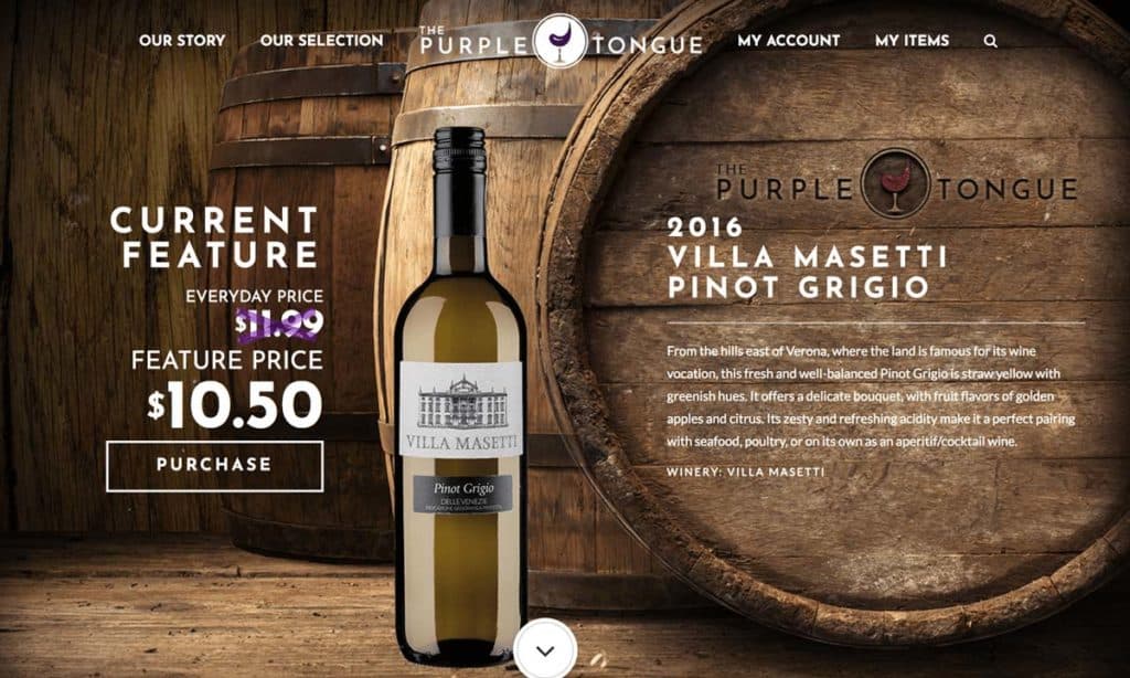
Brown is another colour associated with nature.
It has warm, earthy tones, and it symbolises friendship, sturdiness, and stability.
It is an excellent choice for food advertising, but it is also found in animal-related content, real estate, and finance sector.
The danger of using brown is that it can be boring at certain times.
In general, it is a poor choice of colour if you wish to grab people’s attention.
Black
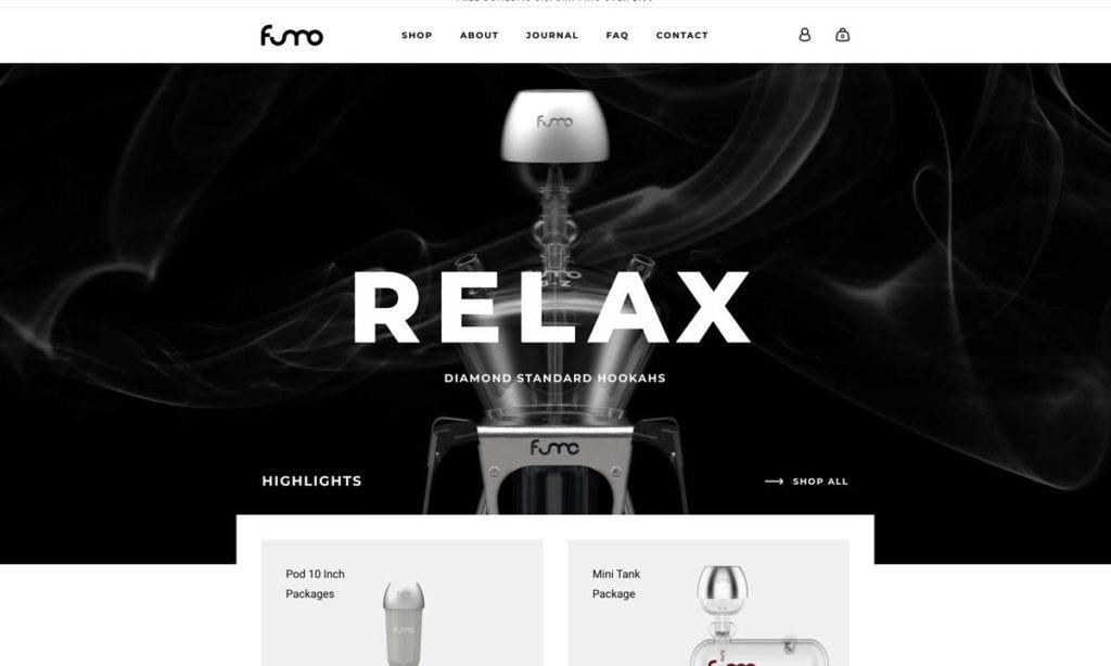
Black is a strong colour. It can easily alter any other colour and change the atmosphere in an instant.
It is a sophisticated and elegant colour, and it communicates power, strength, stability, and intelligence.
Black is often used in marketing, fashion, and when advertising any luxury goods or cosmetics.
However, black also symbolises death and mystery, and it can create a sense of evil, unease, or even fear. If overused, people might feel uncomfortable.
White
Opposite of black, white is associated with purity, virtue, happiness, and safety.
In real-life situations, you can see white mostly in health care.
Doctors and nurses wear it all the time. It also has many uses in technology and science.
White is also a precise colour because it can be paired with any other colour in the spectrum.
With that in mind, it is essential to know what your goal is before you introduce other colours to white.
For example, when used with black or gold, it represents luxury.
It is also essential to think about the absence of white, and the effect it can create.
White is useful if you wish to break heavy tones and make a website more comfortable to look at.
Grey

When using grey, it is easy to create a sense of formality and professionalism.
It is a practical and sophisticated colour.
Due to its strength and timelessness, it is the best choice for professional, persuasive and luxurious websites.
However, it has a feature similar to that of the colour blue.
If not used in the right hue, it can be dull, cold, and distant. It is also not an excellent choice to attract attention.
Pink
We can look at pink as a milder version of red.
It can also represent love, romance, and sophistication, but it doesn’t have the invasive, violent, and angry properties of red.
That’s why pink is a soothing colour, that can create a sense of calmness and relaxation.
Because it is such a soothing colour, it is best used to present any female-related products.
Nevertheless, use it with caution – at times, it can be too sentimental and sweet.
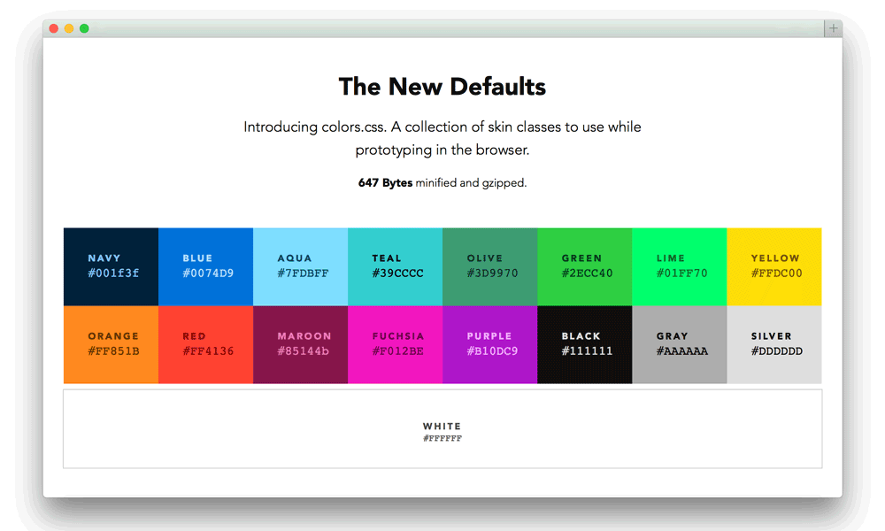
The correlation between colours and how to combine them
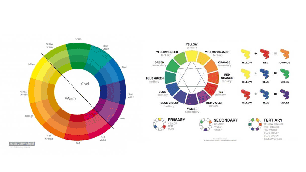
Now that you know what each colour represents, it is easier to understand the psychology of colours in web design, and how colours affect the perception of your website.
However, that is not the end.
It is also crucial to research the relationship between colours.
There is a whole science behind primary, secondary, and tertiary colours, and what is the byproduct of mixing them. An array of different hues with endless possibilities!
When it comes to combining colours, it is crucial to learn from other people’s experiences.
As I mentioned at the beginning, you are not rediscovering the wheel all over again.
There is a multitude of different palettes, patterns, and schemes for websites.
It is also crucial to understand what colours to avoid using together.
For example, if we talk about clothes, as a general rule, avoid mixing red with green, brown and black, grey and brown, blue and black, green and pink, purple and yellow, or green and orange.
As with everything, there are exceptions.
There are ways to make these colours work together, but it is essential to understand their features, strengths, and weaknesses.
Author Bio: Mark is a web designer with over 15 years of experience. He has vast experience and knowledge in creating logos and user interfaces for applications, and engaging design for moving-related websites. Mark always accents the importance of user experience and customer’s demands in web design. In his spare time, he runs a blog and writes articles aimed at helping young web designers understanding the main principles, theories, and best practices.
The post Psychology of Colours in Web Design – How Colour Affects Perception is by Stuart and appeared first on Inkbot Design.