08 Jan Mobile App Icon Design – The Ultimate Guide
Mobile App Icon Design – The Ultimate Guide for iOS & Android
What’s the first thing that users notice about your app? Any guesses?
Well, it’s not your app name or the features it encloses. Instead, it’s the app icon design.
Yes, that small picture that resides on the left of your app name is the first thing that user notices.
And in fact, it’s the first thing that helps them to build an impression of your brand and decide if to download your application or not.
Evidence of which is that a great app icon design can increase the downloads by 560%.
Now while this number would have triggered you to bring your design team on board and curate an ‘eye catchy’ icon, it is good to be familiar with all the benefits that app icons deliver.
So, let’s take a recap of what an app icon design means to your brand.
Reasons Why You Should Focus Upon App Icon Design
1 – Unique Brand Image
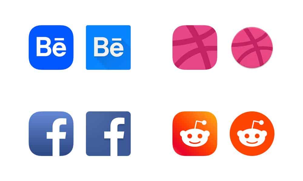
What comes to your head when a blue colour icon comes across your eyes? Facebook, right?
This is what the blue-coloured icon of the Facebook app has succeeded in doing.
The app icon design has created a unique brand image in our mind.
It has made us subconsciously link Facebook to blue colour. And this is the first benefit of having a perfect app icon.
It becomes the hallmark of your brand.
2 – More Downloads
An app icon usually highlights the core functionality of your application.
This makes it easier for users to understand what your app is for, and eventually download it.
Implying, focusing on creating a perfect app icon delivers higher downloads.
3 – Better Retention Rate
An app icon remains on the screen of the users’ smartphone/device throughout.
So, whenever they check their device, the icon reminds them of your application, its features, and experience.
This again motivates them to try your services, which implies less risk of user abandonment.
4 – Lower Competition
By building a unique presence in the market and encouraging users to stay with you all the time, the app icon also provides competitive advantages.
Knowing this, it is likely that you are looking ahead to put this information into action.
It means designing an application icon that rocks the industry.
But wait, before you step into the designing world, it is necessary to be familiar with mistakes that could turn down your idea of gaining limelight in the marketplace.
So, while thinking in the same direction, let’s check for what mistakes you should never commit when building an app icon.
Mistakes that Impede Your App Icon from Touching Users’ Hearts

1 – Introducing Too Many Elements
Most of the designers introduce multiple elements into the same icon to bring the impression of storytelling.
This affects the readability and builds an unpleasant experience; making users ignore the icon forever. So, prevent doing so.
2 – Using Stock Images
Regardless of how attractive a stock image is, it can’t relate to the core functionality of your application.
Besides, it does not give an authenticated look to your app.
Because of these reasons, using stock images is yet another mistake that can make your app icon fail to hit at the right place.
3 – Adding Text
Another mistake that designers often commit is adding text to their icon design.
They believe that this would help users to understand the app concept in a better manner. But alas, the opposite happens.
This text, when minimised at the dimensions in which an app icon exists, becomes nearly tricky to read and adds to the awful look.
4 – Opting Low Contrast
When introducing two different colours into the same design, many UI/UX experts go with less contrasting colours.
This might seem cool but makes it difficult to distinguish between the two colours when implemented.
So again, say no to the idea of using two low contrast colours simultaneously.
5 – Overlooking Design Guidelines
Another mistake that hinders designers from creating a perfect app icon design is overlooking design guidelines.
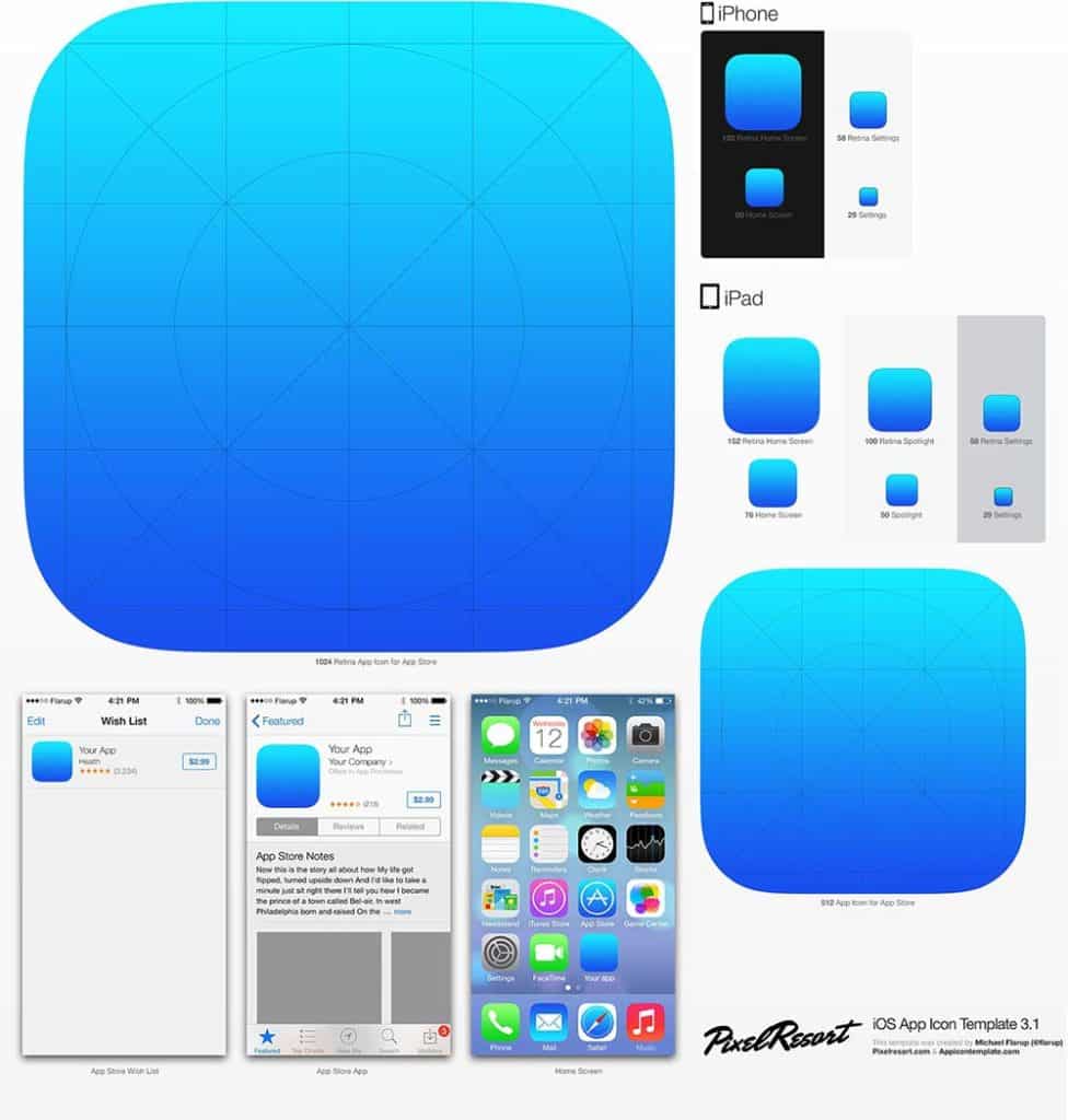
This makes their app icon unfit to publish when compared to the rules set by Apple and Google, a glimpse of which you can take from the table below.
For Android Apps
Dimensions
512px × 512 px
Format
PNG, 32 bit
Colour
sRGB
Max. File Size
1024kb
Shape
Full Square
Shadows
None
For iOS Apps
Dimensions
iPhone – 180px × 180px
iPad Pro – 167px × 167px
iPad, iPad mini -152px × 152px
App Store – 1024px × 1024px
Format
PNG
Colour
sRGB or P3
Layers
Flattened with no transparency
Shape
Square with no rounded corners
With this attended to, it’s time to turn towards what practices are optimal for creating a perfect app icon design.
So, here we go.
Practices that Makes Your App Icon Irresistible
1 – Know Your Audience
To build an app icon that users love, the simplest method to adopt is to design according to them.
Meaning, analysing their needs, level of understanding, expectations and then design the icon accordingly.
For example, if your application is going to focus only on millennials, creating a funky and bold icon will be the best step.
But when targeting professionals, going with a sober design will bring better traction.
So, plan accordingly. Also, feel free to take a sneak peek of your competitors’ work for inspiration.
2 – Focus on the Core App Feature
The golden rule that every app development company follows while creating an app icon is plan around the core functionality of the mobile application.
This is so because when you showcase the USP of your application in the icon itself, users find it easier to understand what your app is meant for.
This eventually, encourages them to tap on the app icon and later download and use your app.
So, never forget this while planning your app design strategy.
3 – Create a Unique Form
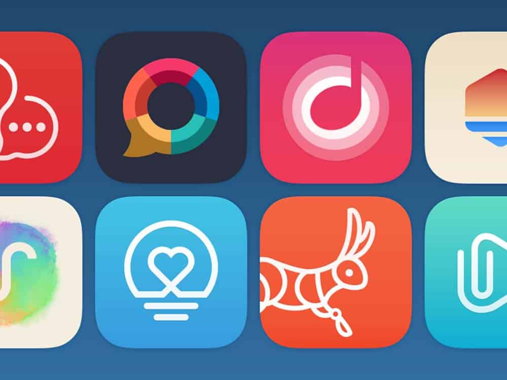
When you bring some unique form or style into your app icon design, it distinguishes the app from others and captures users’ attention more effectively.
So, do not keep your creativity confined and come up with something unique.
However, at the same time, ensure that the app icon design is easy to remember.
4 – Experiment with Different Gradients and colours
Just like unique forms, you can also give a refresh look to your app icon by experimenting with different logo shapes, gradients, font styles, and colours.
So, consider this too while creating your app icon.
5 – Embrace Simplicity
With minimalism app design becoming a hot topic, adding minimum elements into your app icon and keeping it simple yet attractive is also one of the best practices to follow.
6 – Test for Varied Sizes and Dimensions
Since users on various devices and platforms will use your application, it is again profitable to ensure that your app icon looks pretty cool on all the screens.
Now while these practices would help you to formulate the perfect app icons design plan, it can become handy if you use specific tools.
So, taking the same thought forward, let’s wrap up this article while having a look at some of the popular tools to consider in 2020 and beyond.
5 Tools to Consider for Designing Mobile App Icons
1 – Canva
Canva is one of the top designing tools to consider in 2020.
Founded back in 2012, it offers ample of templates, photographs, vector images, and fonts along with drag-and-drop functionality.
This aids you with the right inspiration and lowers down your efforts required for creating app icons.
2 – Iconsflow
Iconsflow is yet another tool that mobile app designers can introduce into their app icon creation plan.
The tool provides UI/UX designers with an option to create, edit, and download a highly-engaging icon while keeping the latest designing trends into consideration.
Another tool that is highly recommended for building innovative icons is Adobe Illustrator.
Founded back in 1985, this tool serves design experts with a vast range of resources including attractive fonts, a handful of editing tools, engaging images, and more.
This, as a whole, enables users to bring out the best of their creativity and put their design into action.
What’s more, this tool is also predicted to hit on iPads soon.
Another tool that you can bring onboard for building a creative app icon is the App Icon Generator.
It lets designers to automatically generate icons that will add more value to your Android and iOS mobile application.
5 – Appicon.io
From drag-and-drop functionality to picking the right dimension for your design work as per the platform/device you are targeting, Appicon avails multiple opportunities to the designers. And the best part is that this tool has a desktop application and even works in an offline mode.
6 – EasyAppIcon
Last but not least, Easy AppIcon is also one of the most excellent tools to opt for creating mobile application designs.
The tool provides designers with an opportunity to create an app icon as per the Android/iOS design guidelines while using ample of other features and functionalities.
Something that eases the whole process and improves the chances of creating an impression on users’ minds.
![]()
The post Mobile App Icon Design – The Ultimate Guide is by Stuart and appeared first on Inkbot Design.


