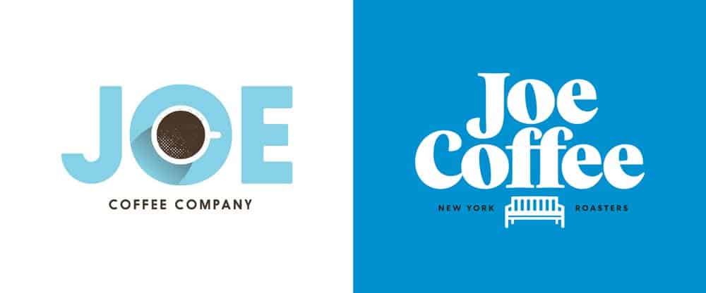
17 Feb Coffee Logo Design Inspiration for Cafes and Coffee Shops
Coffee Logo Design Inspiration for Cafes and Coffee Shops
They say that planting coffee has become more profitable than cultivating cocoa nowadays.
It sounds weird, but other rumour says that it is how numerous Colombian drug cartels were defeated – the government offered an amnesty to those who decided to switch from drugs to coffee.
Therefore, lots of cartels chose to make their businesses legal, taking into account that profits remained the same.
It doesn’t matter if it is one exciting legend or a fact. One thing that no one actually can argue with is the constant growth of coffee popularity among the masses.
Drinking coffee today is extremely popular.
Once you start ordering all those lattes, cappuccinos, mochaccino, you automatically get a reputation of a civilised and intellectual person.
Whether drug lords have switched to coffee or not, we have noticed the rise of coffee shops, coffee houses, and even small coffee booths around.
People enjoy it, and it looks like the number of consumers is not going to reduce soon.
No wonder people start their coffee-related business daily.
But where is the business, there is a need for a logo design.
And while at first sight, the development of a logo for your coffee business seems to be easy, that very moment when you start working on it, you may find yourself getting stuck.
Because, well, coffee is everywhere, and there are just too many logos with it!
Lucky for you, we’ve faced that challenge several times and are almost ready to develop another hundred coffee shop logos.
Anyway, if you are looking for the inspiration while developing another coffee-related emblem, and want to avoid another variation of dull coffee bean, we’ve got five interesting pieces of advice for you!
1 – Study the brand

Yes, we understand you are about to develop a coffee logo design and brand identity.
And yes! You can always do better than to draw a coffee bean or a grinder.
Check what exactly this specific brand does.
Does it sell coffee? Or does it merely transport it? Does it grow it or, perhaps, it cultivates some particular sort of coffee beans?
All these questions will provide you with more details that will make the job easier for you.
Have a look at Starbucks. They sell their famous coffee, and their logo is a mermaid.
Their brand’s name has nothing in common with coffee, because it was named after the captain’s Ahab chief mate Starbuck from “Moby-Dick”.
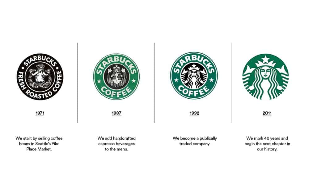
See – there are zero references to beans, grinders, coffee mugs, etc.
A coffee logo design can quickly be developed if you allow yourself to think a bit wider than the current frames.
But the first step to it is to learn what precisely the brand does.
A lesson to learn: If it seems you have a poor choice, it is you the one to blame, not the subject. Think bigger. Whether it is coffee or beer, your job is to develop a coffee logo that will attract people and will look sharp. And it doesn’t mean that you have to start the same old story with beans, and mugs, and all the boring but easy stuff once again.
2 – Develop a style
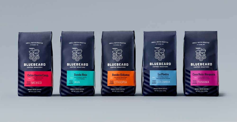
A style is usually more significant than a logo.
A style often can aid you while developing the emblem.
So before drawing a logo, think of your brand’s style at large.
Yes, your company offers a coffee, but there can be like billions of ways to sell the concept.
Keep in mind that it is always better to display specific values of the company, and what differs it from the rivals.
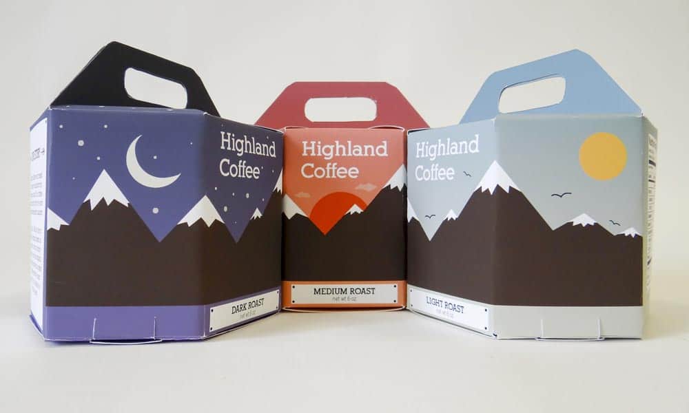
Coffee can be played lots of ways, like British colonial epoch, Brazilian vintage or Ottoman café, and many others.
You, perhaps, are aware of the “Jolly Green Giant”.
If you don’t, well, it is a logo of the company selling canned vegetables.
Does it seem it is a long way from a bean in a can to a huge green-skinned man dressed in a cloth made of giant leaves?
Well, it was embraced by the Minnesota Valley Canning Company after they decided that cabbage as a logo was a bad idea.
They decided to change the overall style and were inspired by the fairy tales of Brothers Grimm.
A Green Giant was taken from some of their tales, and he still looks beautiful and distinguishable.
A lesson to learn: The most straightforward way is usually the worst one. Your job is not to draw something, but to create a coffee logo that will help customers to distinguish this specific sort of a coffee on a shelve. If you can’t come up with a logo – work on a design, it will be your source of inspiration.
3 – Try to be simple
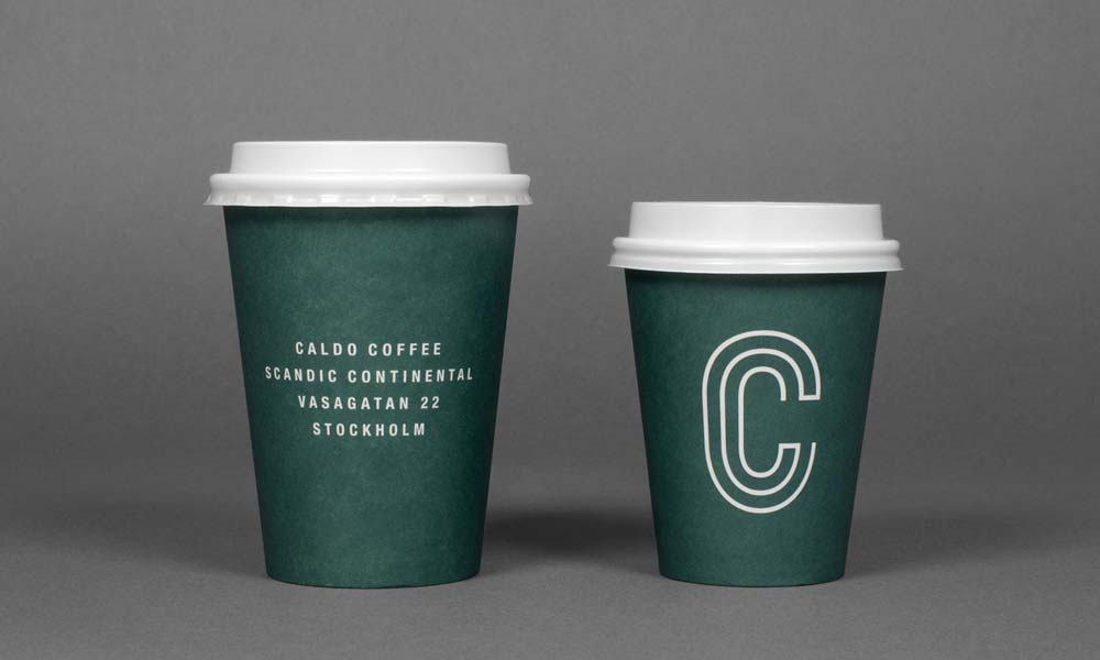
If nothing comes into your mind when working on a coffee logo design, think simple.
We live in the times when simplifying their logos is a goal of even the most famous brands, and they work hard on it.
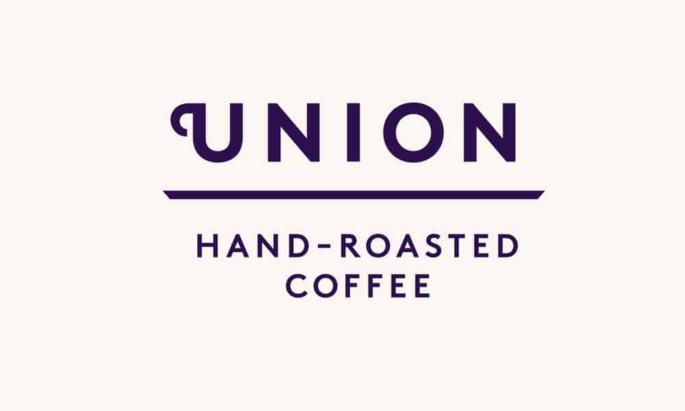
If a brand has an unusual or memorable name, perhaps, all you have to do is to write it down with a good font.
Lots of companies avoid using anything but their own names as logos.
A well written, stylish brand’s name could be the best coffee logo possible.
You might not remember it, but Samsung was the one continually redesigning their logo.
Today we all know its firm logo – the brand’s name written in the corporate font.
But from 1938 to 1958 they had… well, it is even hard to describe.
There were stars and hieroglyphs, and who knows what else on their logo.
It was complicated and intricate, and no one could recognise the brand.
In the eighties, they had another experiment with three stars, but eventually, they agreed that there could not be any better logo than their name.
A lesson to learn: Sometimes, the best logo you can create is the very brand’s name. It doesn’t mean you are a lazy designer if you suggest turning a name into an emblem. Your job is to help customers to memorise the brand. For these purposes, sometimes a name is better than any logo.
4 – Adjust the angles of view
If you are attentive enough, you can see a seed of a future logo in the very word “coffee”.
Those double “F” and double “E” can be turned into something. If you can’t squeeze anything from it, perhaps, you need other words?
Your coffee brand can have a tagline, or its name could be turned into a logo, that will simultaneously include the name and some memorable emblem. Use your imagination.
For example, could you even imagine that one famous company, a Goldstar Electronics, will turn a corporate tagline into their logo?
Today you know them as LG, which is precisely their motto: “Life’s Good”.
They managed to incorporate both the name of their brand and a winking face in a current logo, and it looks great.
What is more important is that no one has to work on additional promoting, backlinks, or a massive marketing campaign to make people familiar with it!
A lesson to learn: Ideas are everywhere. They are lying underfoot, and it is up to you to pick them up. Sometimes all you have to do is to change the foreshortening, and something new can be discovered. Try to look at such a familiar thing as a coffee from a new angle. Who knows what you can see?
5 – Think of the feelings
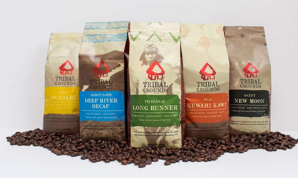
What is coffee? A smell? A taste? A morning ritual?
Perhaps, the related accessories, or a mug, or a sense of comfort? A feeling of warmth in your hands? A sip of energy?
See how many ideas can be brought to light if you start thinking of feelings that coffee can cause.
Now try to draw the feelings.
If you succeed, you’ll create not some ordinary and dull logo, but an emblem people will recognise and distinguish for decades.

Can you believe it? Well, here is another story.
Nike’s logo is officially called “The Swoosh”.
It is one of the most recognisable brand logos in the world.
It was drawn by a desperate graphic design student Carolyn Davidson, and the Greek goddess of victory Nike inspired it.
The emblem was supposed to broadcast the feeling of the victory, speed, power – all the things that now are being associated with Nike’s products.
All Carolyn tried to do is to draw a feeling. No need to say she has succeeded.
A lesson to learn: To draw a feeling is not easy, but it is one of the most appropriate approaches you can develop. No matter what they say, people remember feelings and emotions better than the facts. That’s how the human psyche works, and that’s what marketers try to do – to affect it when building brand awareness. You can do the same and think of feelings when developing your coffee logo design.
Drawing a coffee logo design might seem easy. Sketching logos for a coffee brand might seem elementary.
However, things are usually more complicated than they seem at first sight.
If you are about to start developing the logo for a coffee shop or some other coffee-related brand, you must take it as seriously as possible.
There are no easy themes and no insignificant work to do.
Before developing the coffee logo, try to look at this popular product from a new angle and always seek for a new approach.
That is what distinguishes an average designer from a brilliant one.
Know any other exciting ideas for a coffee logo design?
Feel free to share your thoughts with everyone in the most convenient way. Good luck!

The post Coffee Logo Design Inspiration for Cafes and Coffee Shops is by Stuart and appeared first on Inkbot Design.


