
23 Jan Anatomy Of A Homepage – A UX Perspective (Part 1)
Anatomy Of A Homepage – A UX Perspective (Part 1)
Designing a beautiful, crisp and effective homepage has become a significant challenge. With so many websites fighting to capture a user’s attention, good UX is the first step to having a better chance at this.
Introduction
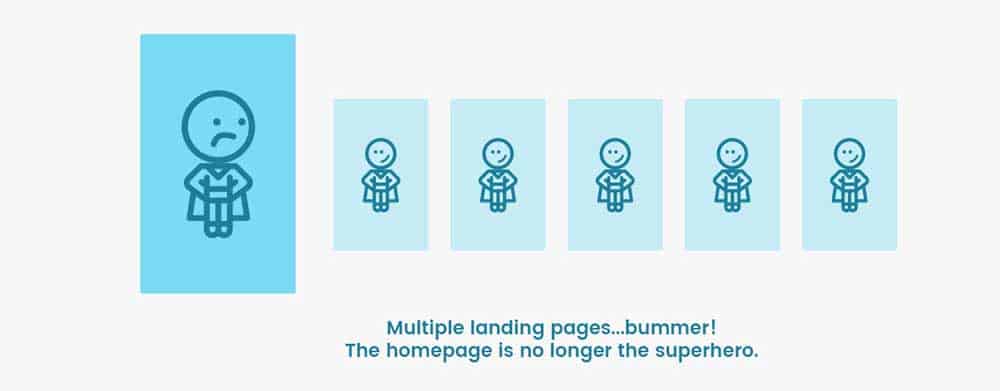
In the modern times of the internet, homepages are no longer the starting point of a website.
People can search for the exact thing they are looking for via search engines and land on the correct page they want, totally bypassing the homepage.
Earlier, homepages were a concise presentation of the entire website and a high take-off point to its other pages.
Today, different sections of a website can have their own’ landing pages’ which are different from the homepage but end up looking like individual homepages in their own right.
This ends up making the actual homepage a bit redundant.
Such a situation brings in great confusion about how to create the information architecture of a website.
More than that, it brings in some fundamental questions:
– What is the homepage?
– What is a homepage for?
– Which page qualifies as the homepage?
– What information should be put on the page?
The more you think about this, the more confusing it gets.
For example, why can’t the ‘Contact Us’ page be the homepage?
Since getting in contact is the end goal anyway, so why not cut to the chase?
If you start to strip a homepage down to its bare basics, you begin to realise that there is very little purposeful information. Everything else is adding to the clutter and confusion.
This article attempts to bring some clarity in this matter.
First, it attempts to debunk some myths about the homepage.
Then it attempts to give some thought processes and guidelines of how to design a homepage from a UX perspective. Hopefully, it will help declutter the internet.
Debunking Some Myths
The homepage is the main page of a website.
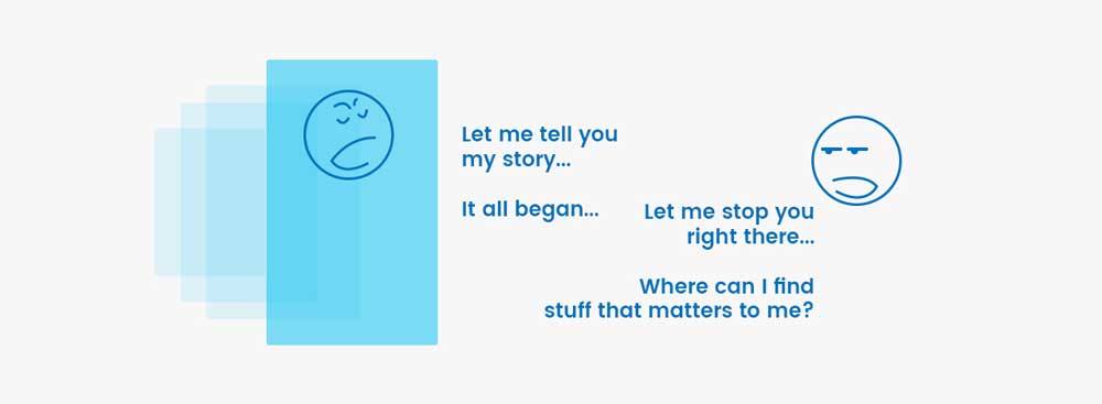
A homepage is by definition, a one page ‘summary’ of what you do. In contrast, most people are coming to your website for the ‘details’.
Within the large number of people on the internet, some people are just exploring the web looking for cool websites.
Only they will find the time to see your homepage in its entirety. But they are like window shoppers. They don’t want to come in and buy stuff.
So for most of the people visiting your website, the page most relevant to their requirements is the one which is most important to them.
This means that that page is most important to them.
The homepage is the first page of a website.
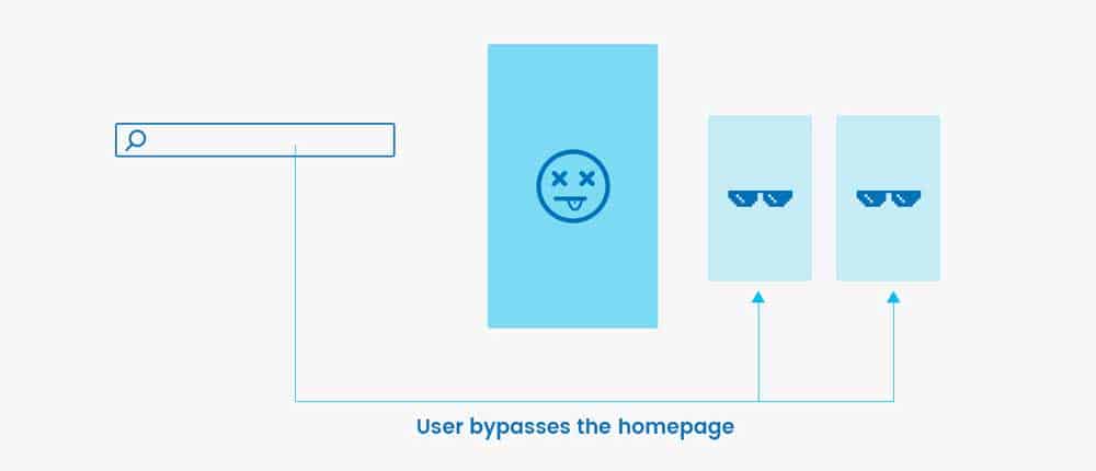
As we have already seen, due to search engines being able to point to the exact page based on your search query, the homepage is rarely the first page people visit.
Even if they type the company name in Google and are shown the website in the search results (which means they are going to land on the homepage inevitably), they are going to explore the top navigation and try to search for the page they want quickly.
So even if the homepage becomes the first page they visit, it is a take-off point to other pages.
The homepage needs to be loaded with maximum information.
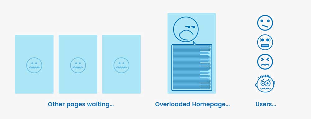
If you bombard a visitor with maximum information on the homepage, your website is going to bomb (pun intended).
Imagine going to a movie theatre where the usher himself tells you the whole story of the movie rather than showing you where the seats are — not a good thing to happen.
Many times, a homepage is an unavoidable step which a user has to take in their journey to the page they want to see.
If it tells them where to go within a few seconds, great! So you should design the homepage to do just that.
The homepage needs to be beautiful first.
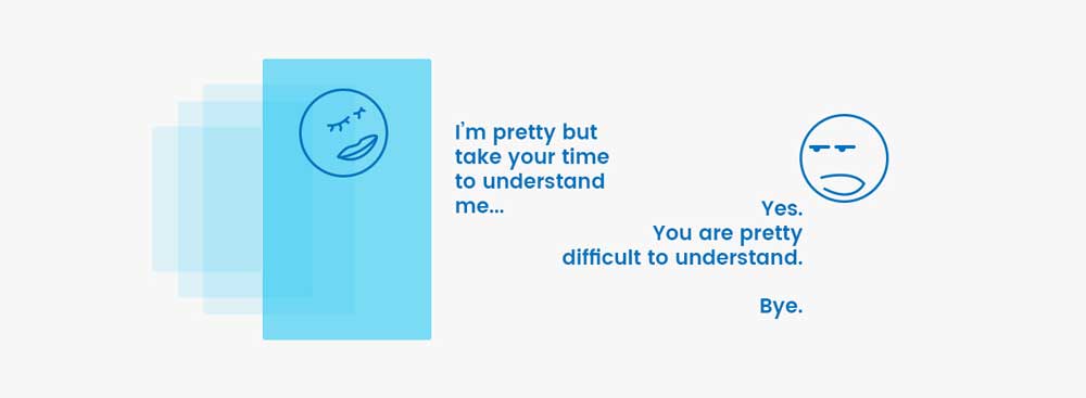
A beautiful looking house speaks nothing of the people living inside it.
Similarly, a beautiful homepage does not guarantee impressive services and solutions. It certainly does not ensure that the visitors will understand what you want to say.
So a homepage needs to be clean first, beautiful later.
Beauty will enamour a user to stay longer on the homepage.
But when it comes to money and trust-related decisions, beauty takes last priority.
The homepage needs to be extended.
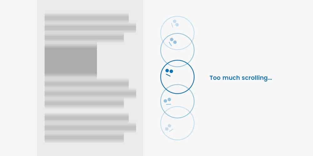
There is a reason why people go to the most expensive restaurants in the world and still have burgers and cold coffee.
The most elaborate menus are often the most confusing. The people are hungry, which means their ability to concentrate, think and choose is compromised.
Visitors of your website are in a similar state.
If they are forced to scroll through your extremely long homepage only to get confused, they will click ‘Contact Us’.
On this page, if they wish to remain anonymous and not give their email or phone, they will close your website. You have lost potential business.
So keep the homepage short.
The homepage needs a lot of animations and interactions.
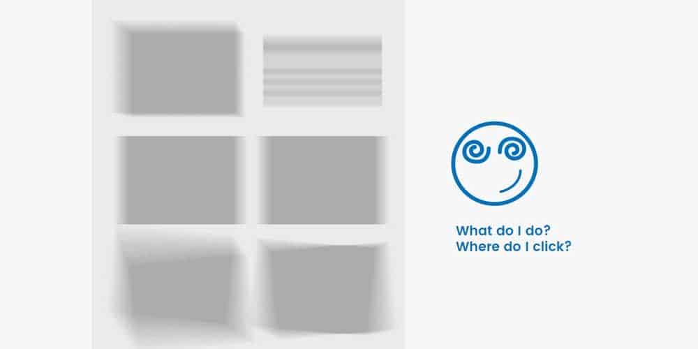
It’s a homepage, not a disco. Unless you are designing for Disney or Cartoon Network, animations and interactions have to be placed strategically.
You should see the contrast of design between Disney’s entertainment website and their company website. The minimalism is startling.
So we’re not asking you to eliminate animations and interactions entirely.
But keeping it only where it is necessary makes a huge difference. If you cannot decide whether to keep or not – don’t.
Now that we have cleared some myths about the nature of a homepage let’s take a closer look at some sections of a typical website to see if they make sense.
Making Sense Of Typical Sections Of A Homepage
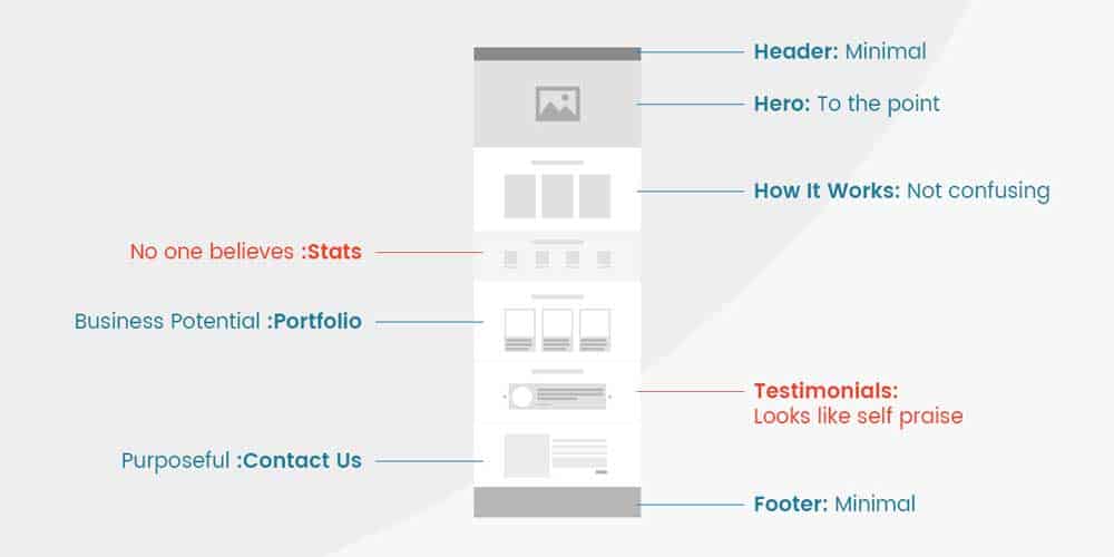
Header section
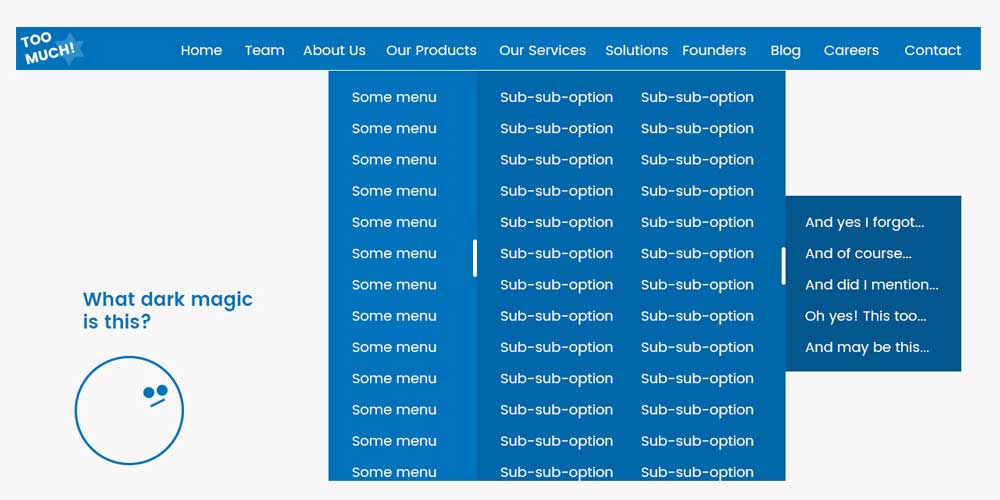
Navigationally, a header is a very core functional requirement of a website.
But loading the header with more than five links starts making it overwhelming. So people introduce dropdowns and menus with submenus. If not, we have subheaders.
From a UX perspective, this is not good at all.
Complicating the main navigational area of a website is merely bad logic. Instead of adding menus, dropdowns and subheader, you should try to rework the information structure and make that simpler.
Ideally, four items or less is excellent. You should see the website of Google’s mother company Alphabet.
It has two items in the header, one of which is the logo. The other is ‘Investors’. That’s planning for simplicity.
Banner or Hero section
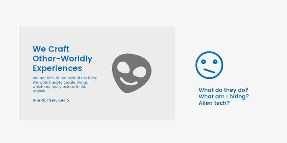
It is often said that the value proposition message of the website should come here.
If you understand this term, then you know that it needs to be the shortest description of your core business.
Then comes the graphic or background image to support the value proposition message.
If that is irrelevant to the message, the banner section is a lost cause.
Then comes the CTA. This button is necessarily going to direct a user’s attention to itself so that he can be directed to a page of good business value.
From an information structure standpoint, planning to which page the redirection happens is crucial.
Now here is the problem. Three things are simultaneously trying to grab a user’s attention:
– The graphic or image
– The value proposition message
– The CTA
The least valuable amongst these is the graphic or image.
The most valuable is the value proposition message.
The CTA only makes sense if the value proposition message is clear or at least intriguing enough.
How-It-Works section
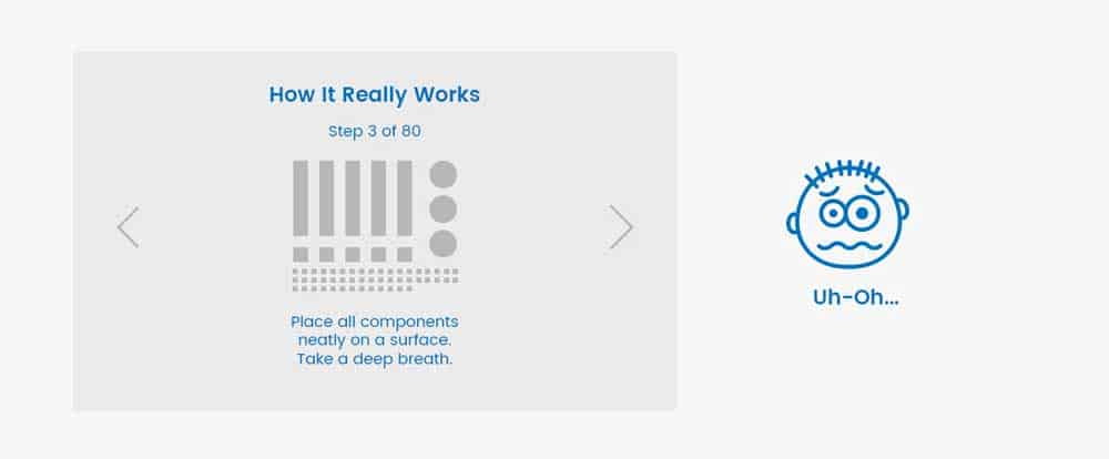
This section, by definition, is meant to bring clarity to a user. It cannot be loaded with too much content. It needs to have images or icons only if they enhance the meaning.
Ideally, each step of the procedure needs to be described in a word or two. A secondary description should be avoided because very few people read through the full thing.
Also, if it takes more than four to five steps to explain something to a user, it is a good practice to capture the essential elements and only those.
If your product or system is more complicated than that, then don’t try to explain it on the homepage. Keep a CTA instead.
Stats section
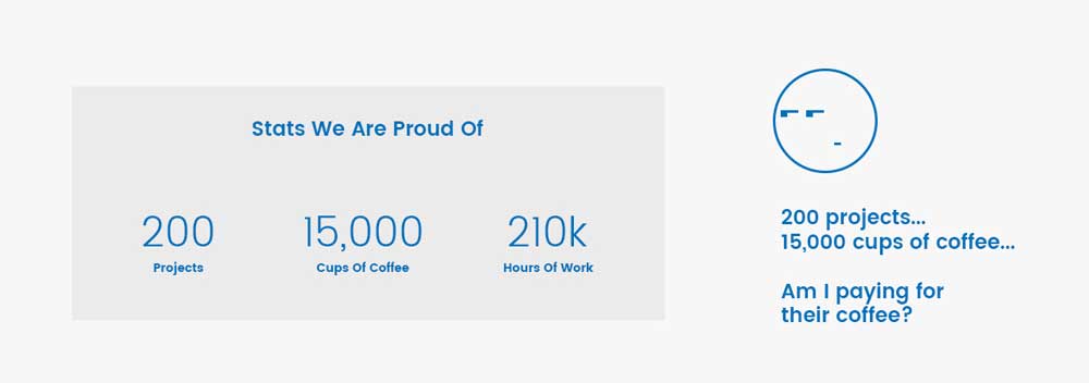
Many websites use statistics to show their executed projects, staff and coffee cups.
If you think for someone deciding whether to give business to someone, you will only partially believe these numbers.
The number of executed projects has decreasing relevance these days. The quality of the completed projects matters more. The technological relevance matters more.
Similarly, unless your website has photographs to support your claims of staff numbers, no one will believe you.
The number of coffee cups was once a very trendy thing.
Today it is only relevant if you are a job applicant who is enamoured by the youthfulness of the company culture.
For a businessman, it is of no value. Unless you say that you provide 24×7 support due to those coffee cups, a business person will not be interested.
And even if you claim to give 24×7 support, a business person will not believe you until they have personal experience.
So stats should be used with caution and strategy, or not at all.
Portfolio section
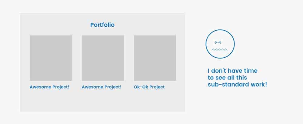
This section screams business potential.
So it should be taken with that seriousness. This means carefully designed thumbnails, extremely relevant information and a consistent scheme of display of projects.
Grouping, sorting, filtering and searching should be enabled if the projects are too many.
Ideally, only the best projects should be displayed. If it means two projects out of a thousand, so be it.
It is better to show small amounts of good work and gain projects, rather than show a lot of not-so-great projects and lose potential business.
Testimonials section
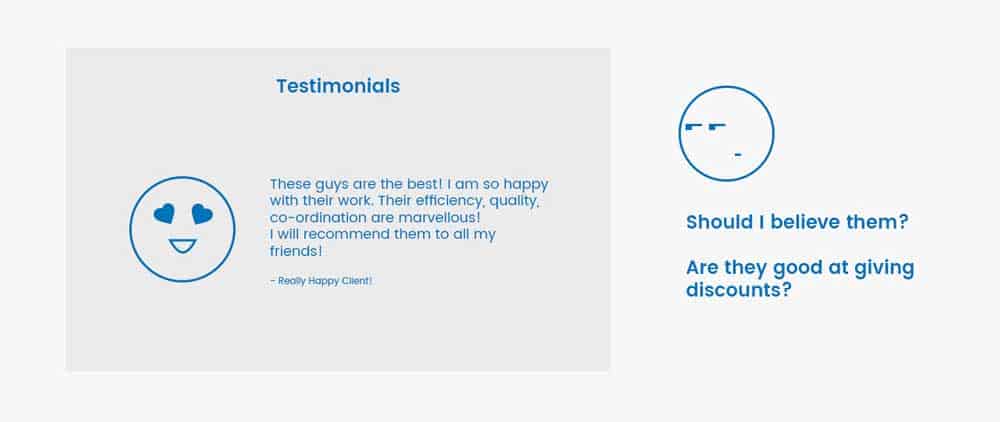
Testimonials are praises of good work. Now there are some critical dynamics to this fold:
– If you are claiming to have executed over a thousand projects, and have three testimonials, does that mean the others have nothing good to say about you?
– Would you believe a random testimonial? Especially in today’s times, when people get testimonials written from their friendlies, how trust-invoking are testimonials?
– It is said that testimonials have a referral business value. But that is not the case. Someone referring your business to their contacts will not do it via your website testimonials section saying, “You should read what I’ve written”.
Unless a famous person has given a testimonial, this section has limited value.
But this section is not totally without value.
Keeping a testimonials section makes a homepage look human. But it needs careful design, good word selection, proper photographs and proper representation.
Contact Us form
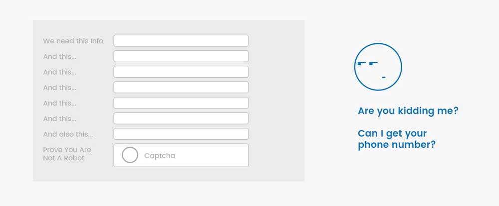
This is another section which screams business potential. It also is the doorway to spam.
Depending upon your business model or purpose behind the website, the ‘Contact Us’ form can be redesigned, simplified or even eliminated.
Your phone number and email should enable them to contact you.
For a business firm, a project requirement collection page is a better approach.
Only those who are serious about approaching you will fill out the requirements.
Footer section
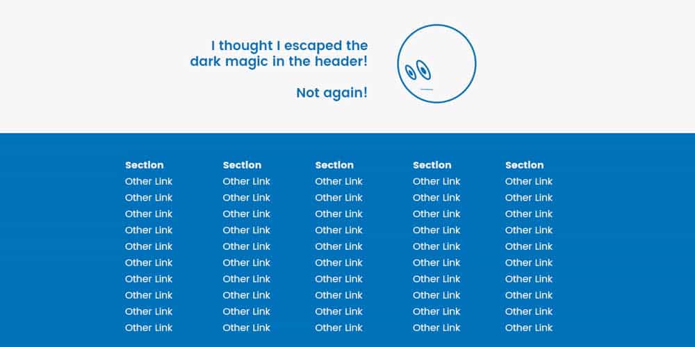
The footer section is generally the secondary navigation section to miscellaneous parts of the website.
But there are examples where people don’t spare this section as well. They load this section for a variety of reasons – SEO being one of them.
The footer is often a very neglected section of a website.
However, a good footer design needs to be supported by good information architecture. It also needs prioritisation and readability design. It needs minimalism.
You may have started feeling that from a UX perspective, a homepage should not exist at all.
That’s not the case. We will see in Part 2 of this article, how a homepage can be designed well.
The post Anatomy Of A Homepage – A UX Perspective (Part 1) is by Stuart and appeared first on Inkbot Design.