
22 Feb 8 Cognitive Psychology Tricks for UX Design
8 Cognitive Psychology Tricks for UX Design
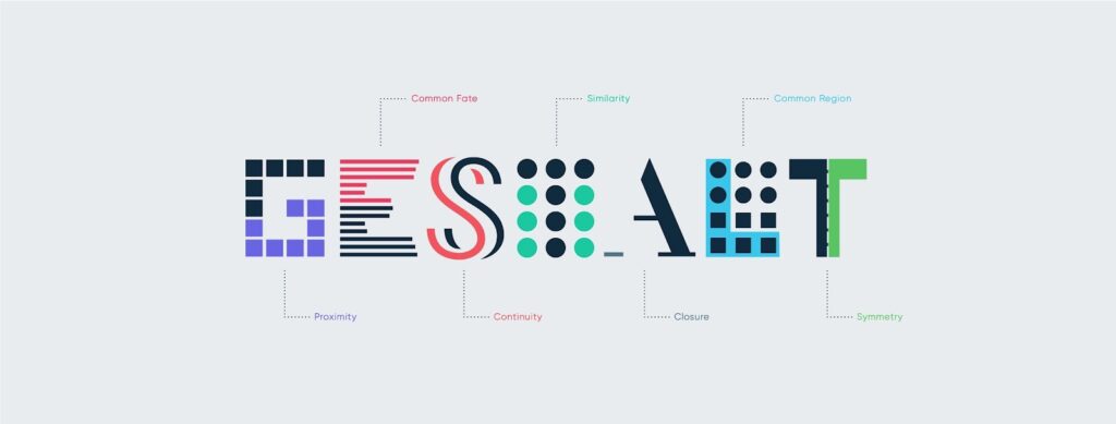
How users perceive an interface and how it interacts with it are vital considerations for UX designers. The user perceptions, behaviour, and interactions largely depend upon the psychological impact design has on them. So, UX design needs to be concerned with psychological principles.
Cognitive psychology, the particular branch of psychology dealing with human perceptions and cognitive faculties, has an influential role in UX design.
Over the years, several cognitive psychology principles have directly impacted UX design. Creating a human-centric design based upon these principles is of seminal importance for any competent web development company.
Let us look at the critical cognitive psychology principles that significantly impacted UX design.
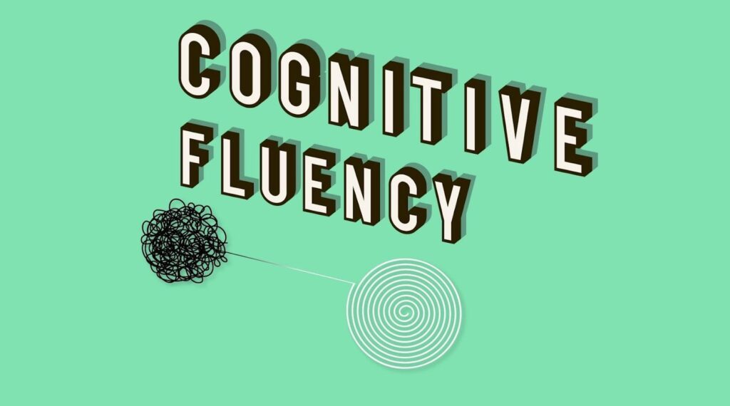
1 – Ensure Cognitive Fluency
Just as speaking fluency refers to how easily and smoothly you speak a language, cognitive fluency refers to the ease of processing information by the brain.
An interface allows users to process information and understand more easily and effortlessly; better engagement and traction can ensure. The design elements have a pivotal role in ensuring this cognitive fluency.
The human brain quickly consumes simple information and can easily remember it if it is familiar. So, to ensure cognitive fluency, simplicity is a must, and secondly, you should adhere to standard design norms. Any design element that creates confusion or difficulty in understanding should be avoided at all costs.
Here below, we provide critical tenets of cognitive fluency in UX design.
- Avoid accommodating too much text content on a page.
- When using textual content, create enough breathing space by using breaks, small paragraphs, subheads, bullet points. Make content scannable at a glance.
- Use contextual visuals in content to express your point quickly.
- Use enough white space in content to help users concentrate easily.
- Use specific established design patterns and elements that are too familiar. For example, you can use the hamburger menu for mobile web and mobile app screens.
- Don’t try to reinvent the wheel for every design element. Use design elements that are familiar to your audience.
2 – Offer Them a Limited Number of Options
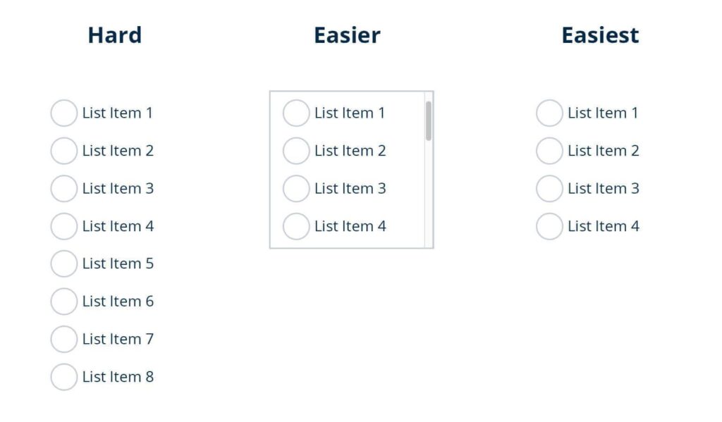
This principle, widely known as Hick’s Law, refers to the cognitive capacity of the human brain in processing information when faced with several optional choices. According to this law, more options for making a choice will proportionately delay the decision-making process. For example, a buyer facing five different choices will make purchasing faster than a buyer with ten different options.
You can apply this principle to drive more results when it comes to digital interfaces. For example, instead of adding too many social share options, you can use only the most relevant ones. Similarly, you can limit the number of form fields or optional CTA buttons.
E-commerce stores have mainly utilised this cognitive principle to their advantage. When presenting a product range, limiting the number of choices could garner more user interactions, resulting in more conversions.
Many brands could significantly enhance the click-through rates (CTR) of their campaigns by following this principle. The key is to allow people to think less when deciding what to do next, which will help them decide faster.
3 – Give Hints of What’s on the Way
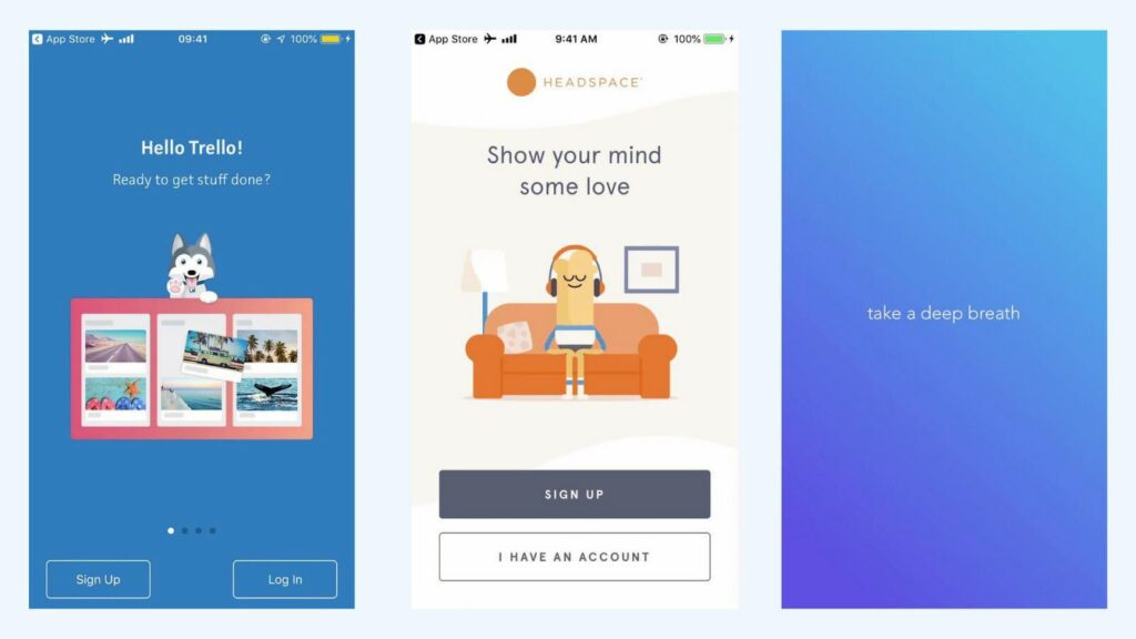
Conditioning the users for any information or interaction coming on their way is another way to enhance understanding and help users take decisive actions. This conditioning or giving hints about what will come can be related to timing, upcoming interaction, or any new information.
For example, before leading you to a third-party website, some websites offer an alert screen. This can be simple micro-interactions like the animation of incoming users about the download time with animation.
Such conditioning, also called Priming, should be used discreetly not to harm the user’s decision-making. For example, suppose your fashion business just showcases a set of womenswear before the entire store page loads. In that case, customers can feel that the brand is only catering to womenswear.
4 – The Chameleon Effect

People tend to reflect the emotions they observe in others. A lot of joyful faces invokes a sense of happiness in you. Similarly, a sign of danger instantly alerts your brain about something prohibitory or harmful. This is called the Chameleon effect as per the cognitive theory and is consciously used by UX designers.
The trick is to create design and content that intuitively drive specific emotional effects from the users. There are several examples of using this effect across leading websites or apps. For instance, Google 404 error page shows a robot tattered into pieces to tell you that something went technically wrong.
On the other hand, the language learning app Duolingo uses a bird animation to show surprise, joy, or sorrow as per your learning context. If you have skipped a lesson for a day, the crying bird on the screen will make you feel bad about it. There are many excellent UX tools for UX designers to try and experiment with this effect.
Similarly, in content writing, writers often incite excitement or scepticism with the use of certain expressions only to keep readers engaged. Invoking certain feelings and emotions for making users react in the desired manner is the key aspect of this cognitive principle.
5 – Transference
As today’s users frequently engage with web and app interfaces of all types, some interactions and digital behaviours with certain features and interfaces remain common. Incorporating similar UX elements to help them behave or interact similarly reduces their efforts and makes interactions easier.
This cognitive principle of transferring experience into the design is called transference. For example, anyone who uses Microsoft Word will find several similarities with the editing tools of other document or note-taking apps. Specific methods and experiences are repeated to help users interact and engage quickly.
6 – Left-to-Right & Top-to-Bottom Placement
There are various proven ways to draw users’ attention to specific information. You can use the contrast of colours, variation of button sizes or fonts, or simply can use blurring effects. But underlying these visual tricks, there is the cognitive principle of placing information horizontally from left to right or vertically from top to bottom.
According to this cognitive principle, our mind is pre-conditioned to process information better by following the sequence from left to right and top to bottom. This happens primarily because most linguistic scripts follow this order for writing and reading. Only for people speaking Arabic or similar languages can the left to the correct order of perception be the opposite.
Depending upon the target audience, UX designers now can use this cognitive principle of placing information to draw user attention better. For example, e-commerce stores always tend to showcase the most saleable products on the product page.
7 – Effective Use of Repetition in UX Writing
Repetition is mainly viewed as a negative aspect when it comes to writing. But quite the contrary can be the case when certain words or terms are repeatedly used in a text to convince people or make a more profound impression. Researchers have observed that people coming across an identical piece of information several times are more likely to believe in it.
Following these principles, certain websites in their copy use certain words repeatedly to make the intended impression. For instance, an ERP development company, by using similar terms like “customisation”, “custom development”, “tailored to needs”, “business-specific”, “ implementation”, etc., can establish an impression.
The repetition always doesn’t have to be the same. Similar meanings with different expressions can make it sound more convincing. This is where the role of UX writing comes into play.
A UX writer based on the context can consciously use repetition to convince users about a specific value that the business wants to project.
8 – Using Colour Psychology to Your Advantage
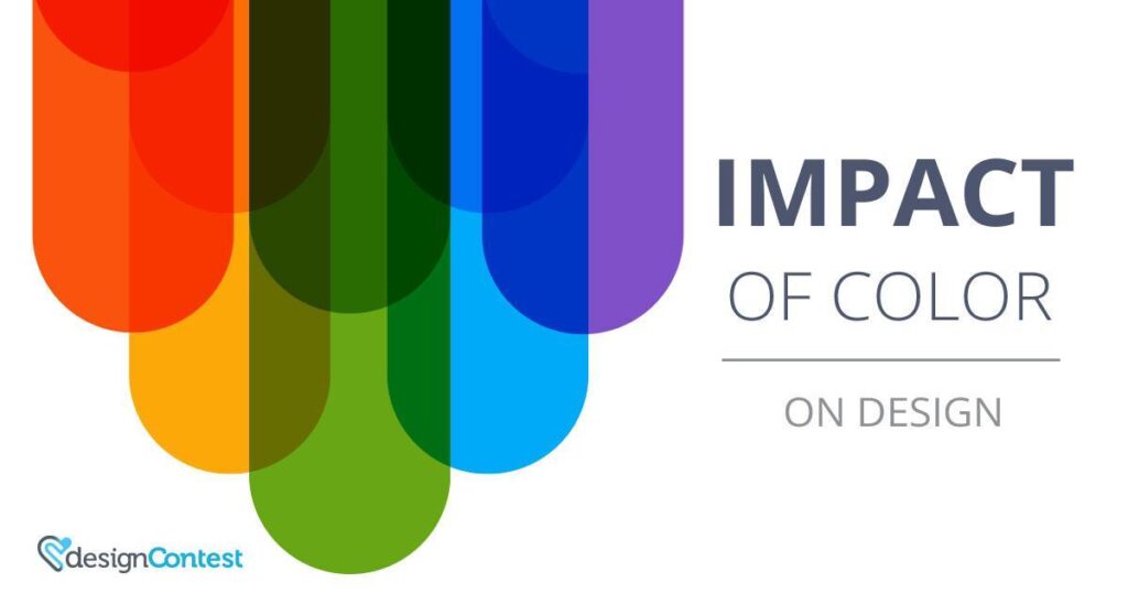
Finally, it is time to spare a few thoughts on the cognitive impact of colours on the design. First of all, we always associate specific colours with brands. The use of several bright shades by Google tells about its multiplicity. The continued use of blue by Microsoft tells about its professionalism and reliability.
When it comes to web or app interface design, apart from choosing this brand-specific colour palette, you need to consider the impact of colours for different contexts. It also depends upon the demographics of your target audience. First of all, men and women respond to colours differently.
In other cultures, there are biases about different colours. Your choice of the colour palette should resonate with your audience’s perceptions.
Maintaining harmony comes as the first consideration when you pick your shades from a colour wheel. When you need to combine colours, a sharp contrast with two colours directly opposed in the colour wheel can add to the visual distraction. It is essential to use colours sitting nearby within the colour wheel to ensure harmony.
Another proven approach is to use a neutral colour to mellow down the contrast and establish harmony. You can follow the proportion of 60-30-10 for using three colours to ensure balance. According to this theory, one neutral colour will consume up to 60% of the colour scheme. A complementary colour takes 30% of the palette, and an accent colour consumes 10%.
Conclusion
So, utilising cognitive psychology principles in UX design requires a meticulously detailed approach. Here, you cannot take any design element for granted. Every design consideration should focus on how users perceive, how it makes it easier to consume information, and how the design can make an intended impact. It is truly a problematic and multifaceted approach to achieve simplicity.
Author Bio: Tuhin Bhatt is a co-founder of Intelivita, a leading web and mobile app development company with offices in the UK and India. He has expertise in Mobile Game, iOS, Android, AR and VR App Technologies. With an excellent command over app development, Tuhin also has a passion for sharing his expertise with clients and other enthusiasts.
The post 8 Cognitive Psychology Tricks for UX Design is by Stuart and appeared first on Inkbot Design.